INSPIRATION & CONCEPT
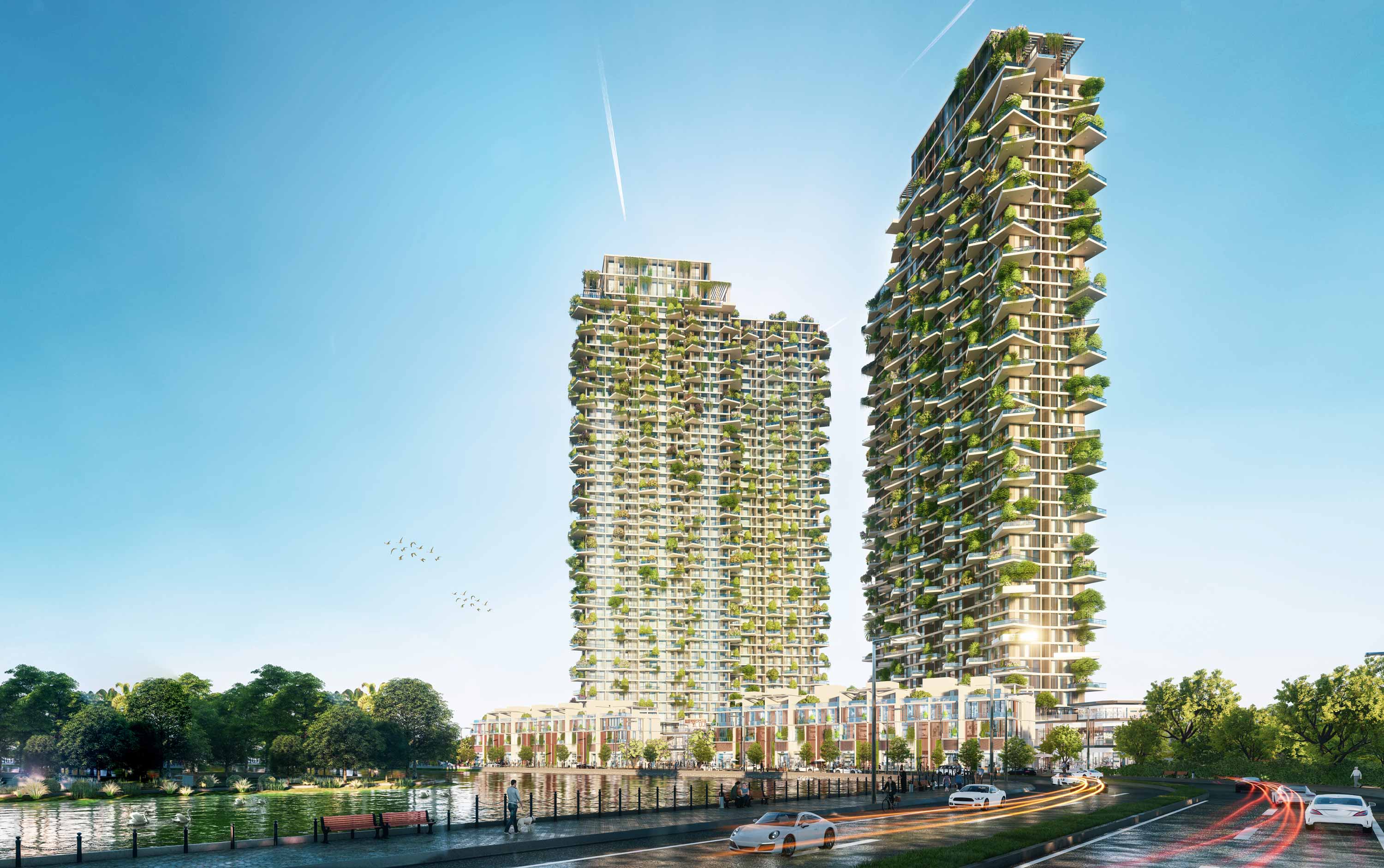
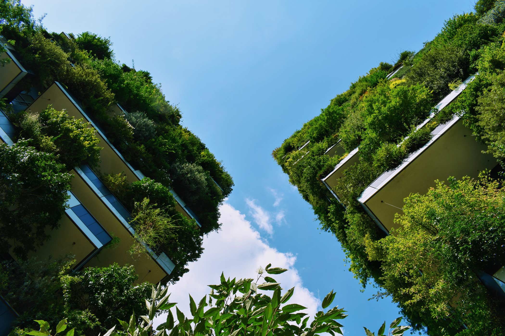
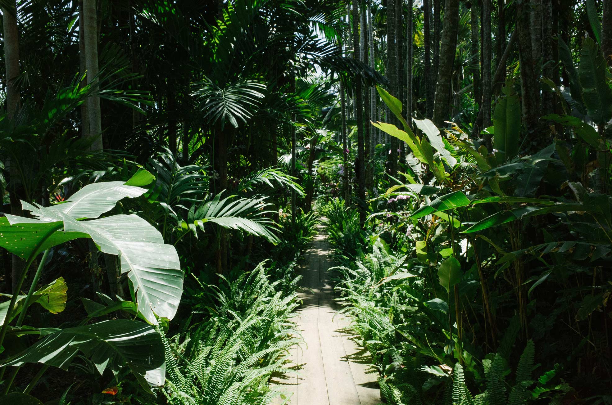
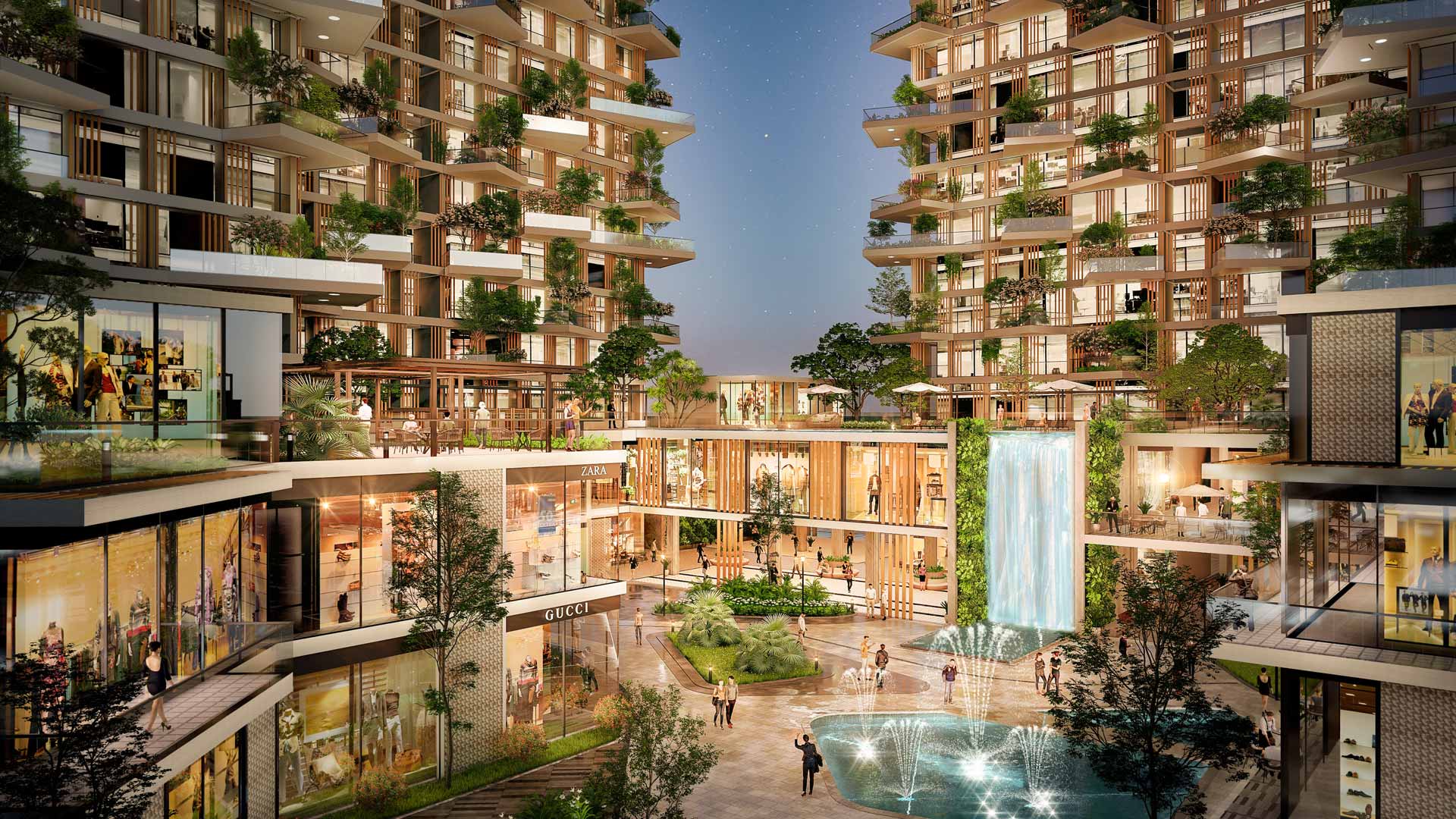
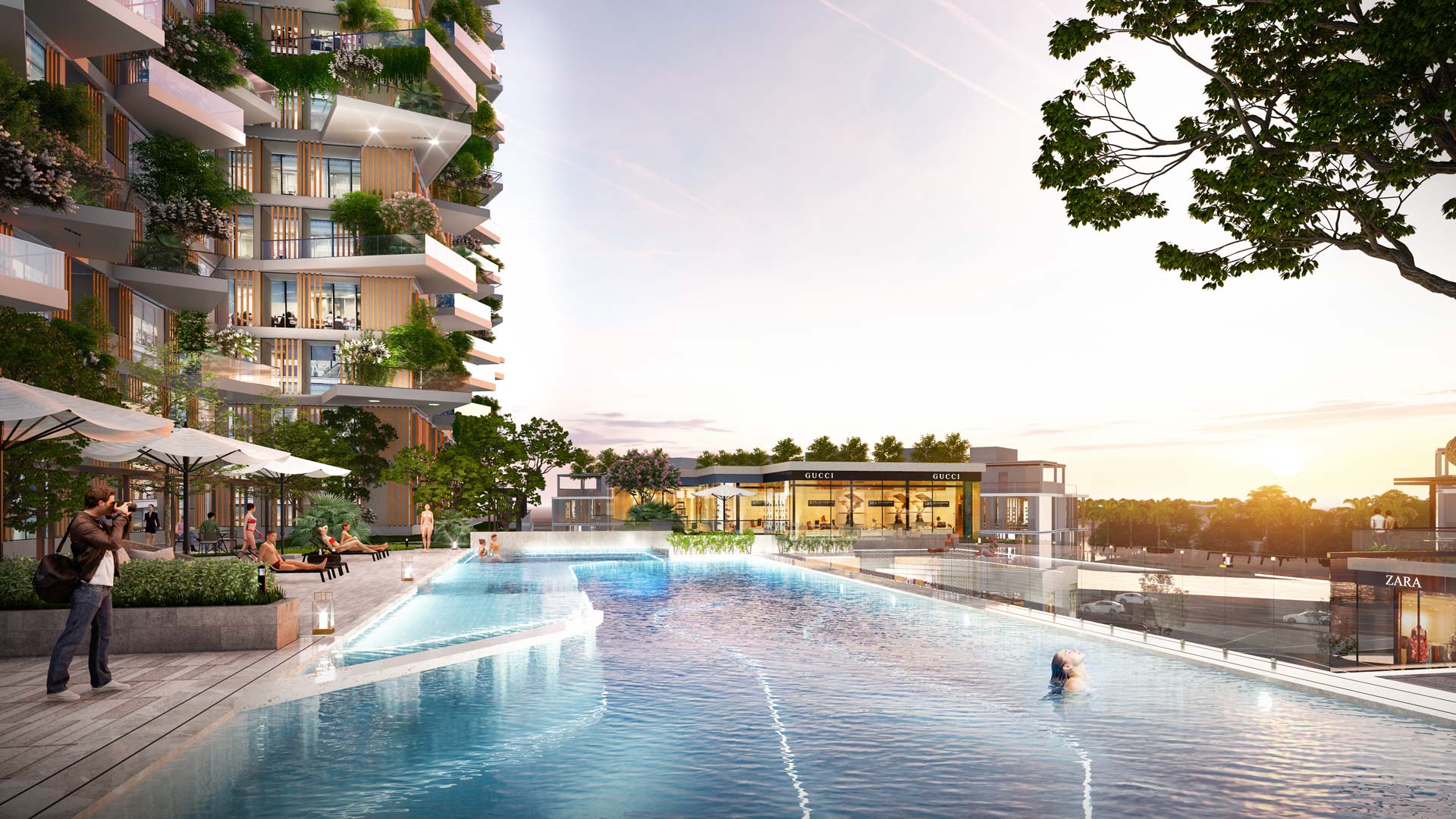
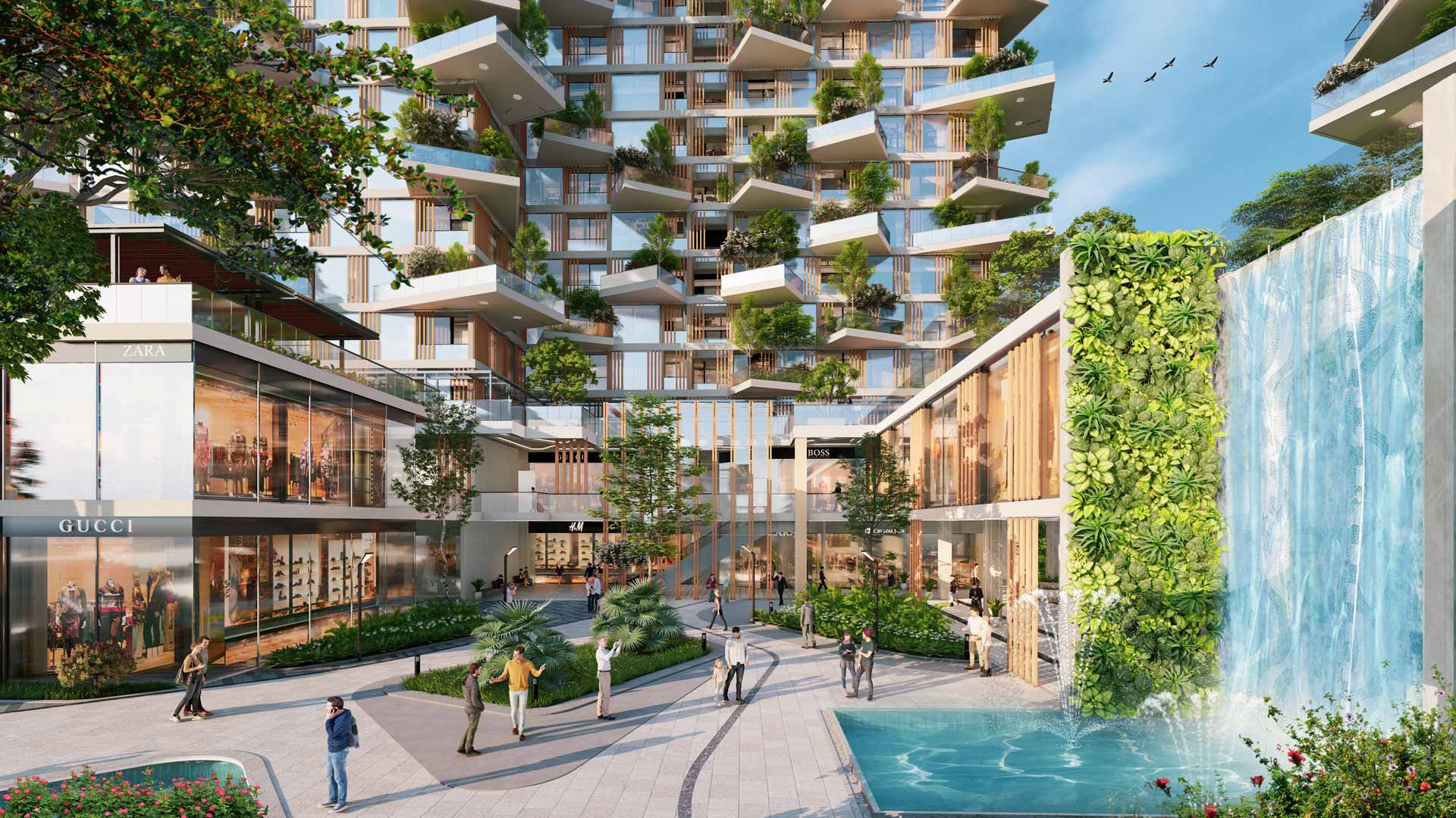
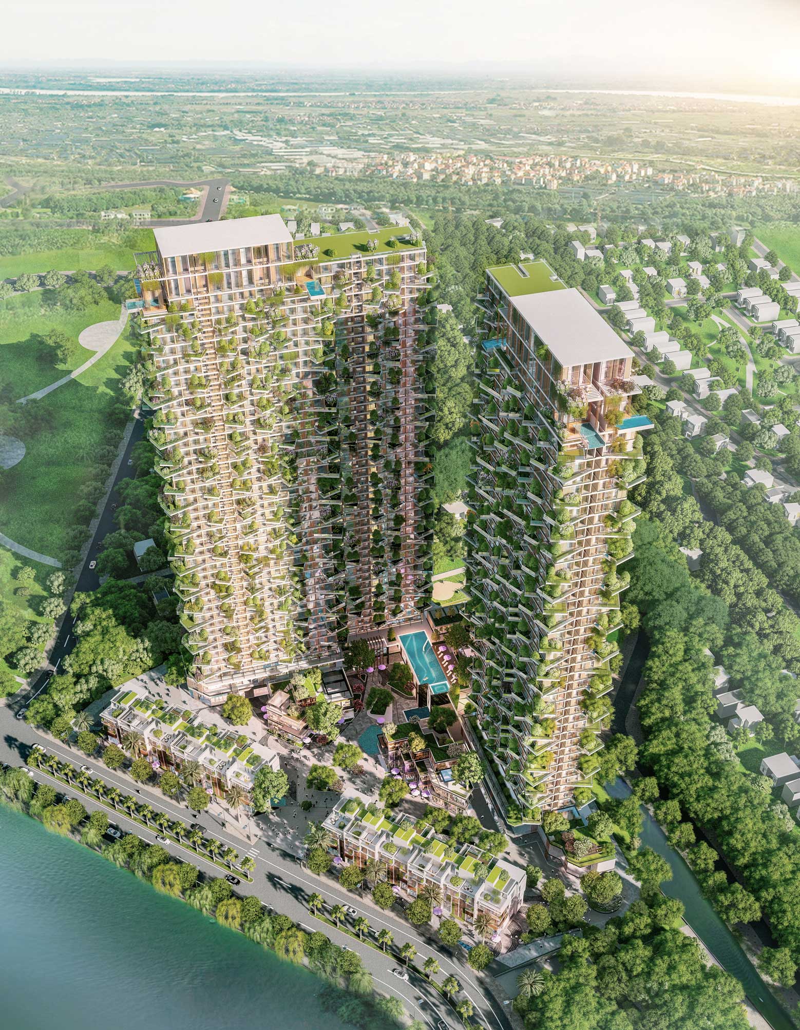
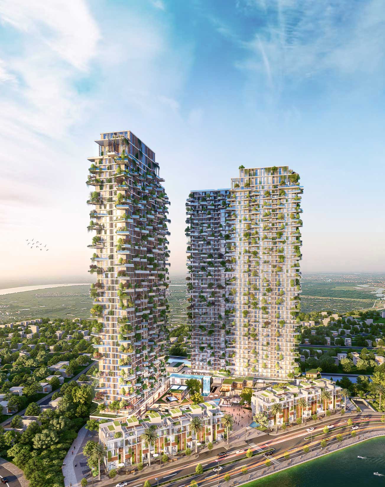
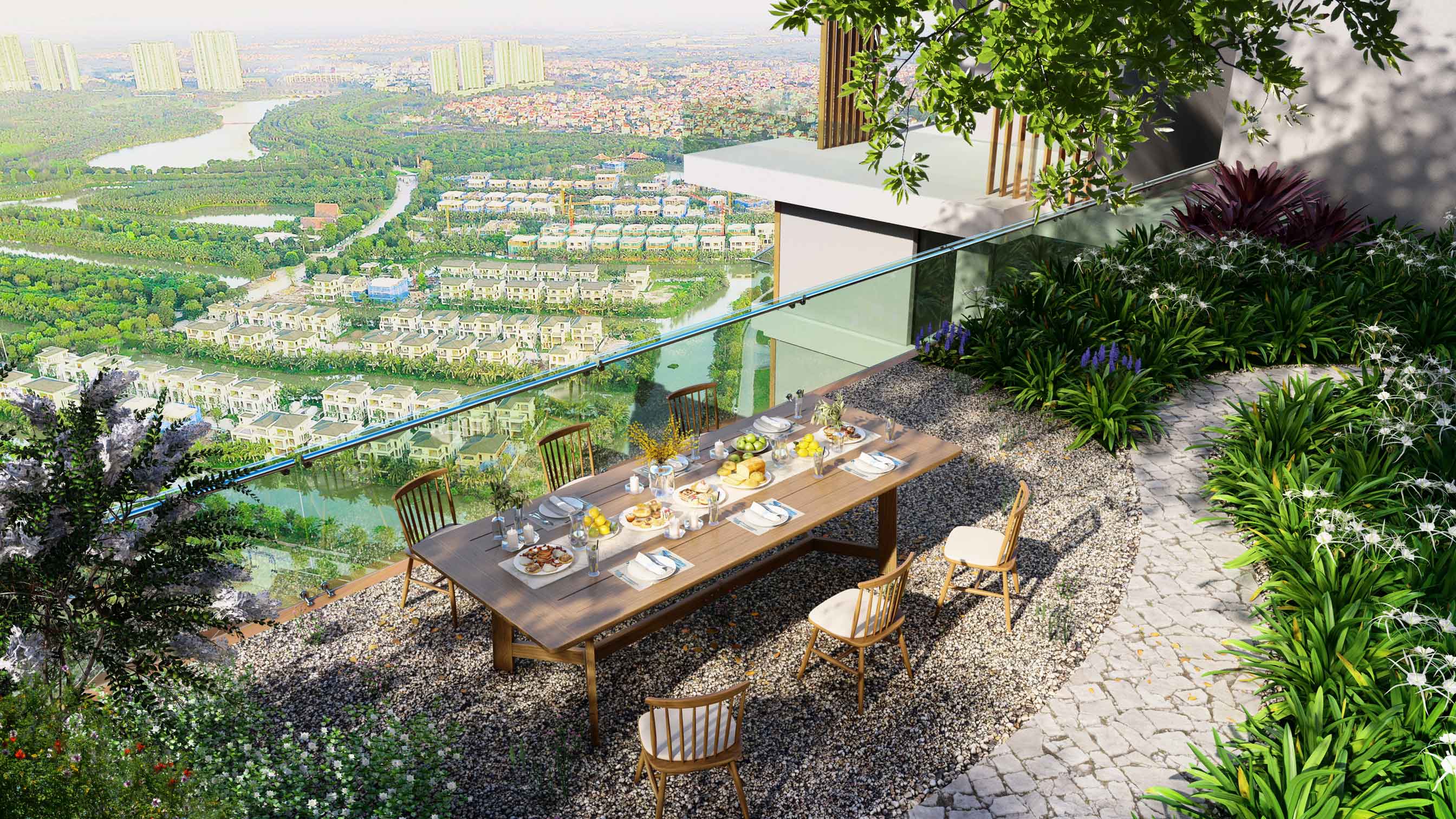
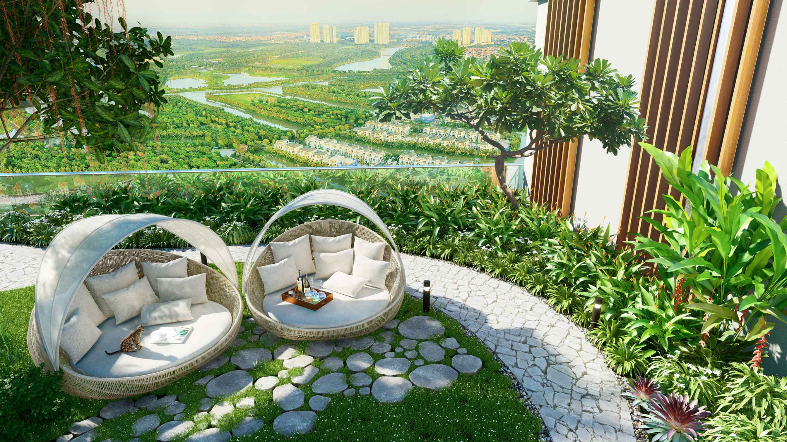
Ecopark Solforest is a tall and sprawling residential apartment project designed by Dewan Architects situated outside Hanoi, with inspiration drawn from vertical forests, a space of fleshed-out greenery and sprawling nature. The inspiration is to bring calmness and serenity to a bustling residential real estate complex, providing homeowners with the best of both worlds; a comfortable, luxury living space surrounded by green space.
Setting a new standard for eco-architecture, Ecopark Solforest also features one of the tallest vertical gardens in the world. The complex itself is a reimagined treatment of what a contemporary living community can be, and The Only Three was able to continue our work of branding services and strategy with Ecopark for this collaboration.
Scope of Work
Creative Concept
Brand Identity
Key Visual
ARCHITECTURE DESIGN
Brought to life by Dewan Architects and engineers, the sprawling and eco-friendly complex is separated into two towers, with a mesmerizing view of Vietnam’s Red River. The Only Three constructed an in-depth analysis of Solforest, with all of its unique architecture, and crafted a brand identity based on this.
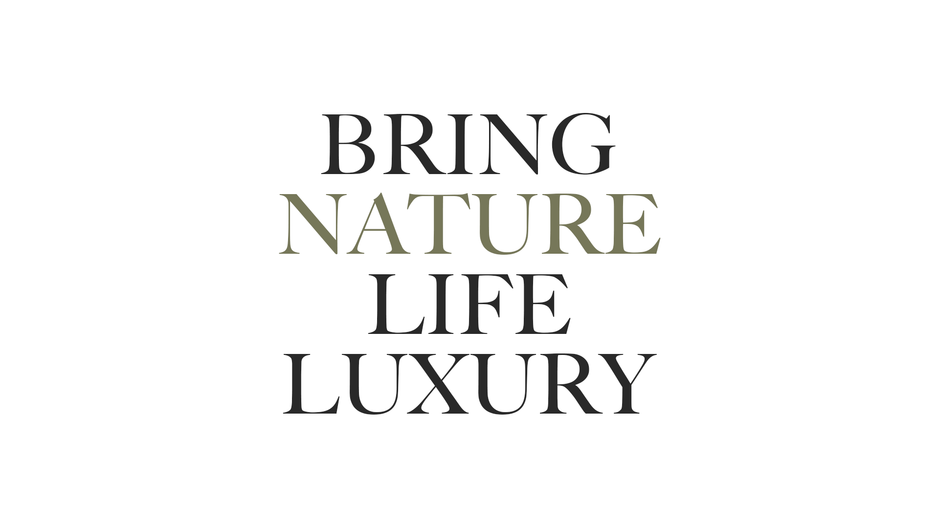
A tall, modern residential complex with an identity born out of nature; The Only Three focused merely on bringing nature to life.

BRANDING
The Only Three worked closely with Solforest’s team to come up with the fitting branding and collateral for the project, with special attention and care given to the development’s eco-conscious design and ideology.
Solforest gained global recognition for being the tallest vertical forest residential building in Southeast Asia, and The Only Three was able to craft and capture the project’s sensibilities into a clearly communicated brand position.
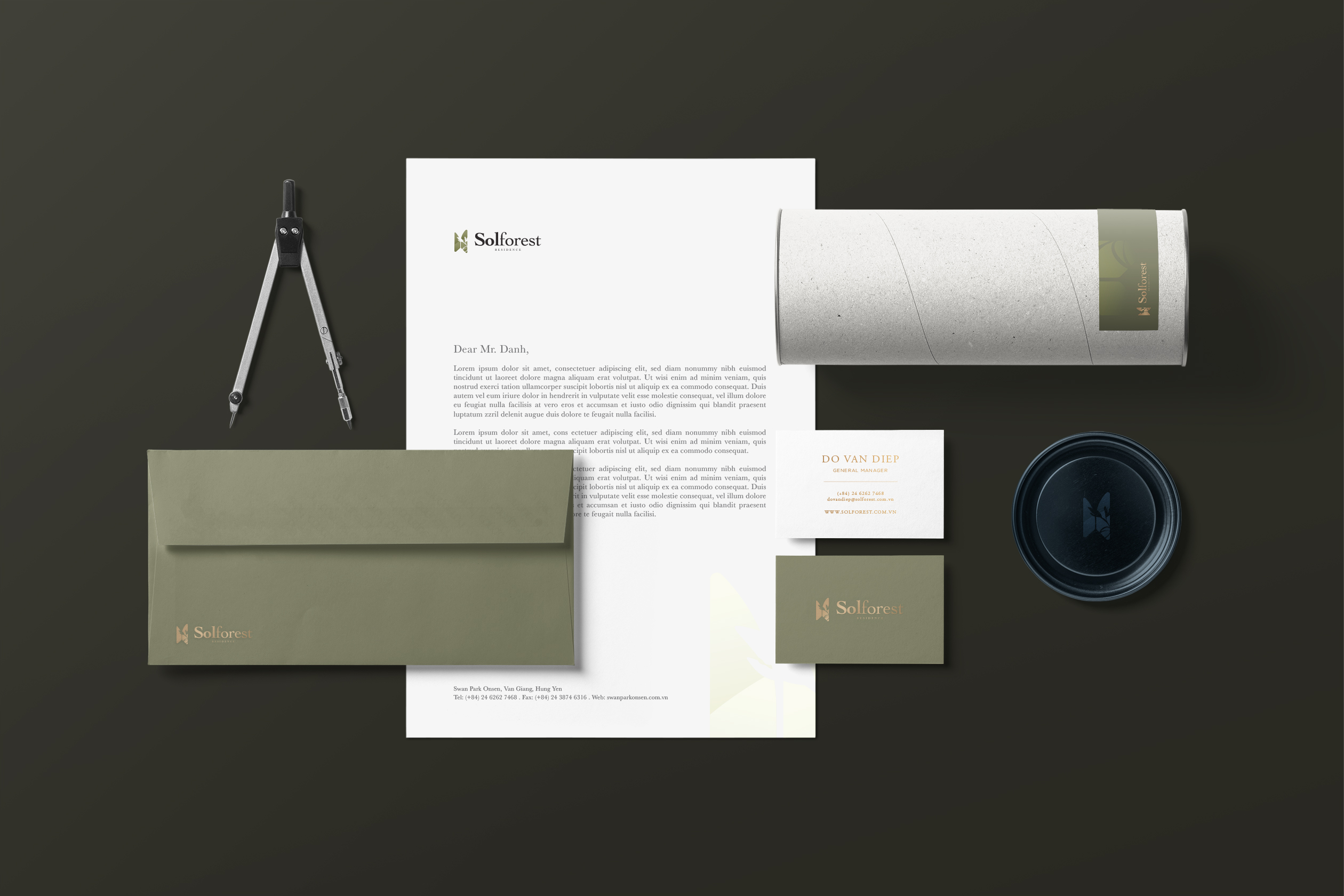
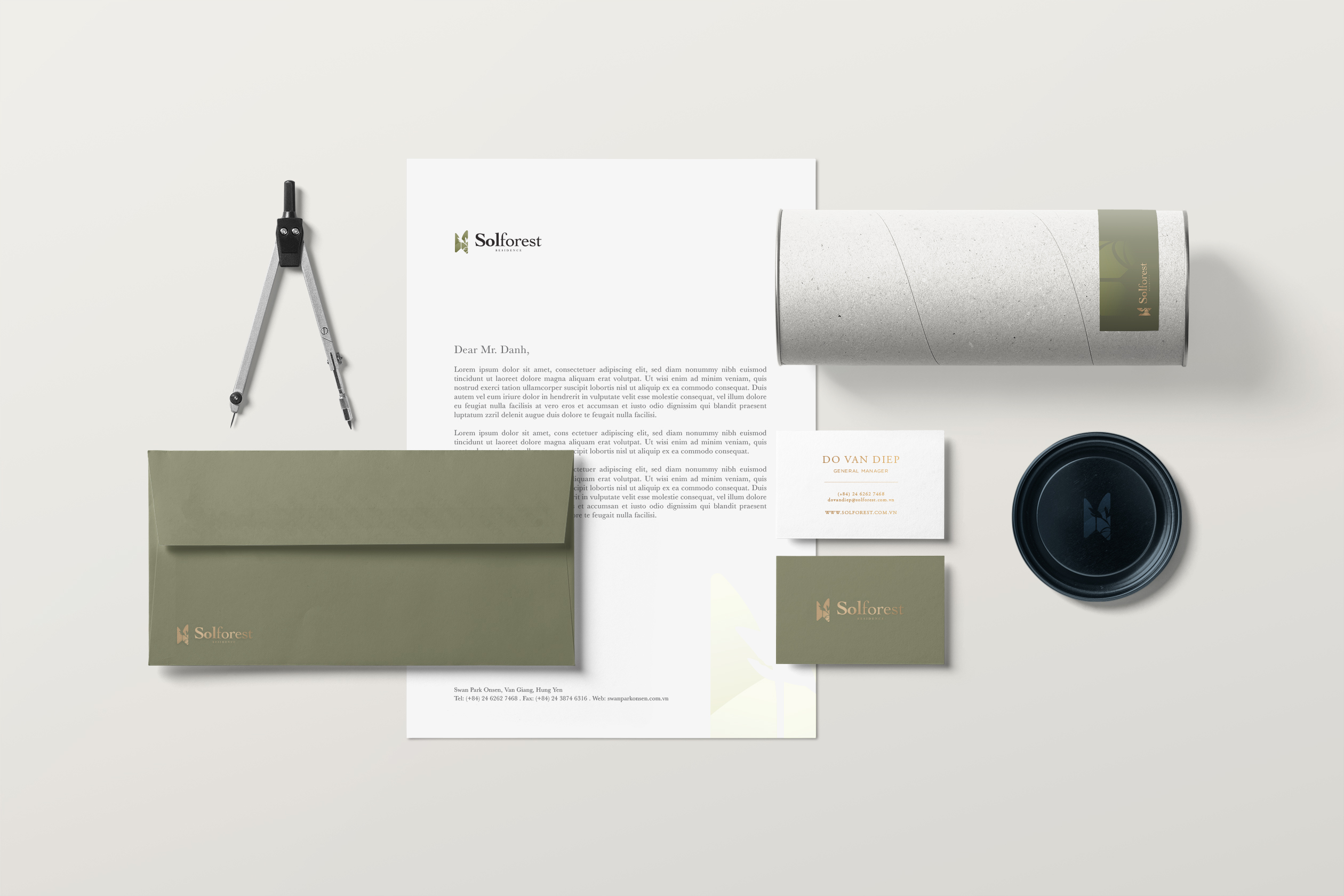
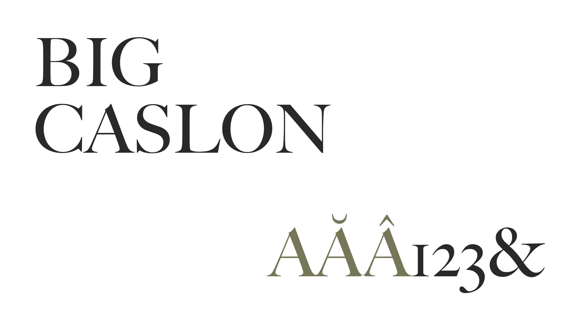
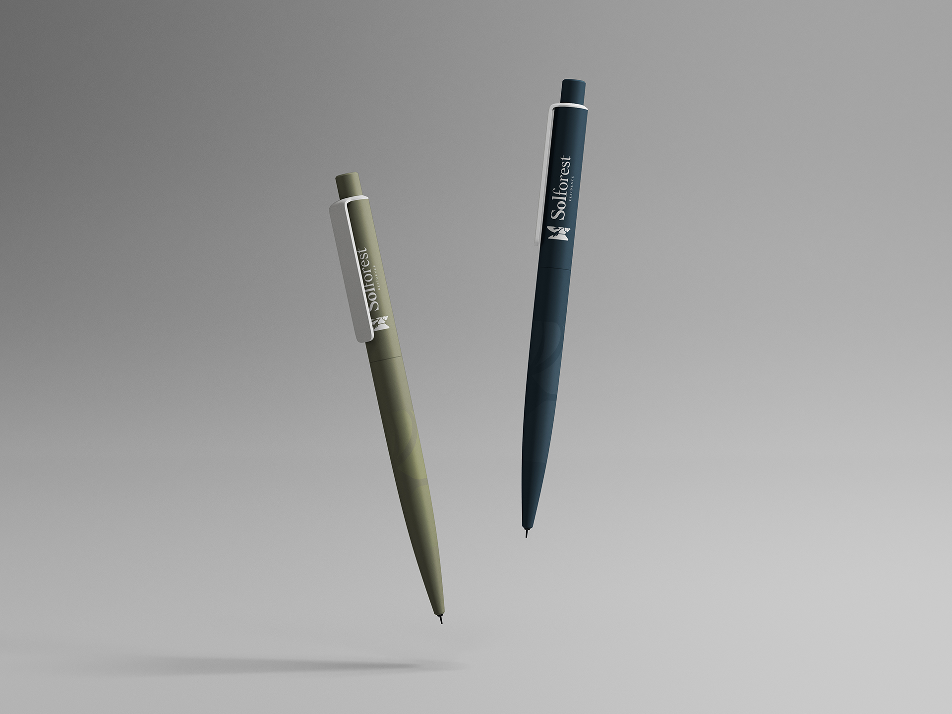
The logo was inspired by the shape of the building itself, a butterfly that represents the duo towers, a symbol that expresses livelihood and freedom, whilst being one with nature. The butterfly symbolizes evolution, change and prosperity. The coloring of the logo is a light earth tone, again reinforcing the project’s closeness to natural habitats.
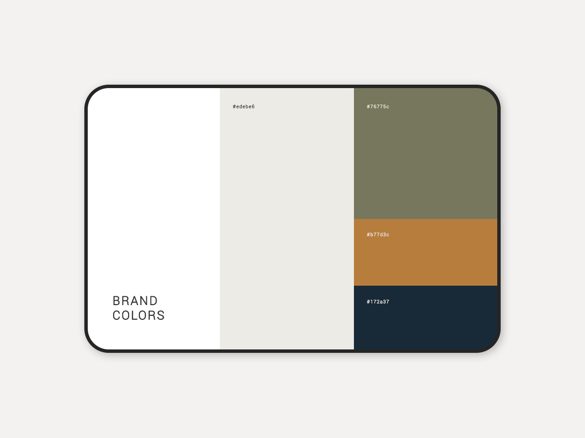
The Only Three established unique color palettes for Solforest; a dark shade of green, a mix of orange and tan with dark navy to support its brand position. Collateral items include name cards and stationery, all of which are imprinted with the earth tone butterfly logo with tabs of earthy green on paper.
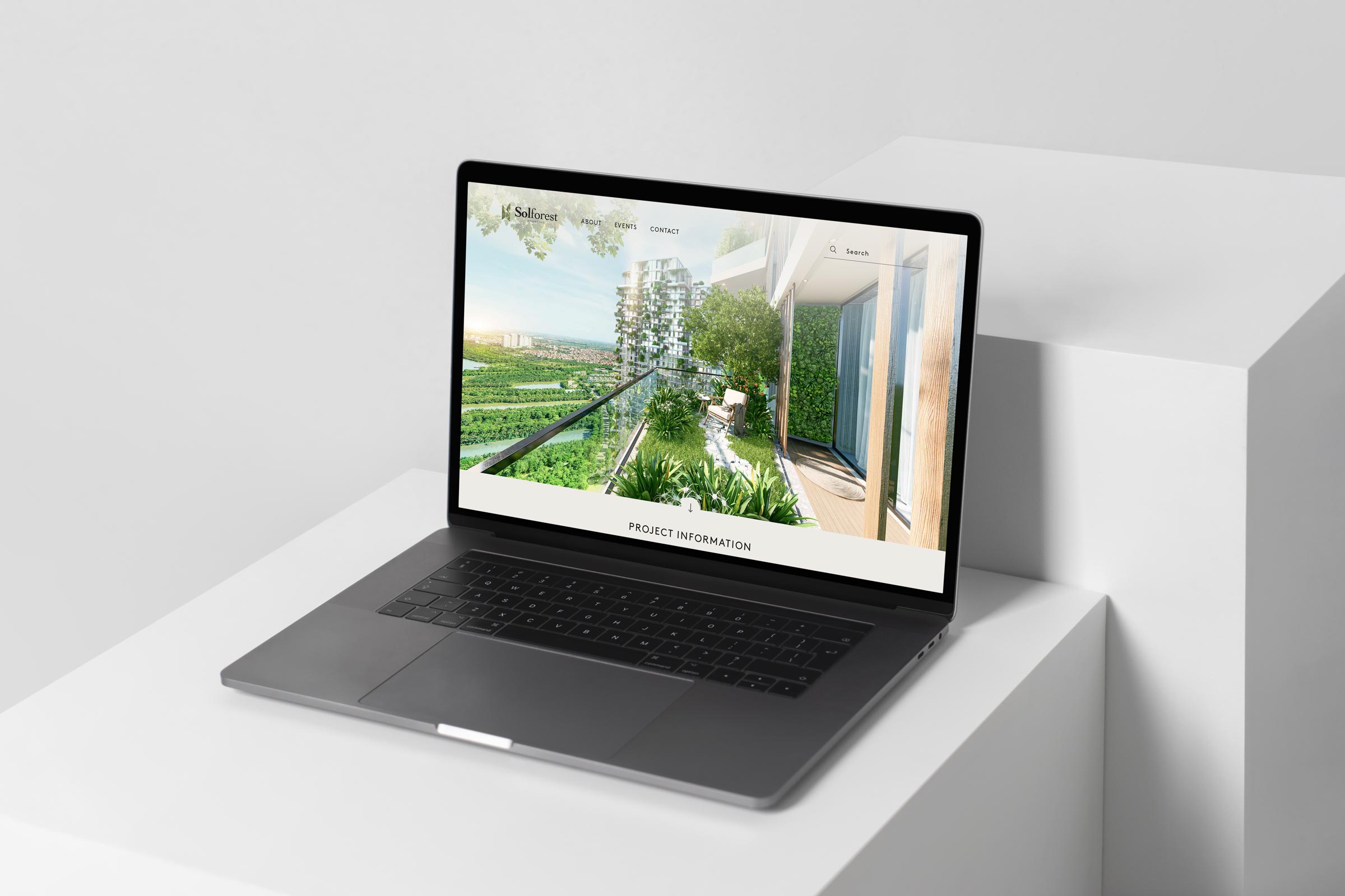
Beyond this, The Only Three was also responsible for marketing materials to capture potential buyers through a seamless, crisp website and OOH advertising through billboards.