DESCRIPTION
Located inside The Global City – the first residential township created by world’s renowned Foster+Partners architecture firm, The Global Golf Academy & Club (GGAC) is a world-class amenity catering to the town’s residents as well as the community of golf-lovers in Saigon and nearby. This international club’s 200 x 87 yards practice zone includes 3 par 3 holes, 60 practice ranges, and top-class amenities such as restaurants, bars, private gendered lockers.
Scope of Work
Creative Concept
Brand Identity
Key Visual
INSPIRATION & CONCEPT
The Only Three conceived The GGAC’s brand concept and identity. Inspired by the sport itself – golf which is a sport of connecting great minds who share mutual passion and aspirations in life, The GGAC’s brand was infused by the progressive, vibrant and respectful tone, bringing the excitement of active and exploring spirits across brand identity and collateral design.
The brand concept of The GGAC is not only where sports are practiced but also a place to gather and to share great moments together. Reflecting through an array of color palette that brings a sense of welcoming and friendly-inviting great minds alike to come and explore golfing at its best and joy-est.

BRANDING
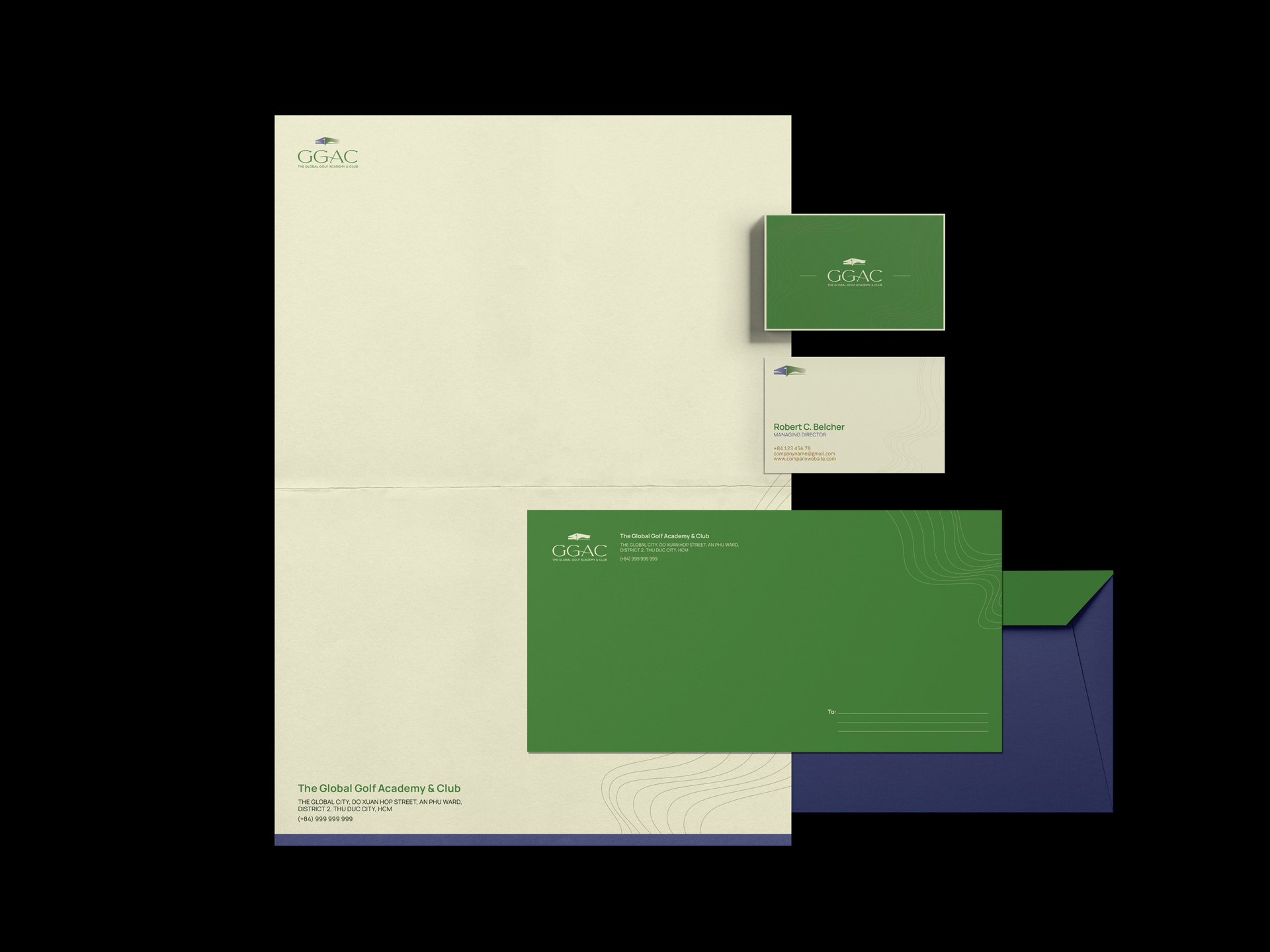
LOGO
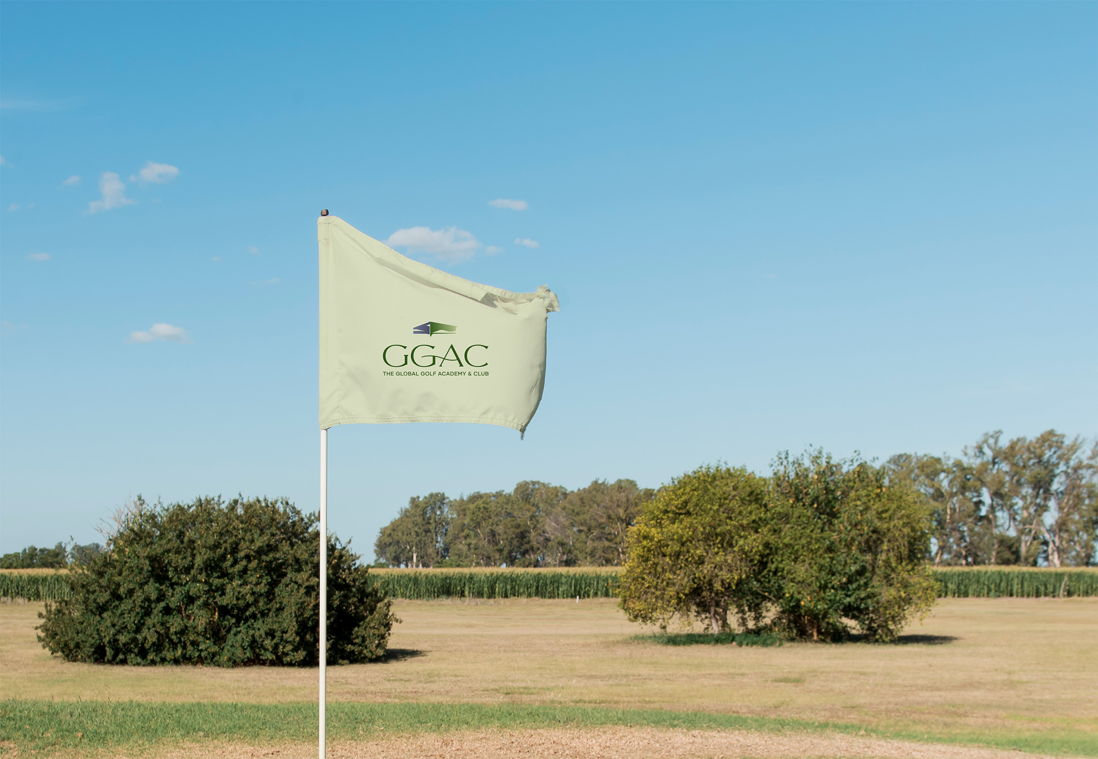
Consisting of two inseparable elements: the symbol and wordmark, The Only Three has observed and illustrated, putting together the shape of the club’s two-story practice hall as well as its landscape. The result is a unique, compact and highly recognizable symbol.
For the wordmark, The Only Three has chosen a light and elegant serif typeface for the abbreviation, with a wavy curve in the center to highlight and soften the characters. The full name below, however, needs a clearer and more official look, so our team has selected a sans serif font for it.
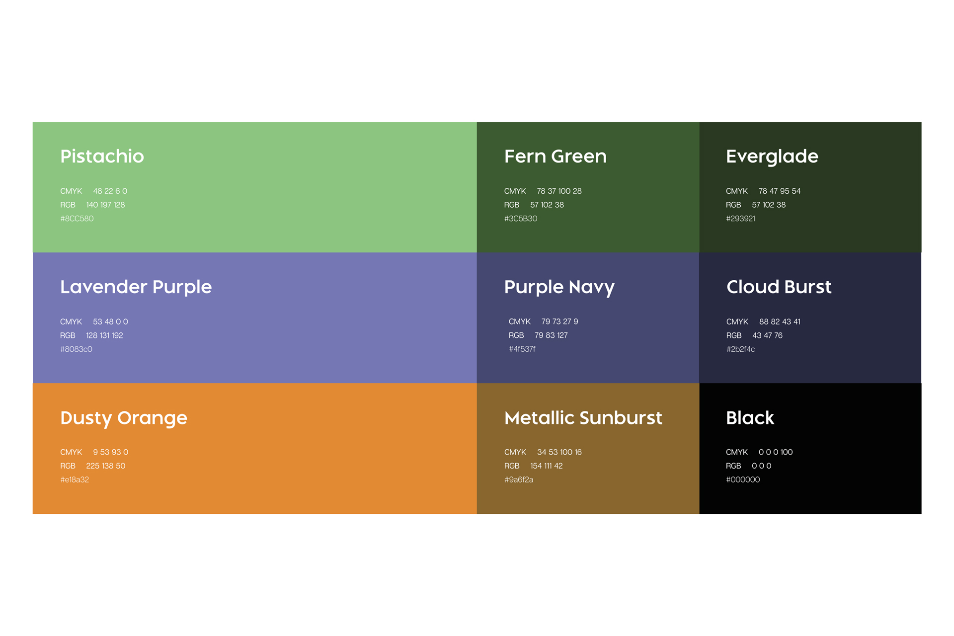
COLOR PALETTE
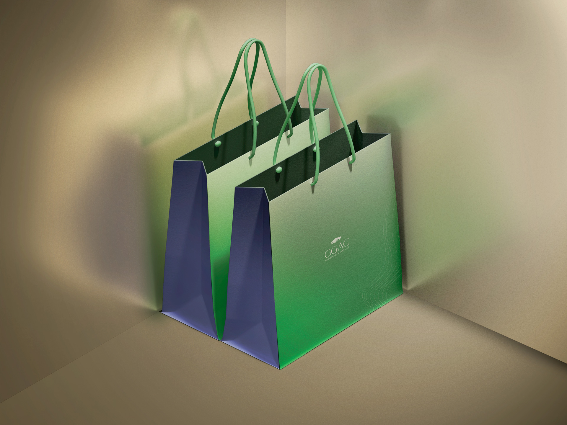
Impressed by the project’s breath-taking landscape – grass, sand trap and sky, The Only Three assembled and infused these elements in the brand’s primary palette. Picking the primary color palette of green, brown and purple navy and extending further into the secondary color palette to create a pairing guide.
The graphic patterns specific to the GGAC brand are several combinations of lines and geometric shapes. This is the result of The Only Three’s creative process based on the golf flag and the topography of the golf course. The shape of waving flags and topography maps of the club’s practice zone are both developed to reach complicated yet airy patterns that exude curiosity and invitation to explore the brand.
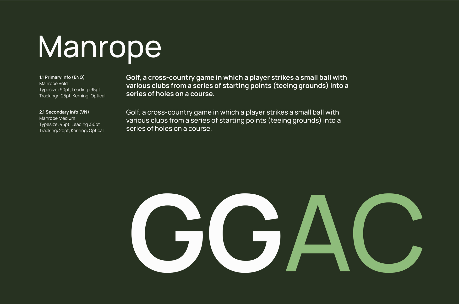
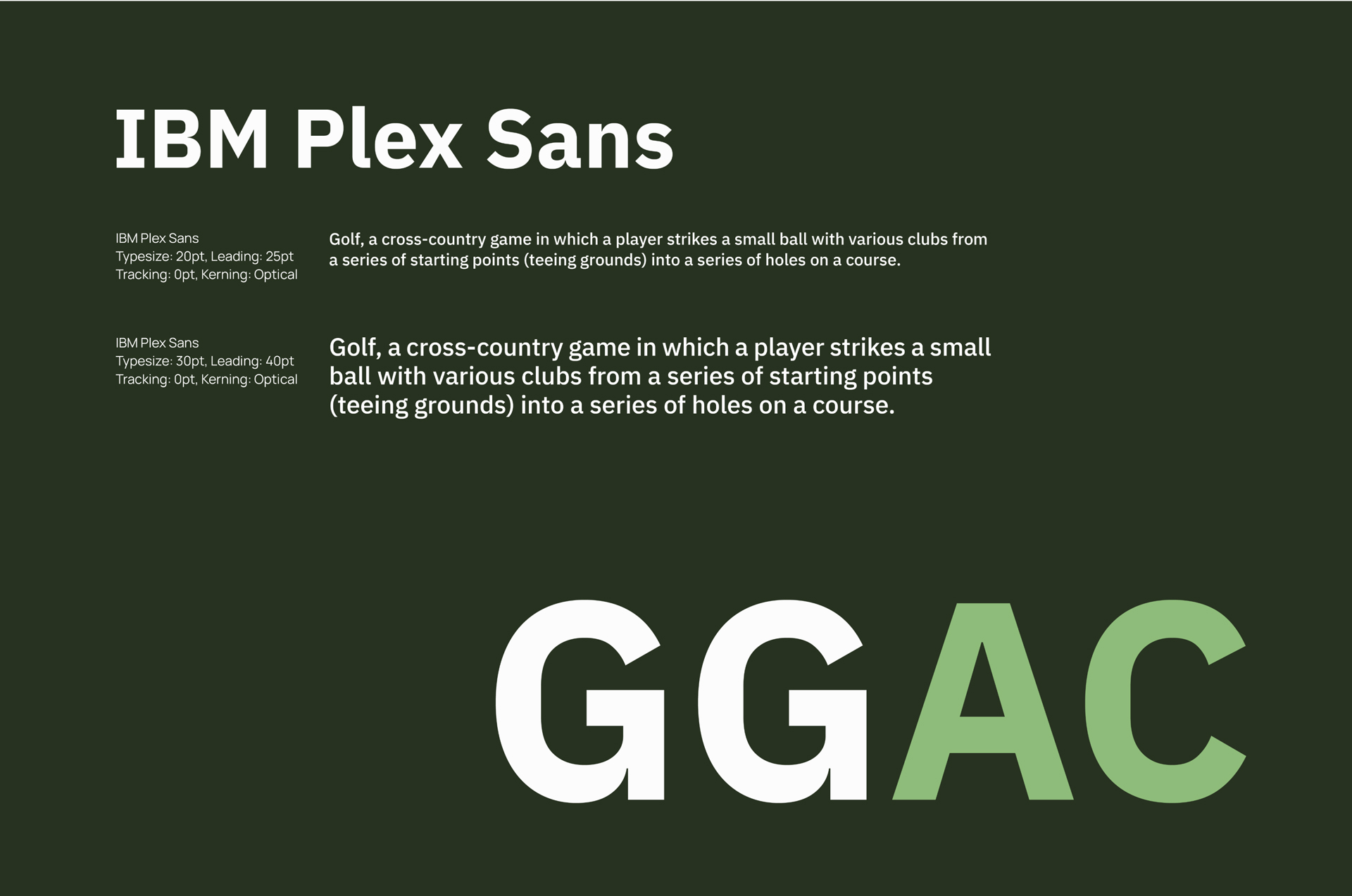
TYPEFACE
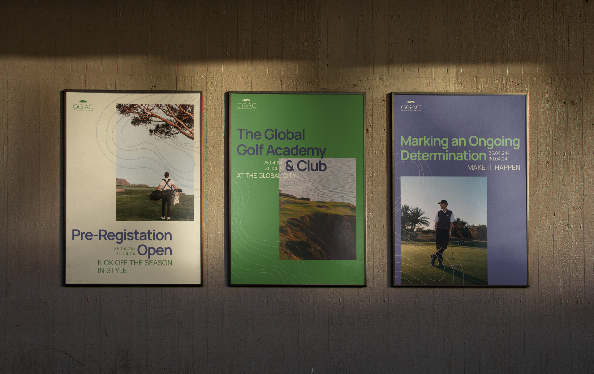
The choice for the headlines is Manrope Bold, a strong and vivid font that will catch anyone’s attention. The body texts will be presented in a lighter but quite similar sans serif font which is IBM Plex sans. Acknowledging the brand’s need for various types of communication material composed from both visual and text contents, a few grid systems were introduced to help maintain the structure and agreeable ratios.
These systems serve as an essential, underlying structure for an identity layout system that The Only Three has constructed for the brand with five overlapping layers: Grid – Base – Brand Element – Info – Expressive layer. Following our layout system guides will help the brand to expand their marketing contents without fear of visual incoherence.
COMMUNICATION
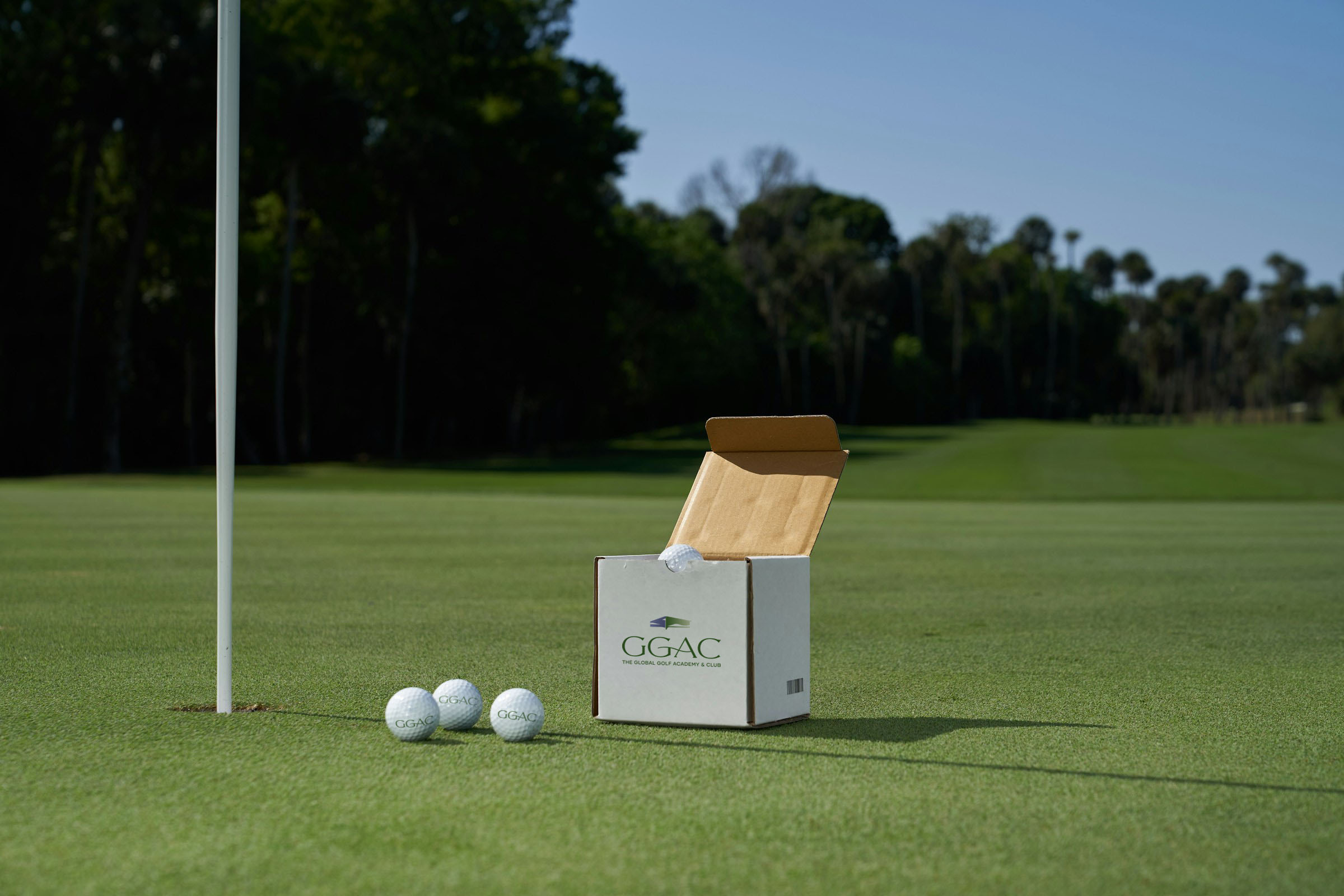
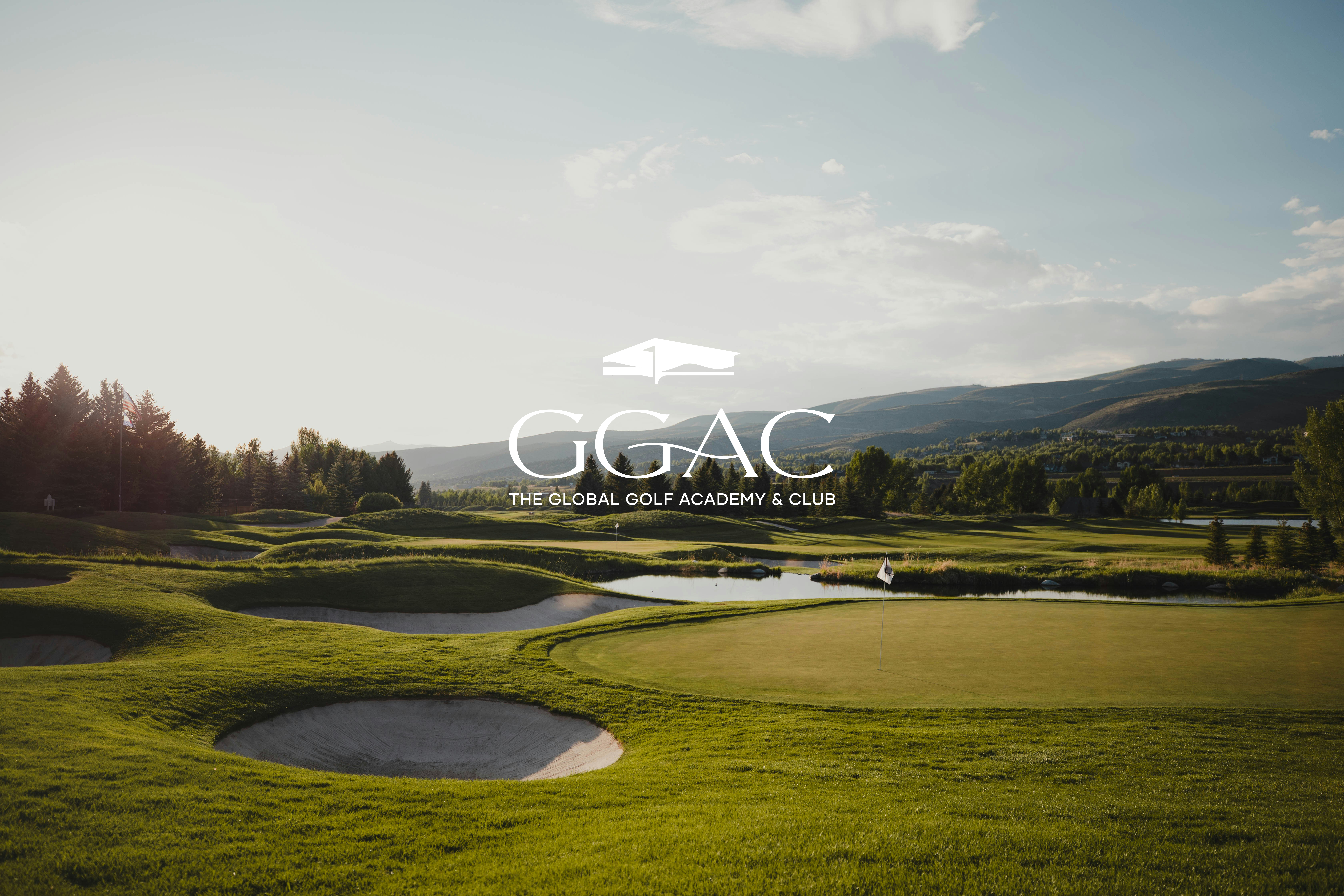
To further bring the GGAC brand to life, The Only Three provided visual direction better reflecting its spirit and tone, including some criteria for brand photography and the image it will use in future marketing campaigns. The signature landscaping was combined with photography creating visual layers that help communicate the brand spirits to a wider audience.