DESCRIPTION
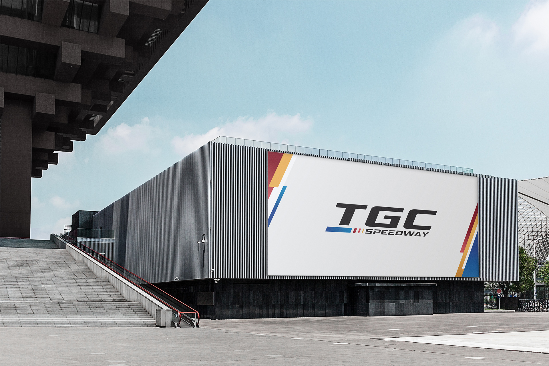
Located inside City Park, Ho Chi Minh City’s largest entertainment and sports complex, TGC Speedway is proudly the longest integrated Go-kart track in Southeast Asia. Its racing tracks are laid out both indoor and outdoor, paired with the most advanced interactive virtual reality world of AR, VR, and 7D cinema.
Scope of Work
Creative Concept
Brand Identity
Key Visual
INSPIRATION & CONCEPT
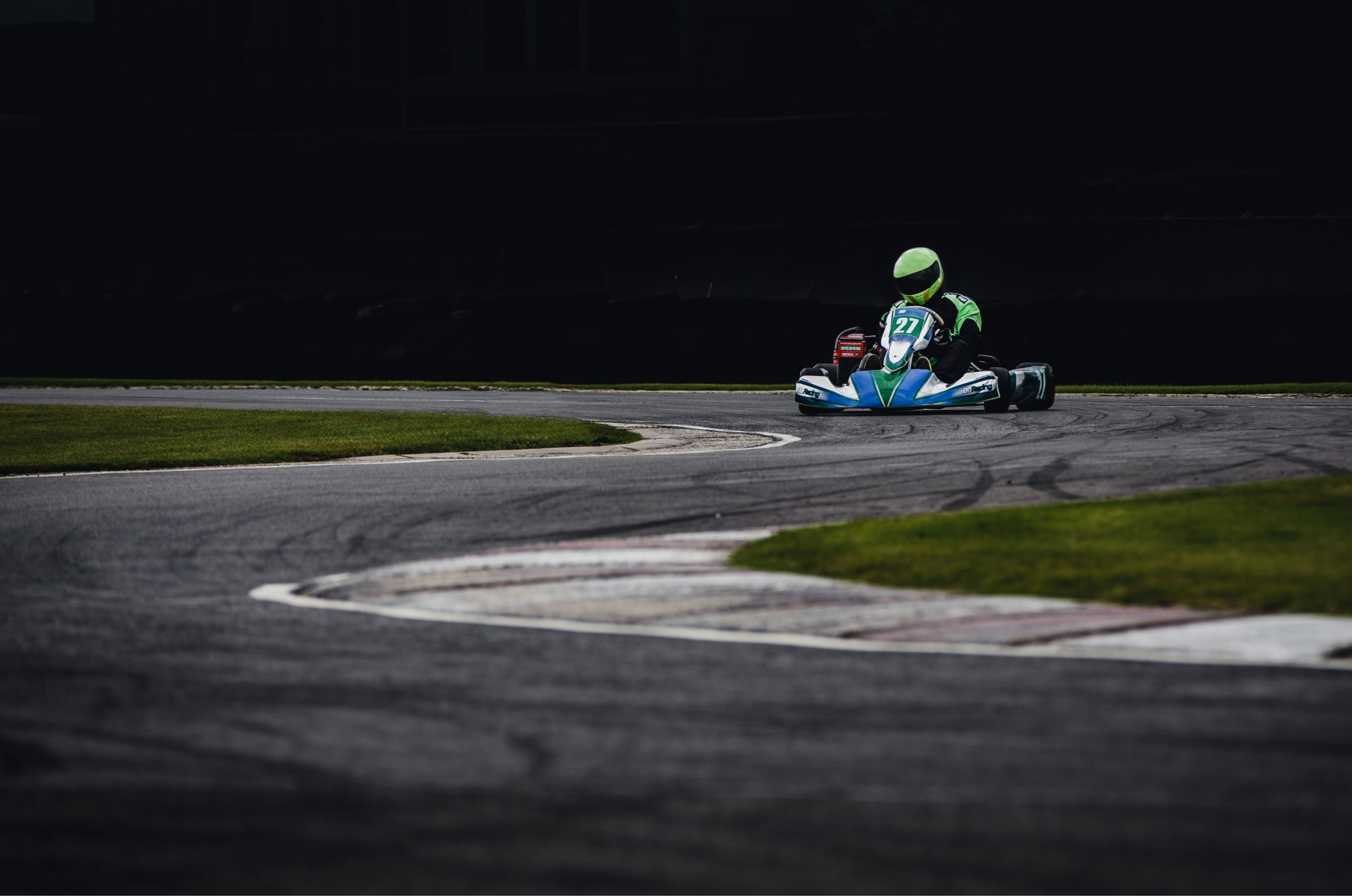
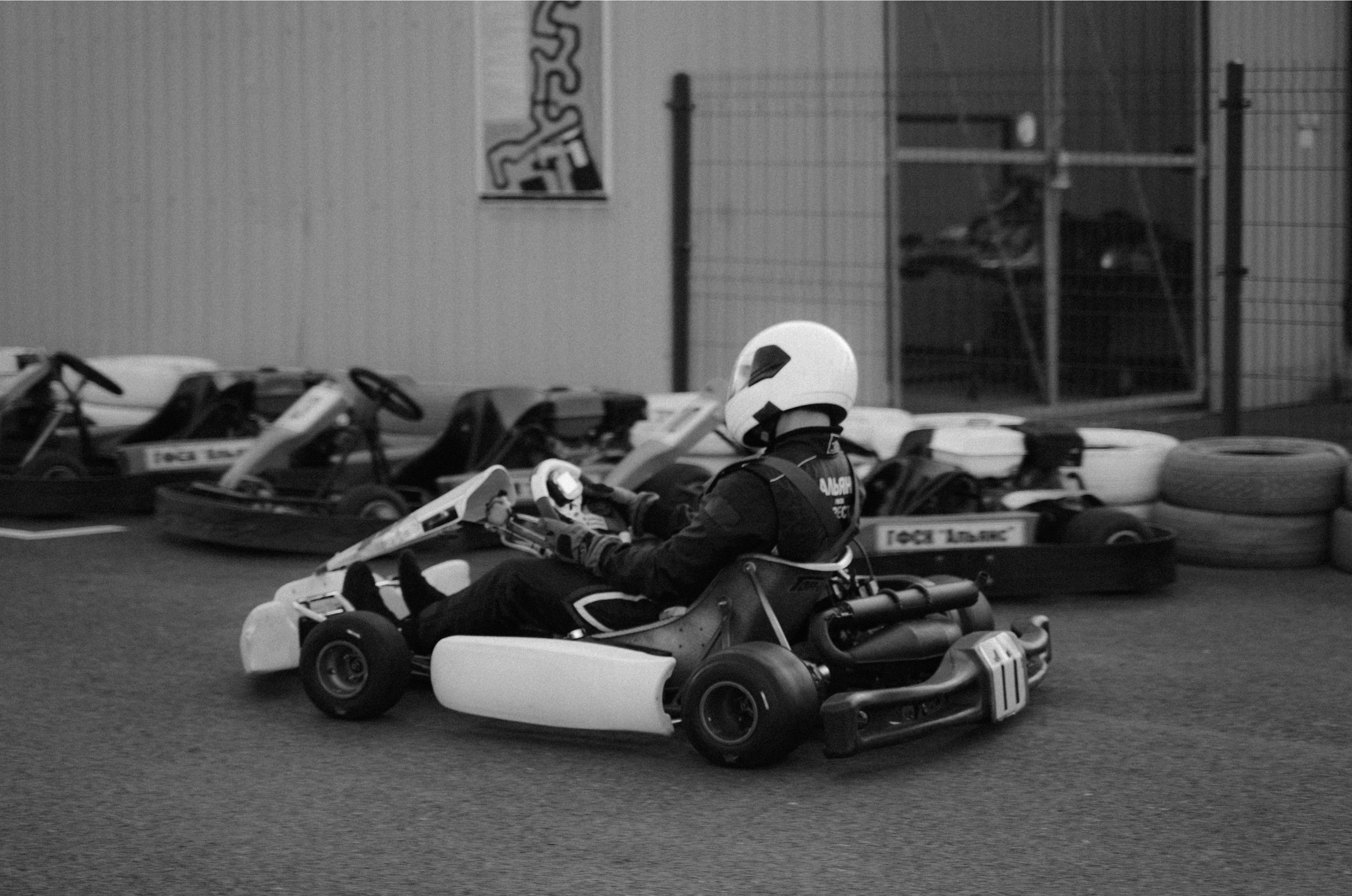
Being a kart racing center, the TGC Speedway’s core identity is obviously the sport itself, which consists of the track, the cars, and the element of speed. From speed comes the thrill, the joy, the challenge and the unique experience that this global-standard racing center offers its customers.
Mesmerized by the speed of racing kart cars, The Only Three has adopted it for the concept of TGC Speedway’s branding. Our team has closely studied the visual and symbolist aspects of this element to construct a representation that best expresses the brand’s spirit and image.
BRANDING
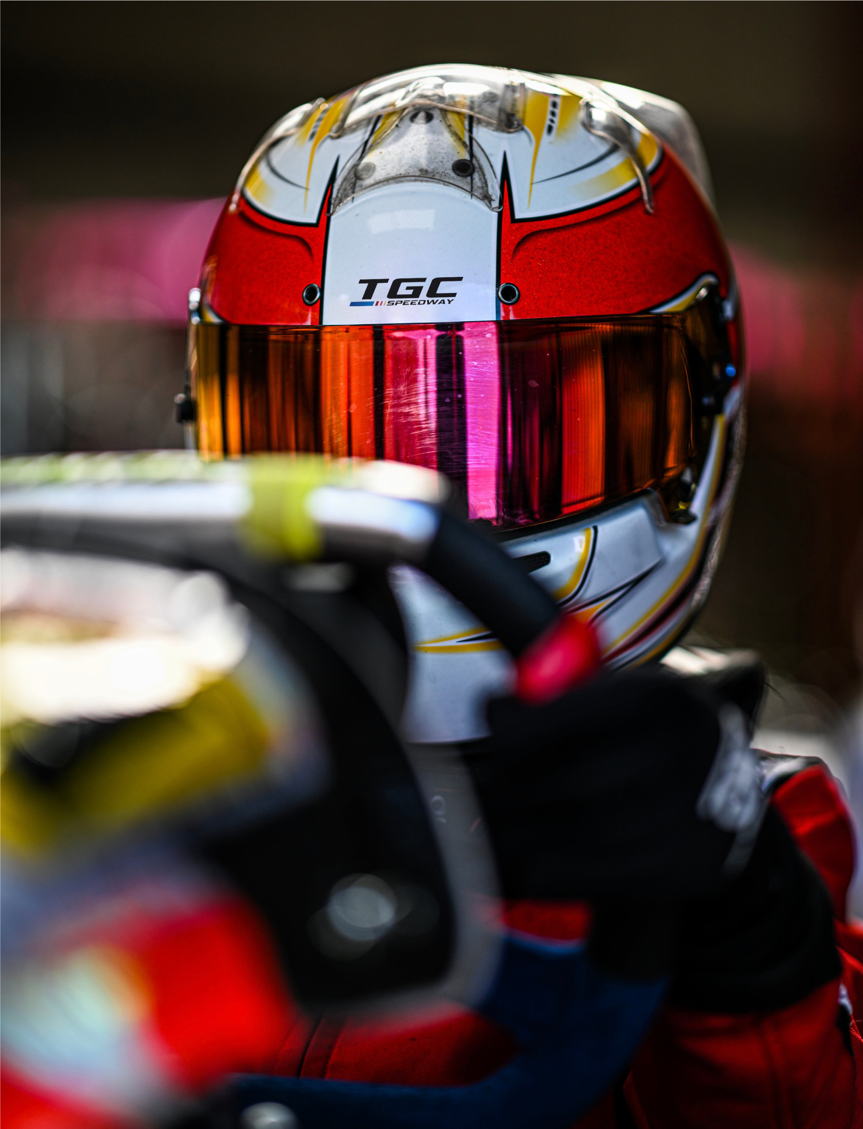
LOGO
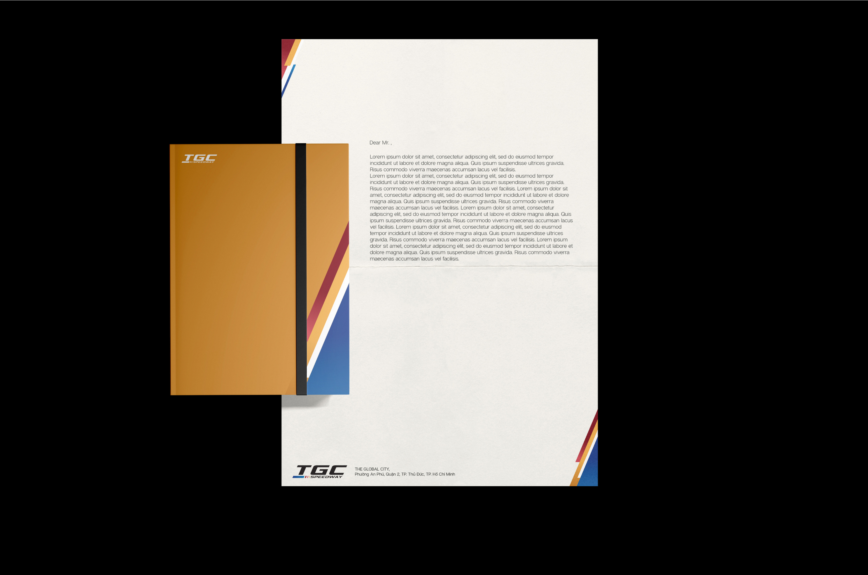
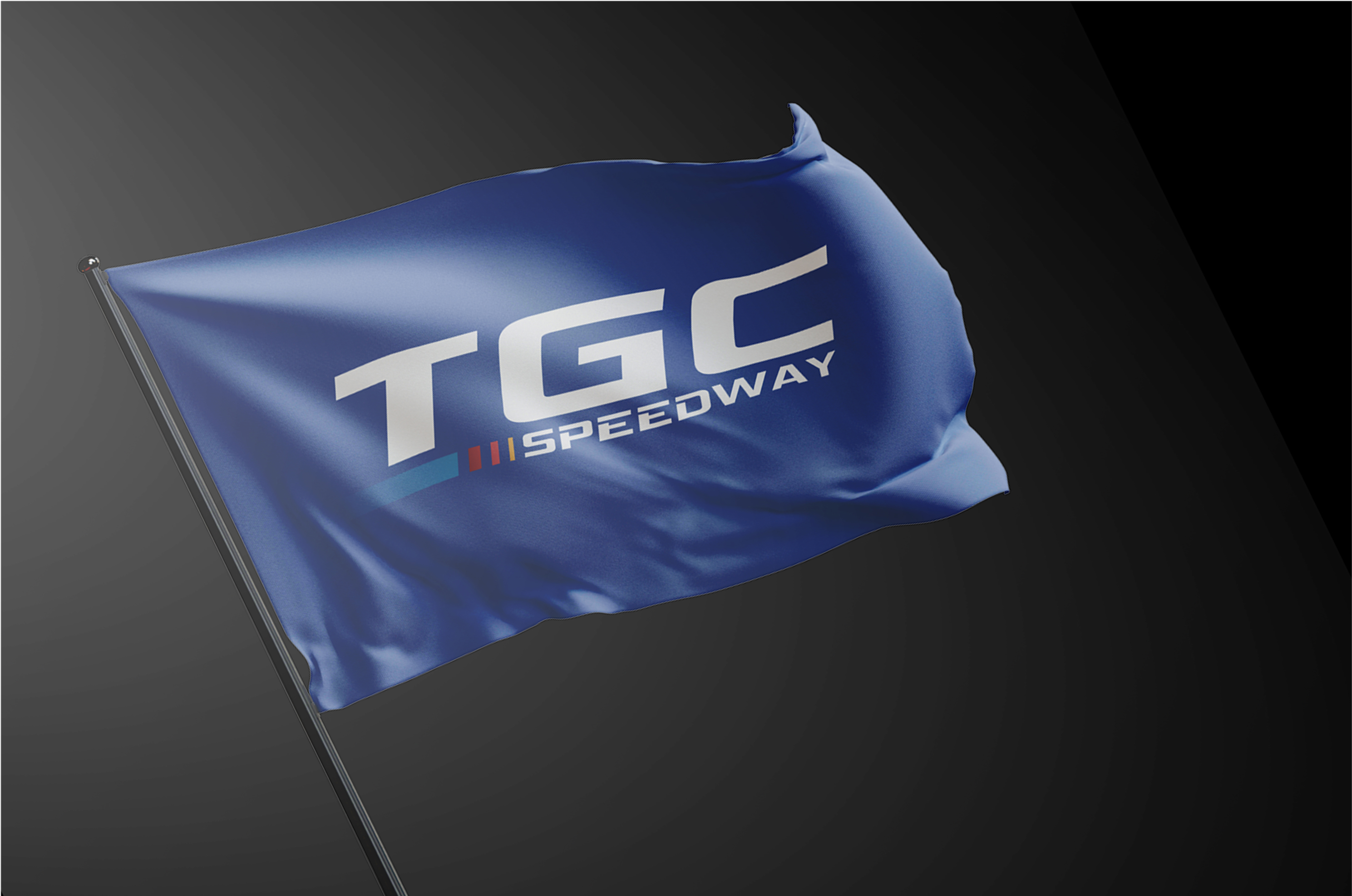
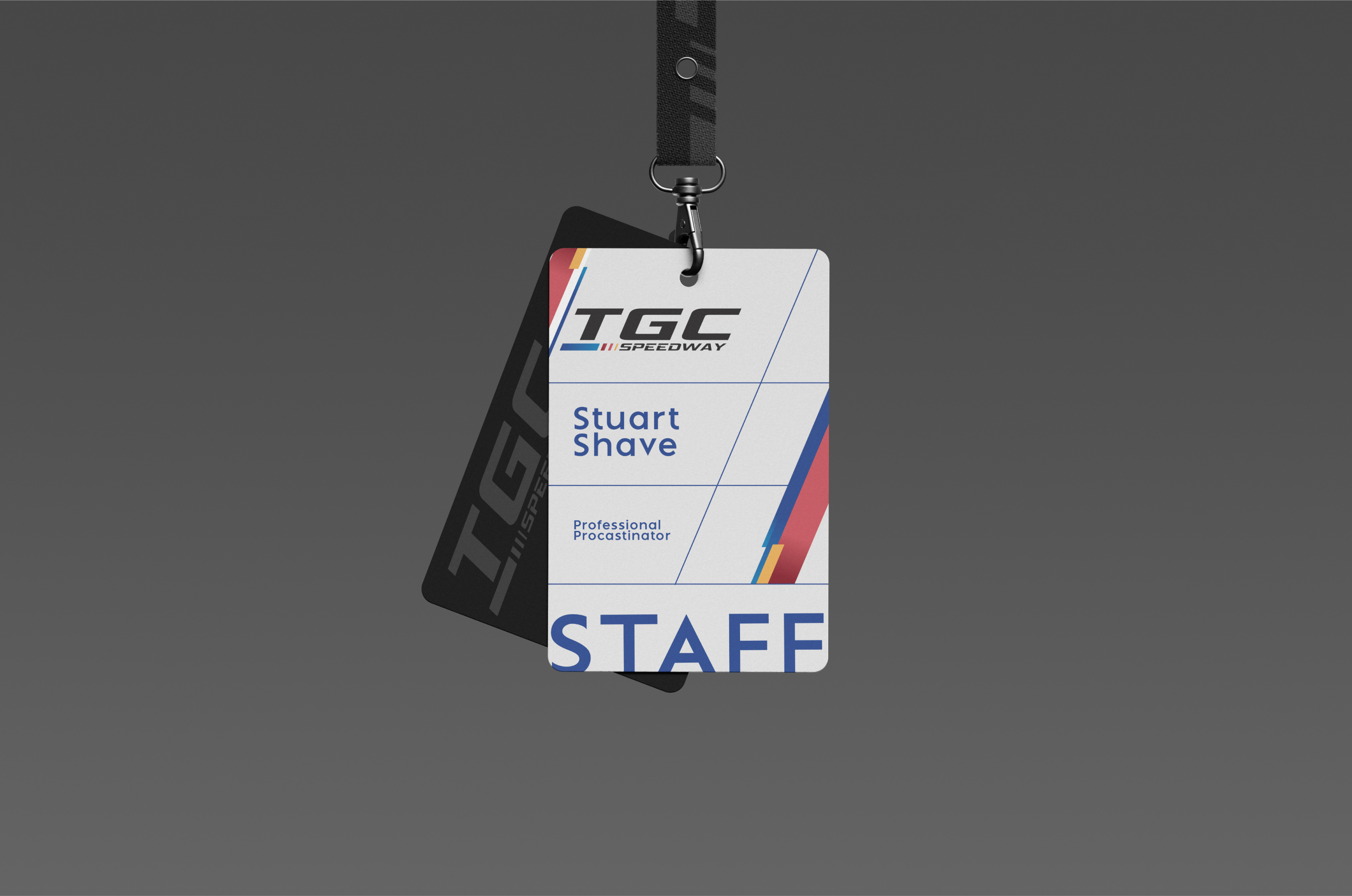
The Only Three has conceived the logo’s graphic symbol with the element of “speed” in mind: the stripe represents the blur of images captured at high speed. Its color transition from deep blue to warm tones illustrates the heat generated by racing cars’ engines from starting up to full speed, recalling the powerful and invigorating experience on the brand’s racing tracks.
The four colored stripes of the logo also represent the four main entertainment options at TGC Speedway: kart racing, 7D cinema, VR games and dining service. The wordmark was created with a strong and bold typeface with certain rounded corners reflecting the design of the actual kart cars. We’ve also put all characters in italic to further emphasize the speed element.
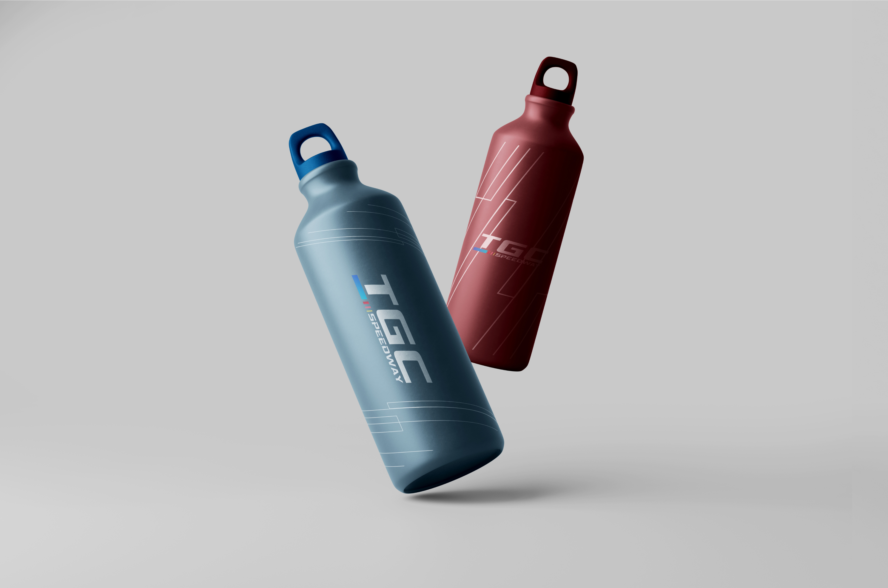
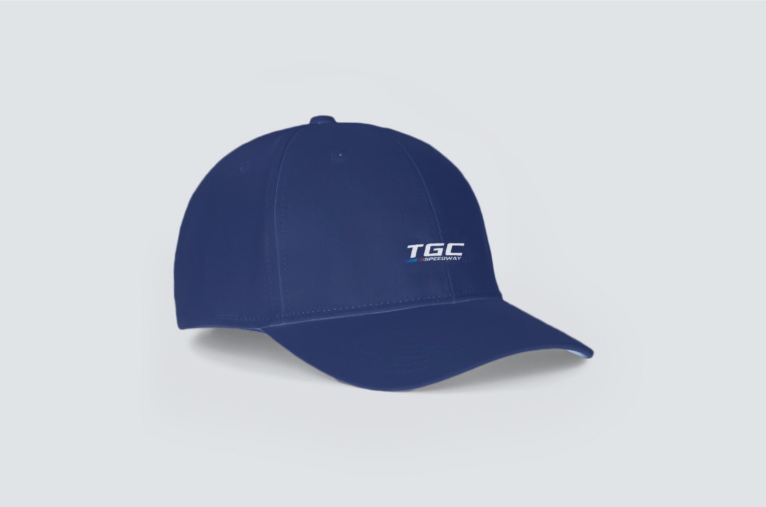
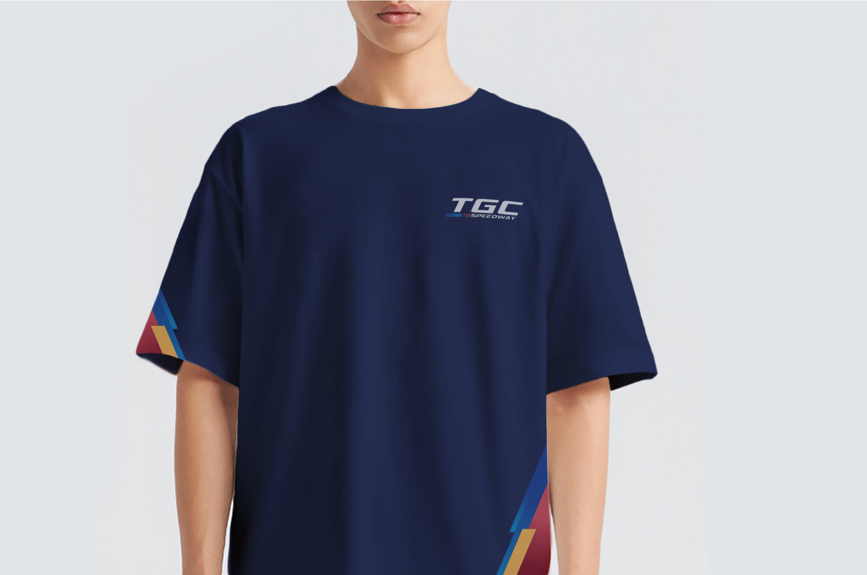
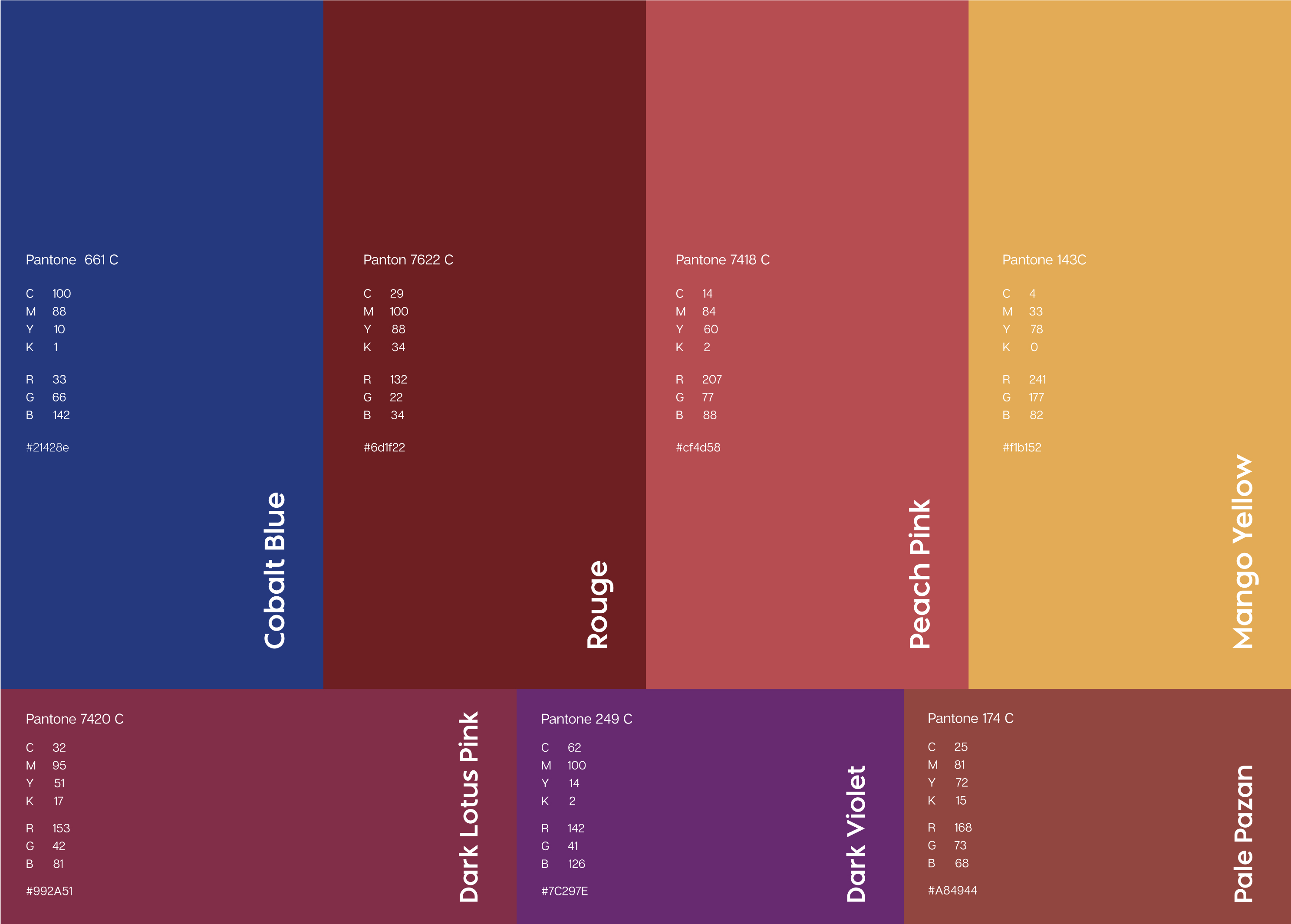
COLOR PALETTE
The TGC Speedway’s outstanding color palette best represents the brand. Inspired by the sky, the dawn and legendary racing cars such as Ferrari and Mustang, the primary palette consists of four straightforward and impressive colors. The secondary palette of three colors comes from the futuristic and adventurous spirit of the center as well as the whole park.
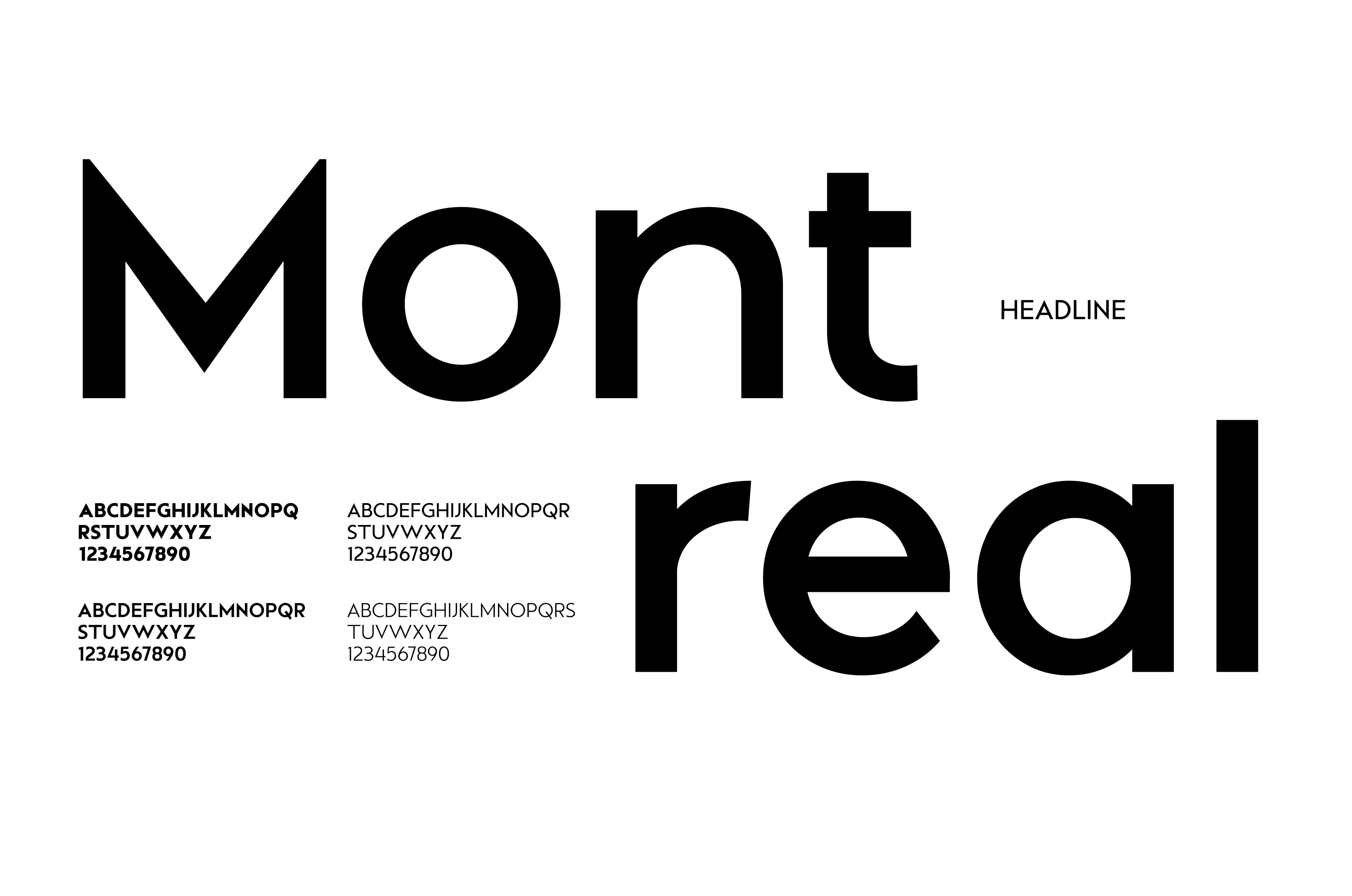
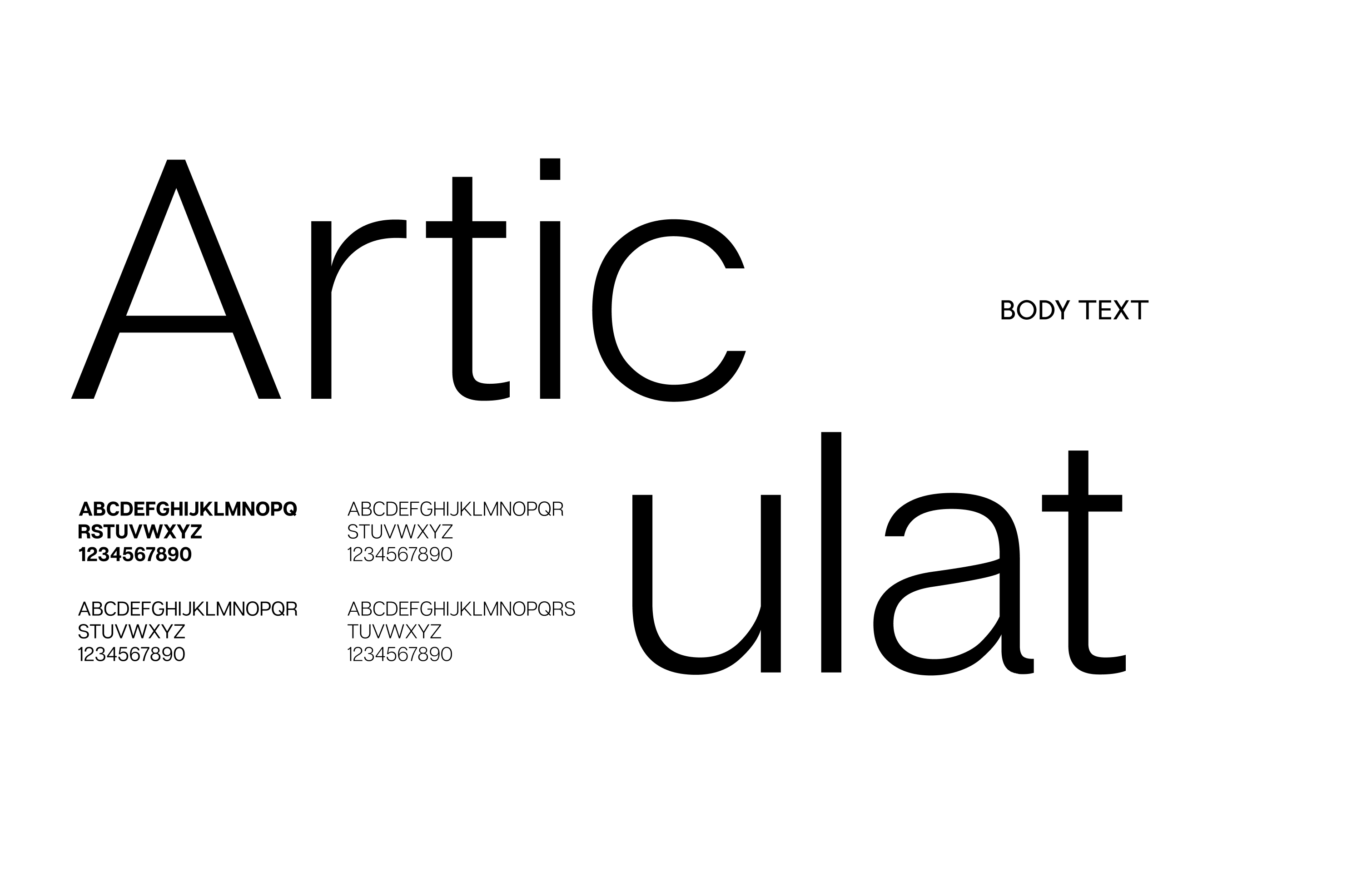
TYPEFACE
Selecting a suitable typeface to appeal to the public is also an important mission in constructing a brand’s identity. Being a racing and entertainment center, the TGC Speedway needs clean, strong and technical typefaces. With these criteria, our team chose Montreal, a geometric font with sharp angles for the headers and subheaders. For the content body, we once again employ the versatile and charismatic Articulat.
COMMUNICATION
The text contents of the brand must follow a format pre-defined by our team. However, seeing the brand’s regular need for other contents such as tables and charts, The Only Three also introduced a format for these elements – strictly respecting the brand’s color palette and aims for legible, straight-forward presentations. Some layouting rules are suggested to help the TGC SPEEDWAY maintain clarity and consistency throughout its various materials.