DESCRIPTION
Developed by Masterise Homes, the largest developer of branded residences in Vietnam, LUMIÈRE is a residential brand with the commitment to reach global standards in quality, amenities and lifestyle. LUMIÈRE Evergreen is the brand’s latest project, and for the first time, comes to the West of Hanoi in the vibrant heart of Smart City. The Only Three was commissioned to develop a full-pack of branding and communication for this project.
Scope of Work
Creative Concept
Brand Strategy
Brochure
Sales Leaflet
Key Visual
TVC
Website
INSPIRATION & CONCEPT
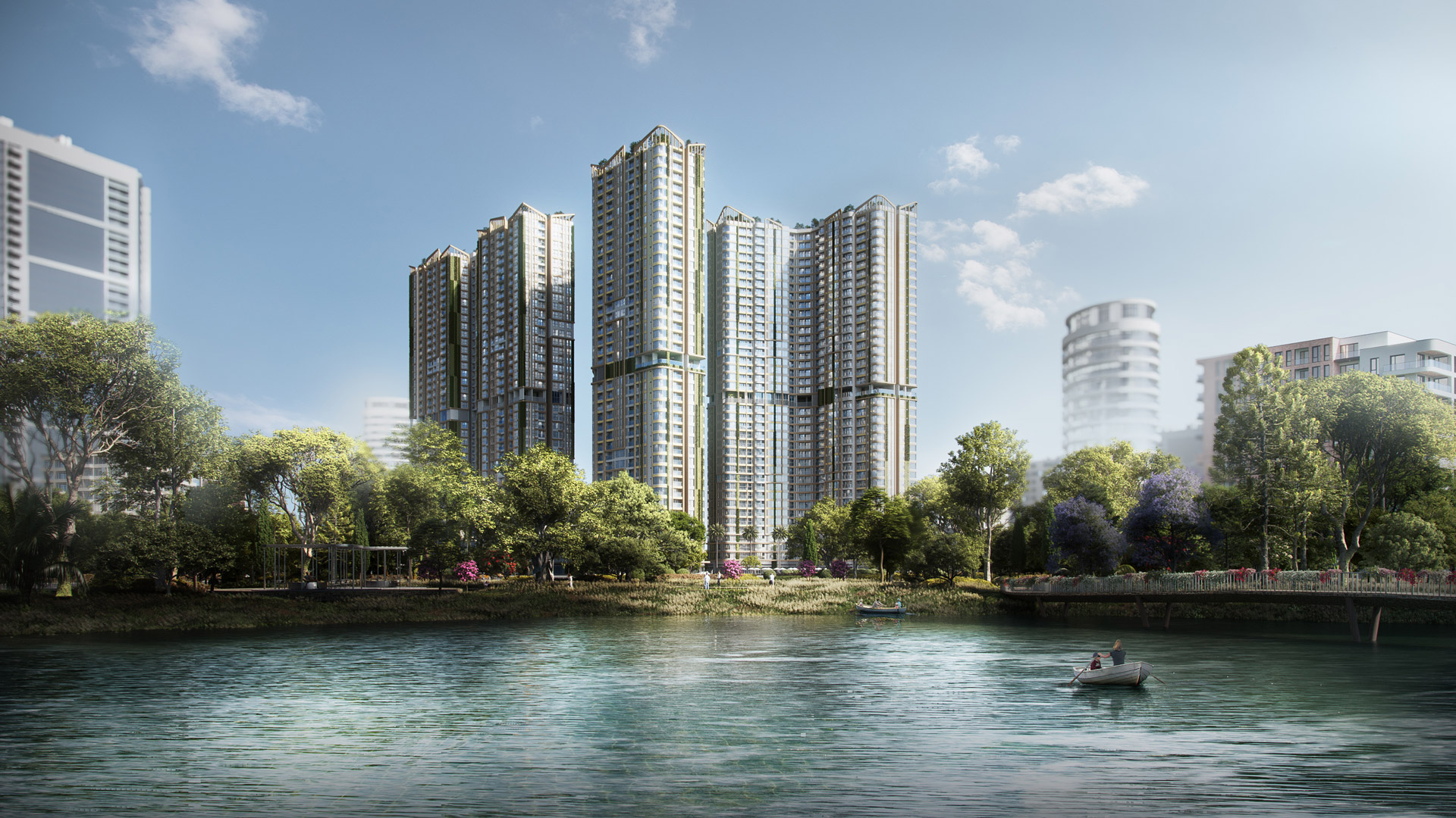
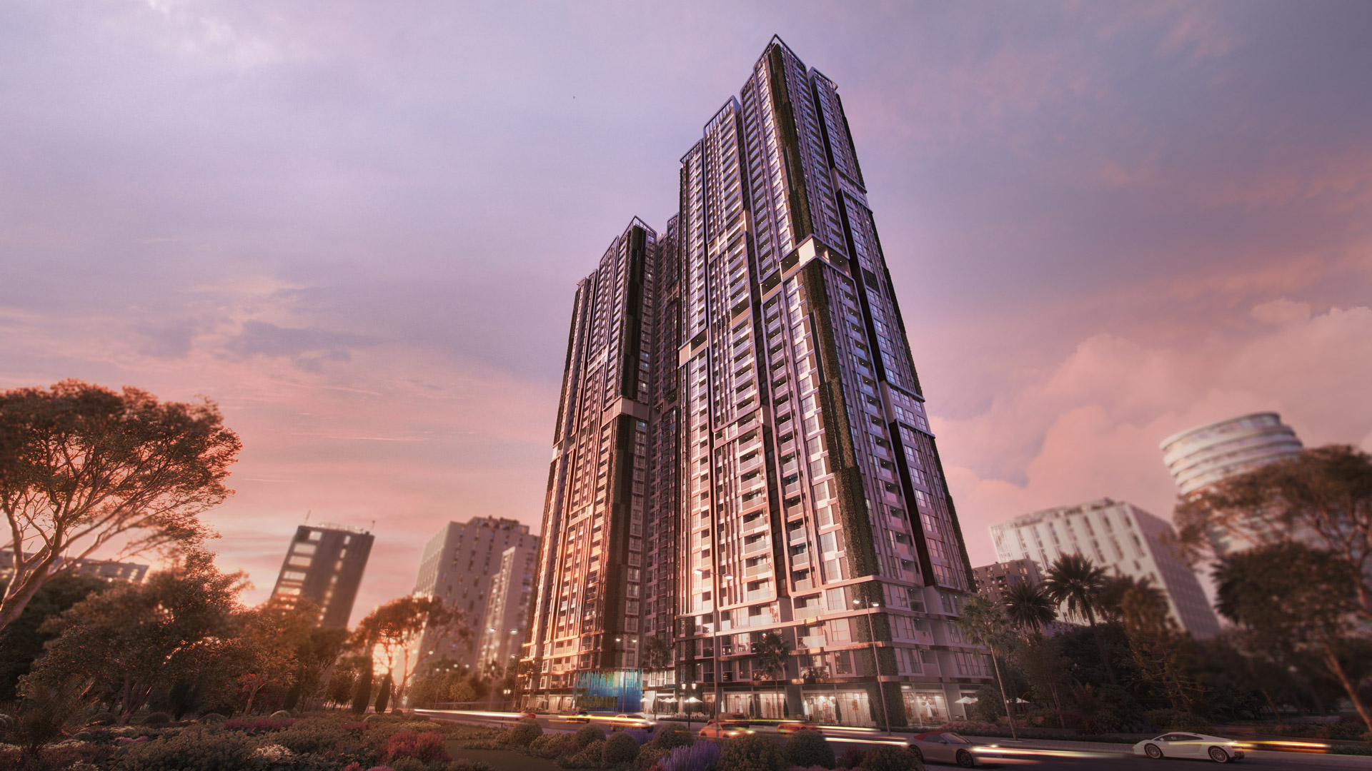
Inspired by the multi-faceted beauty of life, the LUMIÈRE Evergreen sets itself apart from other real estate projects through an innovative complex of commercial, education and services’ acclaimed brands, where the quintessential international community converges. At LUMIÈRE Evergreen, residents enjoy livable values of health, unsurpassed living quality and convenience right at the heart of the quintessential international community.
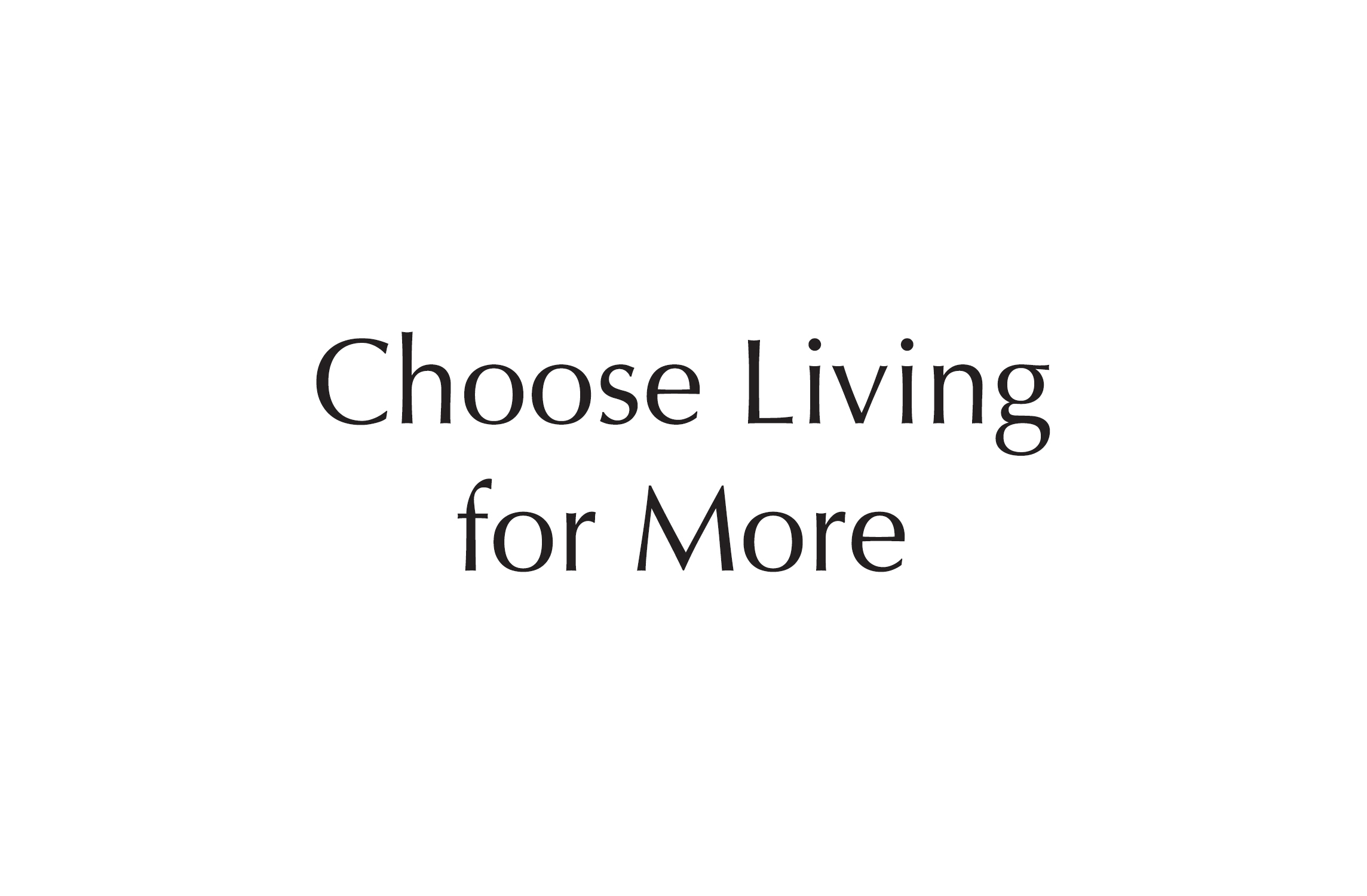
Taking inspirations from architectural concepts of Light, Air and Water, The Only Three create brand concept and brand story rooted in the idea of Choose Living for More, highlighting extra livable values through an innovative complex of commercial, education and services’ acclaimed brands, where the quintessential international community converges.
BRANDING
NAMING & TAGLINE
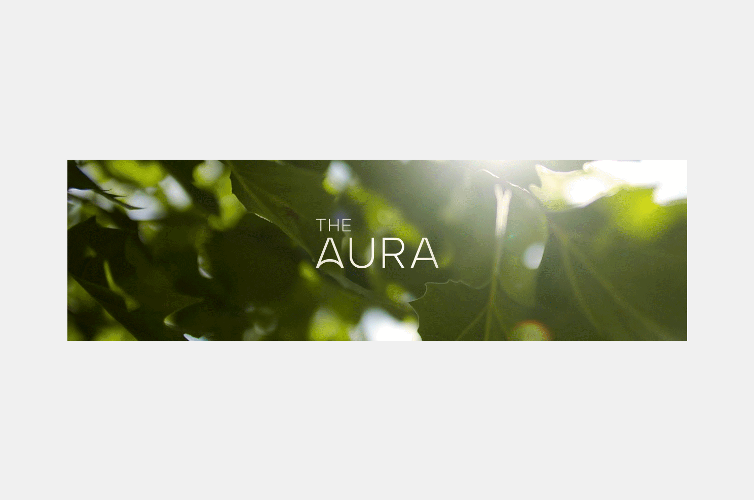
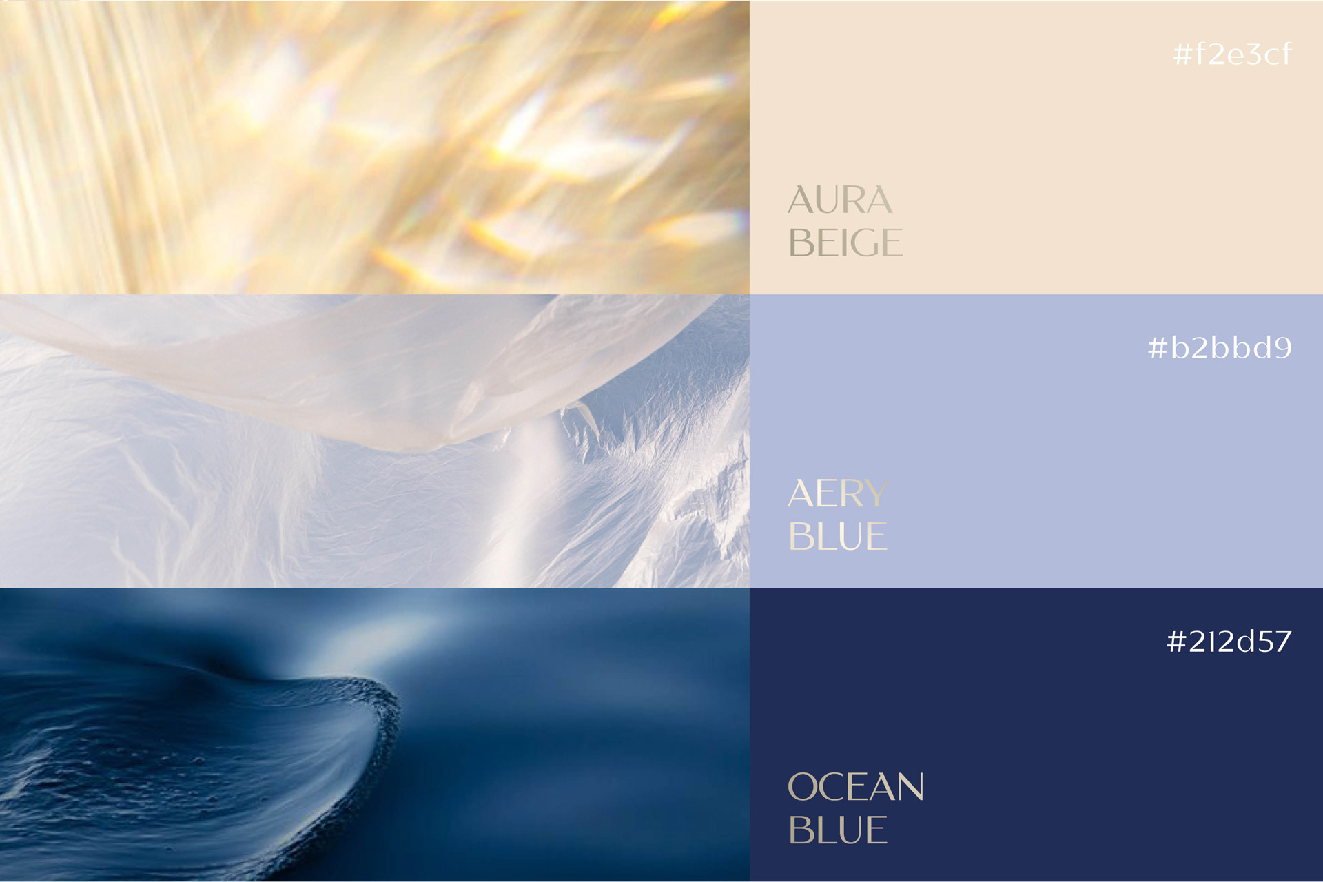
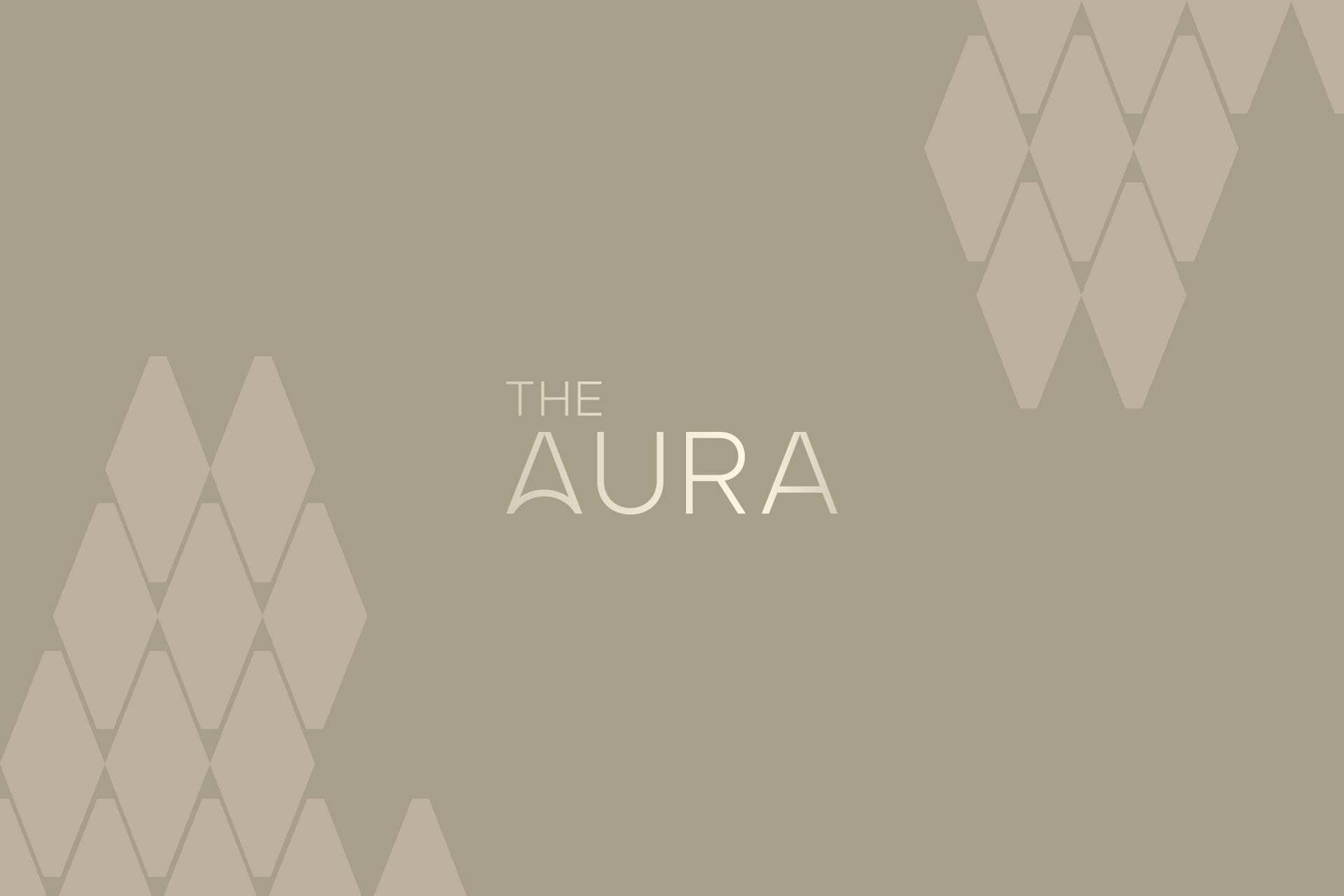
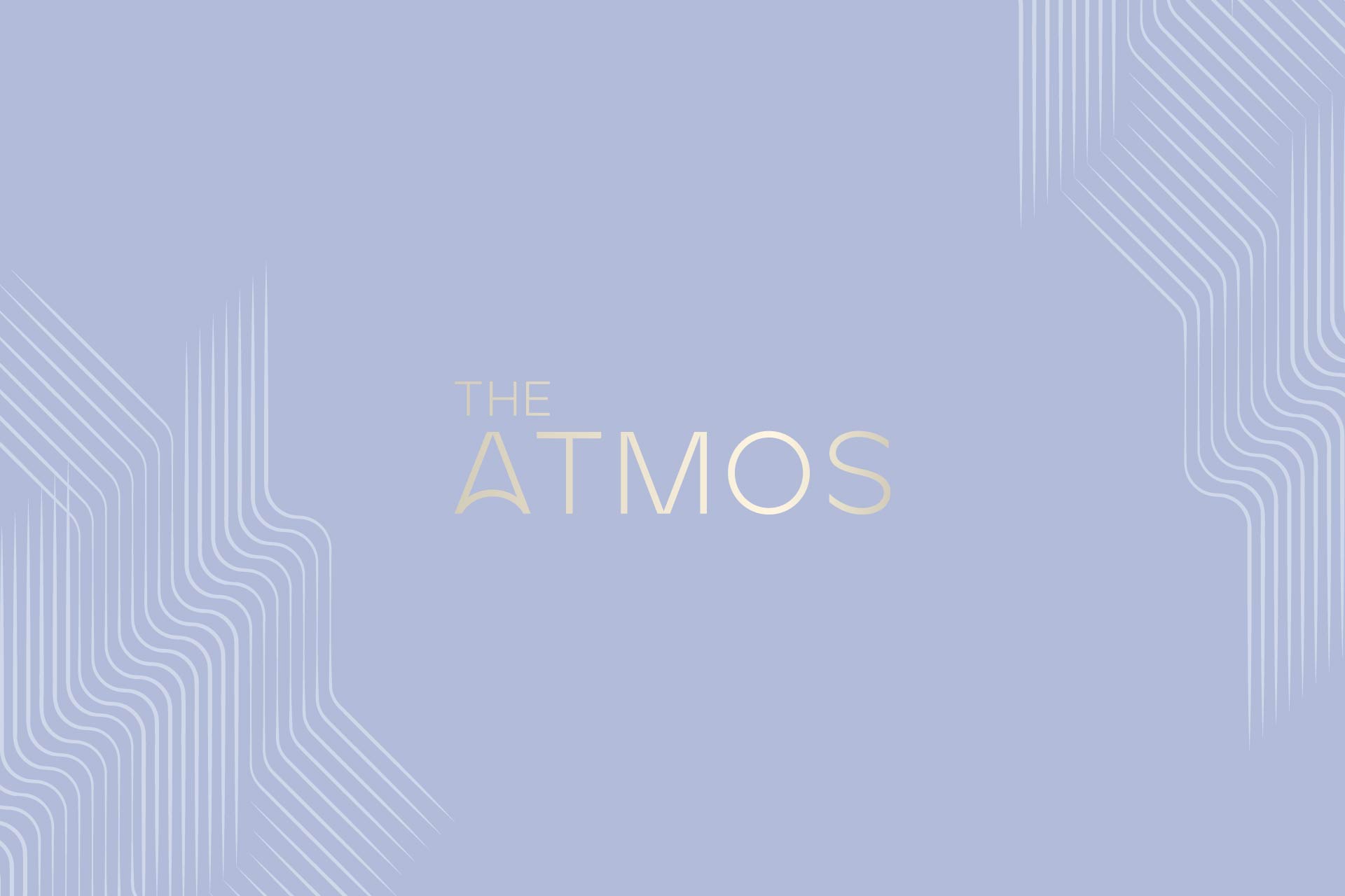
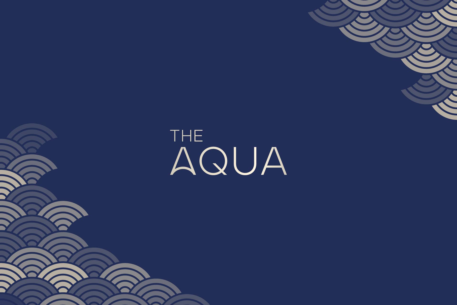
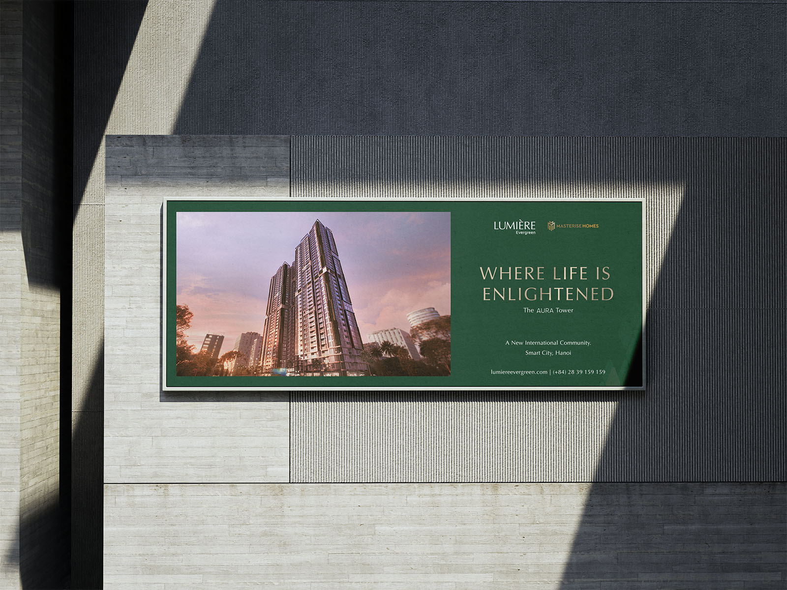
For naming, “Evergreen” is a combination of “Ever” with the hope of continuing the existing success of the brand, and “Green“ to emphasize LUMIÈRE’s enduring values. LUMIÈRE Evergreen consists of three towers which need original, striking names. Taking inspiration from architectural concepts, The Only Three brought up three names corresponding to those elements for the towers: “Aura” – the light of dawn standing for beginning & possibilities, “Atmos” – the air of freedom, and “Aqua” – The water that nourishes and enduring life.
For the tagline, “Choose Living For More” was chosen to reflect LUMIÈRE brand’s concern for well-being, reputation and quality. Furthermore, “Where Life Is Enlightened” and “The Freedom of Being” were chosen to express the meaning of a new beginning and freedom for each tower that took inspiration from Light and Air. Together, these three taglines express LUMIÈRE Evergreen’s idea that everyone has the choice to seek for a more fulfilled, higher-quality life.
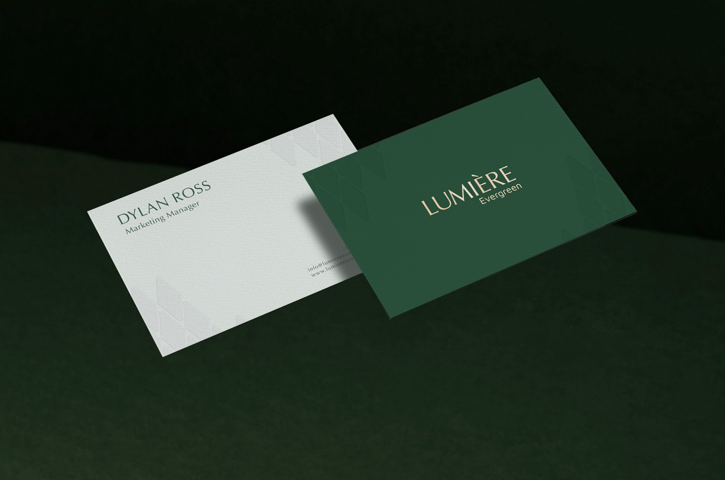
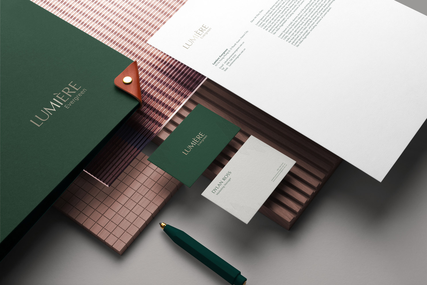
TYPEFACE
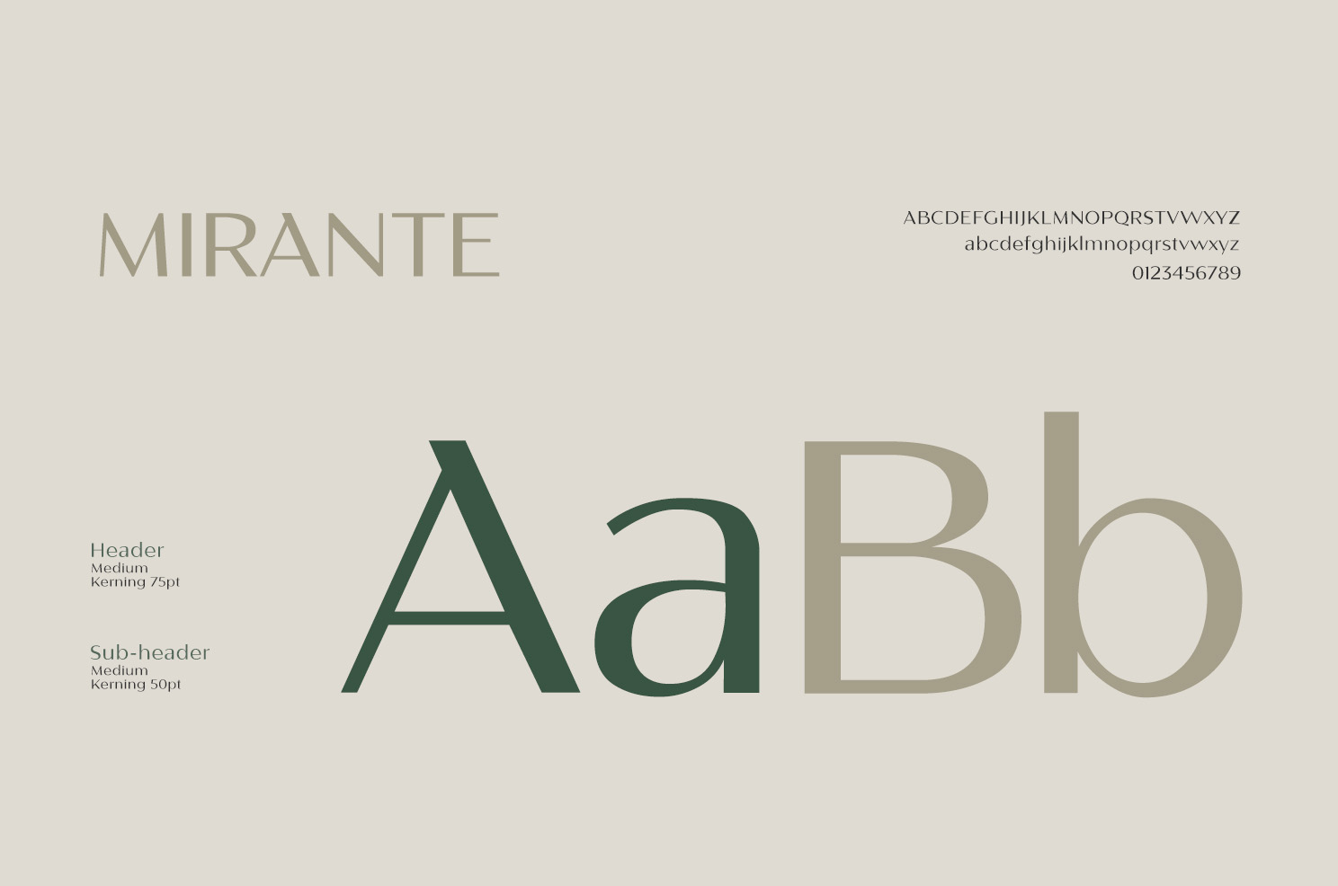
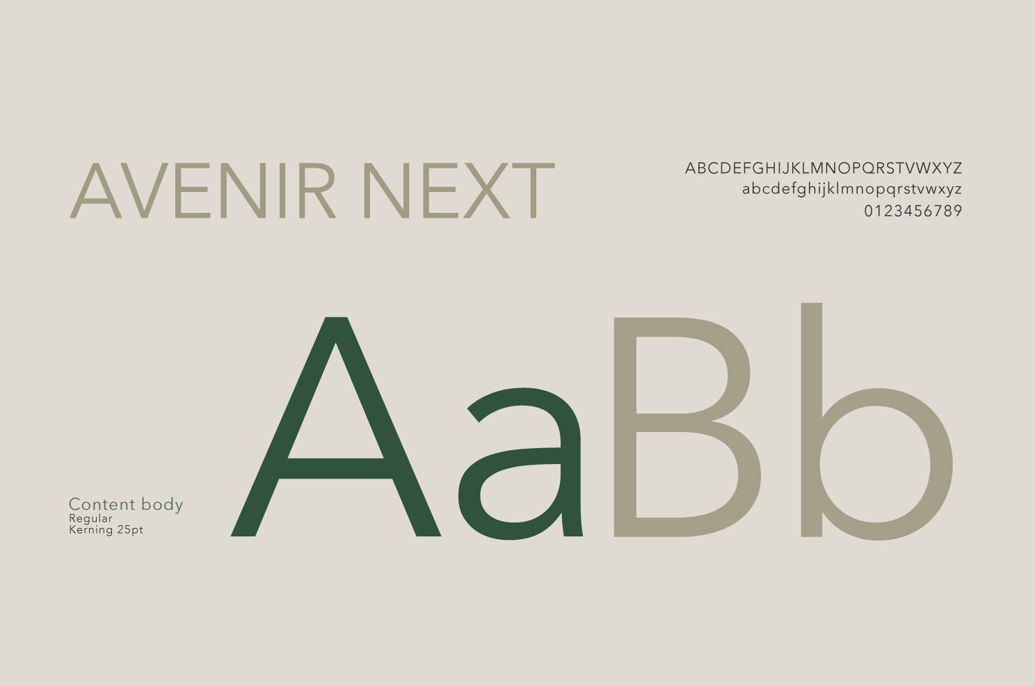
The Only Three’s findings show that the typefaces should embody the sophisticated, timeless yet minimal and distinct spirit of LUMIÈRE Evergreen. Mirante was chosen because of its elegant yet simple font, for Header and Subheader. For the contents’ body, the light and highly flexible Avenir Next is our final choice. Once put together in layouts predefined by our team, these two fonts will surely catch the public’s eyes for their rich and straightforward appearance.
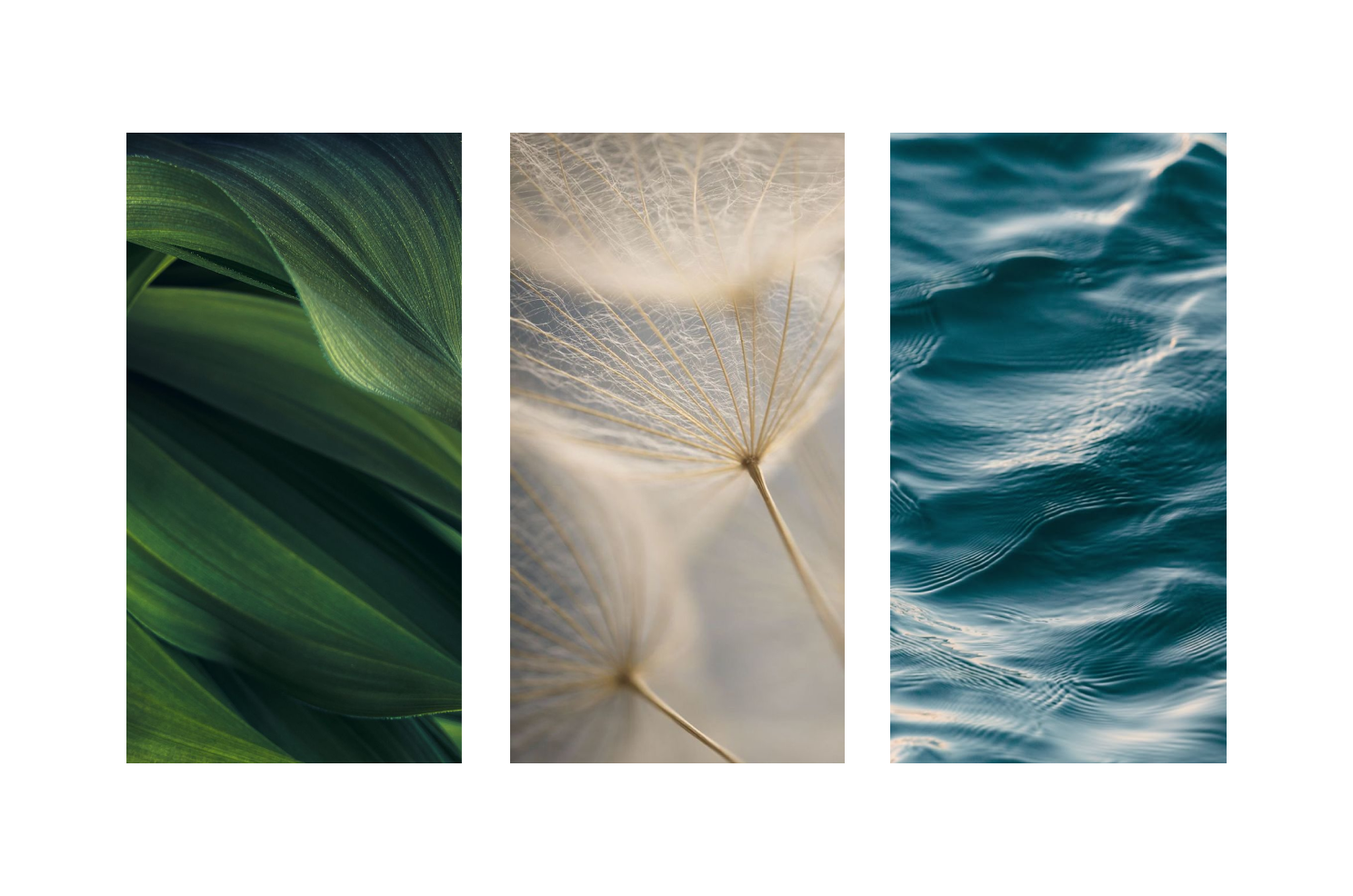
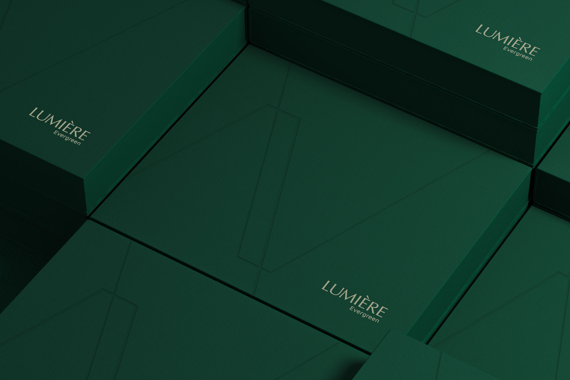
PATTERN
The Only Three has drawn inspiration from LUMIÈRE Evergreen’s three towers, each inspired by an element essential to life: Light (Aura), Air (The Atmos), and Water (Aqua), highlighting creative ideas that each tower should have its own element-inspired graphic key to visually express its narrative and leave a lasting impression to the public.
As seen, there are three multi-layer patterns that poetically illustrate the elements and bring life to the towers. These patterns are arranged on all communication materials of the tower in elegant and flexible ways through different opacity levels, scaling and balanced layout placement.
COMMUNICATION
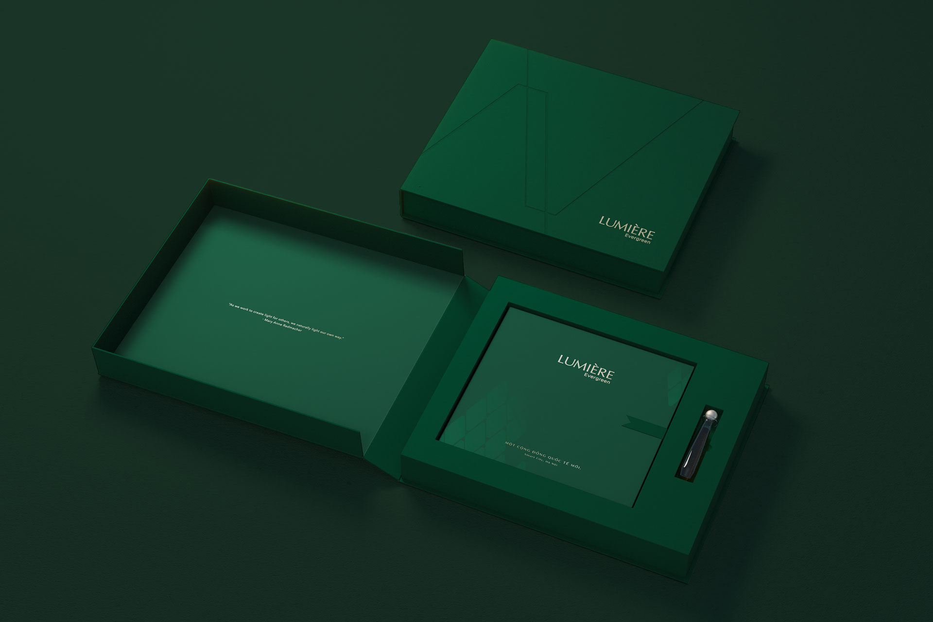
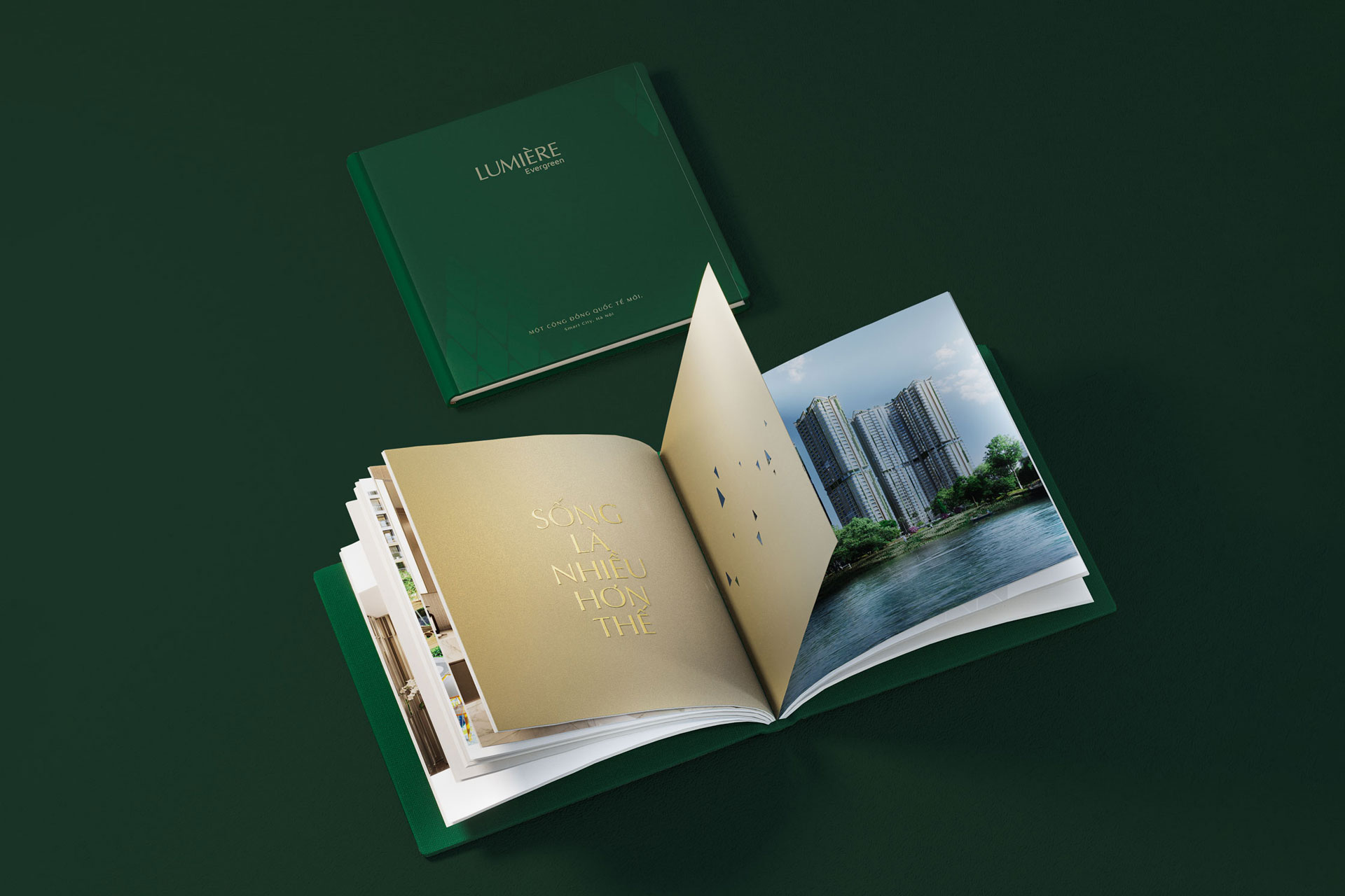
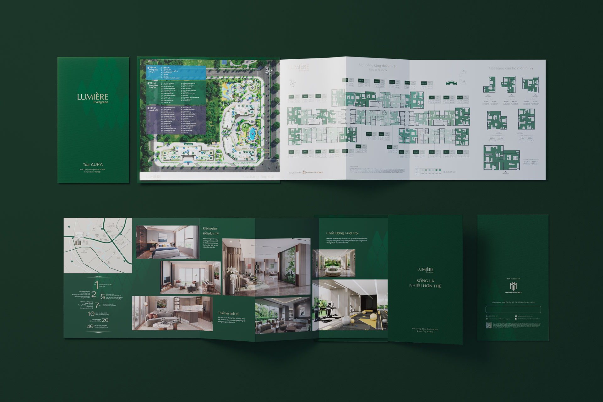
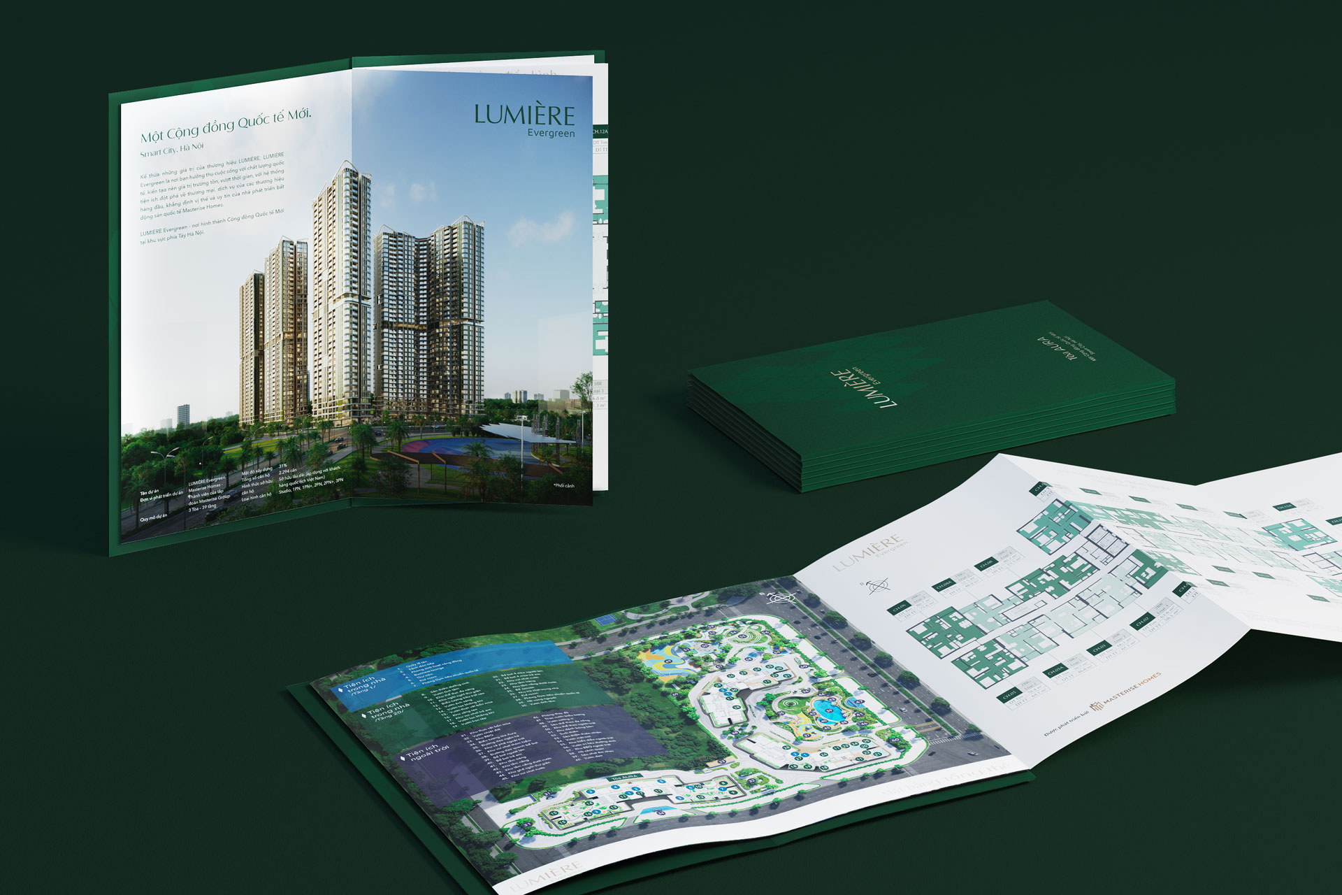
BROCHURE & SALES LEAFLET
The Only Three was commissioned to create brochures and sales leaflets for the project. A simple yet expressive uniform cover for these materials were decided, containing only a green background and the project’s logo in gold, as specified in the brand’s integration guideline. The leaflet is conceived in folding form, meanwhile the square format brochure is produced in square format with saddle stitch binding technique,, giving the brand’s predefined layout and the presentation of its images.
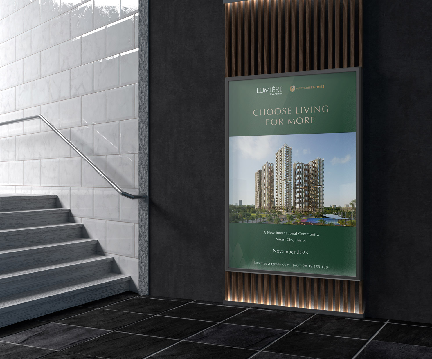
KEY VISUAL
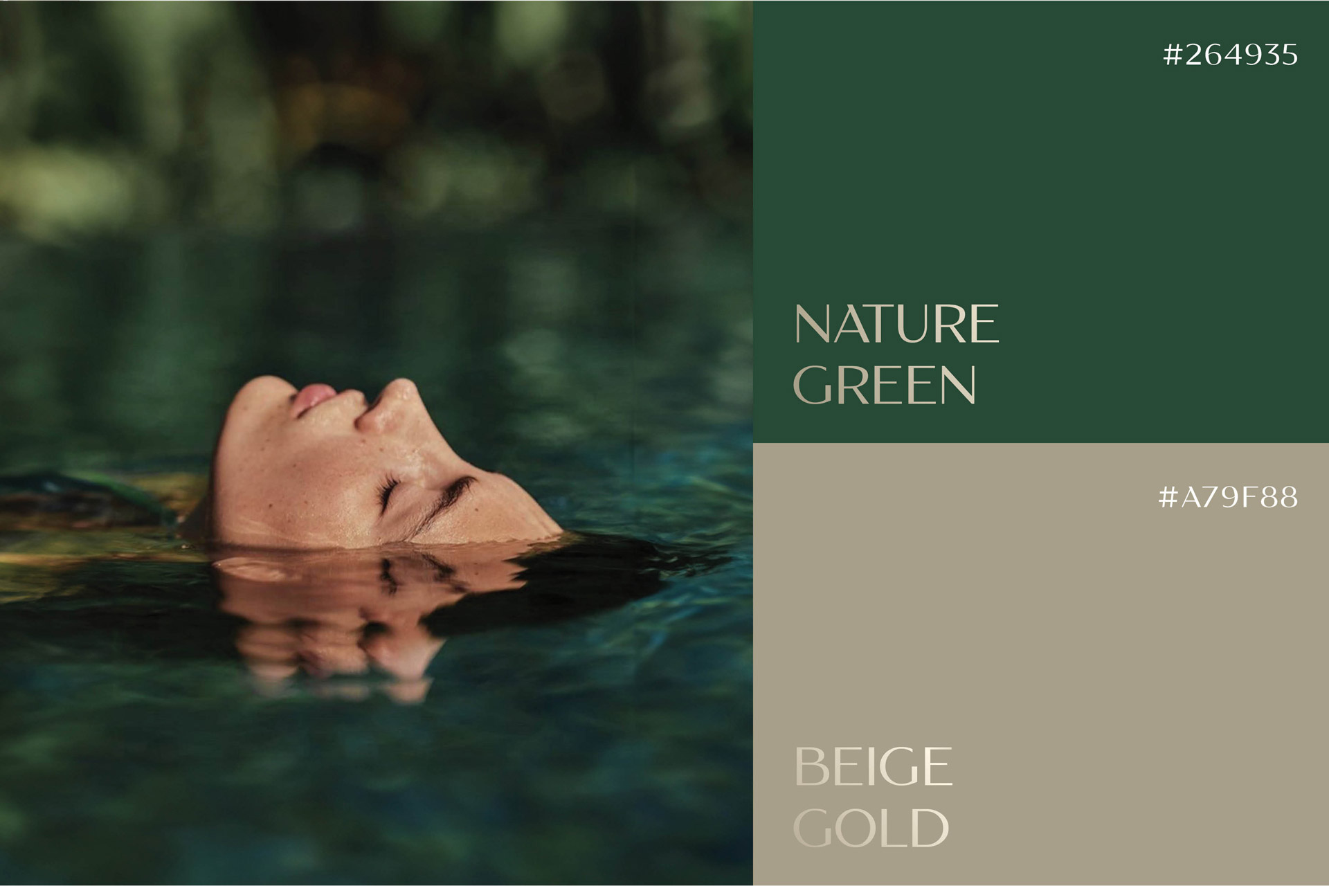
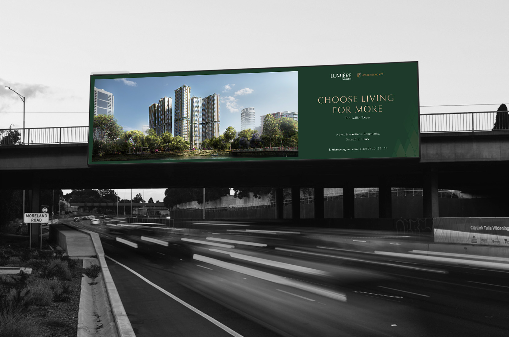
For all key visuals for LUMIÈRE Evergreen, The Only Three employs the project’s palette of nature green and white for the background and contents. Moreover, to ensure the brand’s consistent representation, the layout systems applied on key visuals were introduced.
For launching key visuals, The Only Three pursue a simple yet graphical in a template of blocks to showcase the project. Strictly adhering to the layout & placement system and brand integration guideline, the minimal layout and strong, bold typeface capture the public’s attention at first sight.
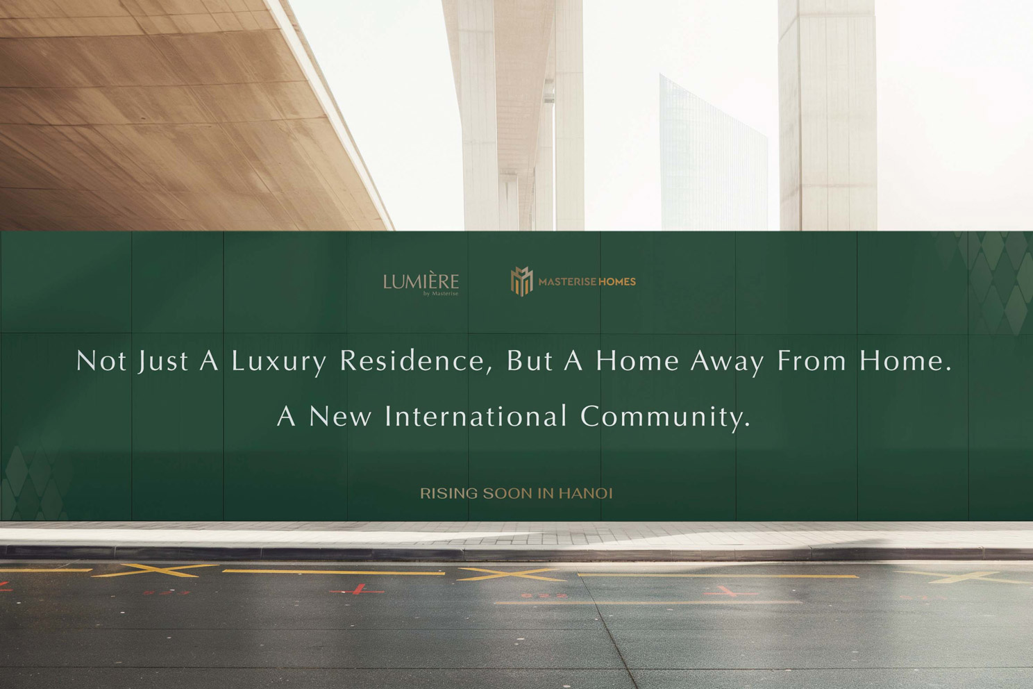
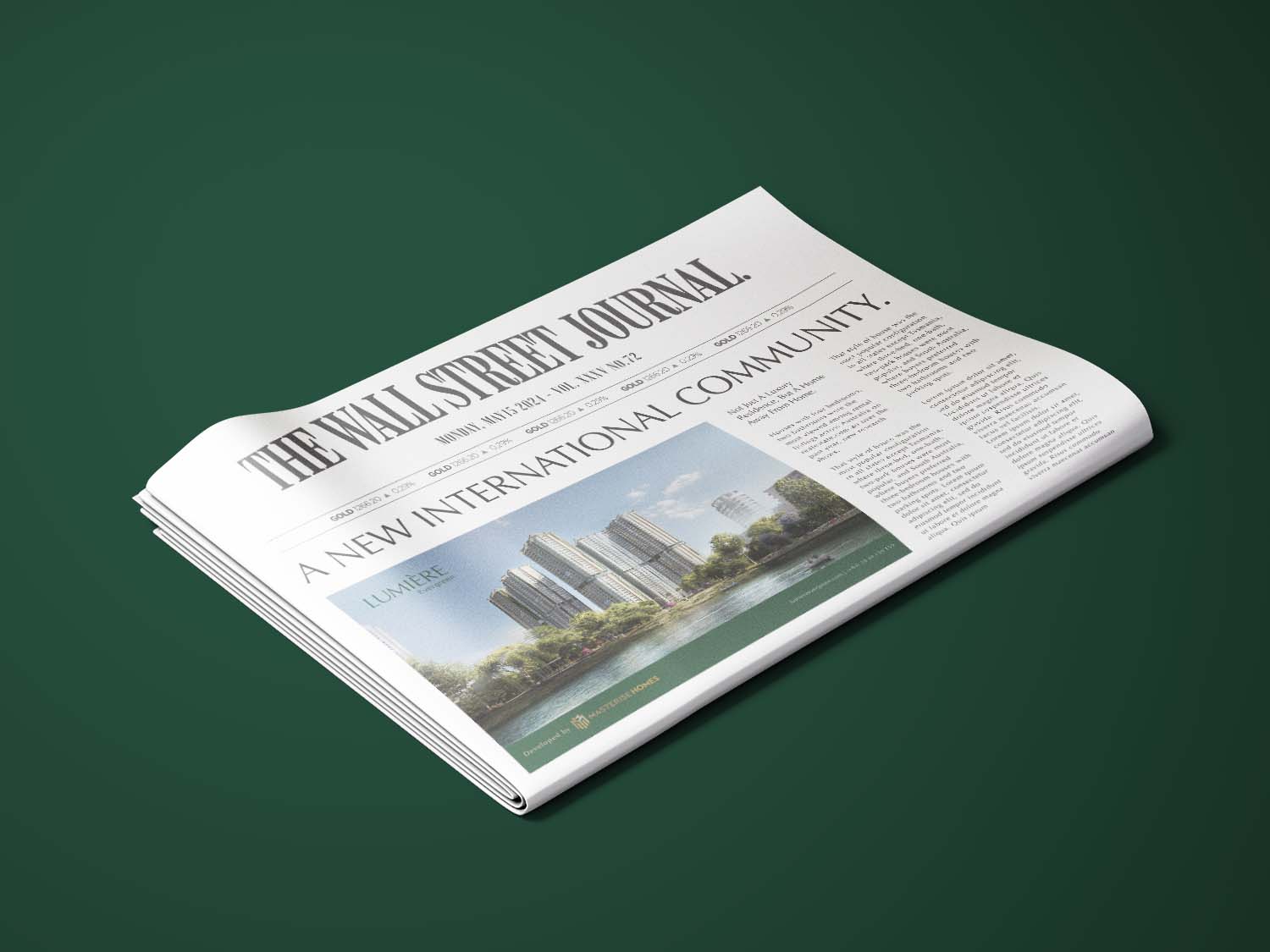
TEASING
For teasing key visuals, The Only Three created a statement presented across hoarding and OOH media. Using the uniform background for all key visuals, the statement stood out highlighting the meaningful message of “Not just a luxury residence, But a home away from home, a new international community”. Some touches of pattern were added on the layout to achieve a visual attraction.
BRAND FILM
The Only Three was also invited to create LUMIÈRE Evergreen’s brand film. Centered around the motto “Choose Living For More”, our team has conceived the three-scene storyline portraying a male character who has a successful career and a happy family; he looked back at the decision he had made living at LUMIÈRE Evergreen and was happy to see the joy all of his family members.
A storyboard with scene-by-scene visual direction and narration was developed, illustrating each family member’s emotional adventure upon exploring the projects’ estates and landscape. Through the brand film, LUMIÈRE Evergreen’s outdoor, indoor amenities, architecture facade and interior ambiance were showcased at its finest.
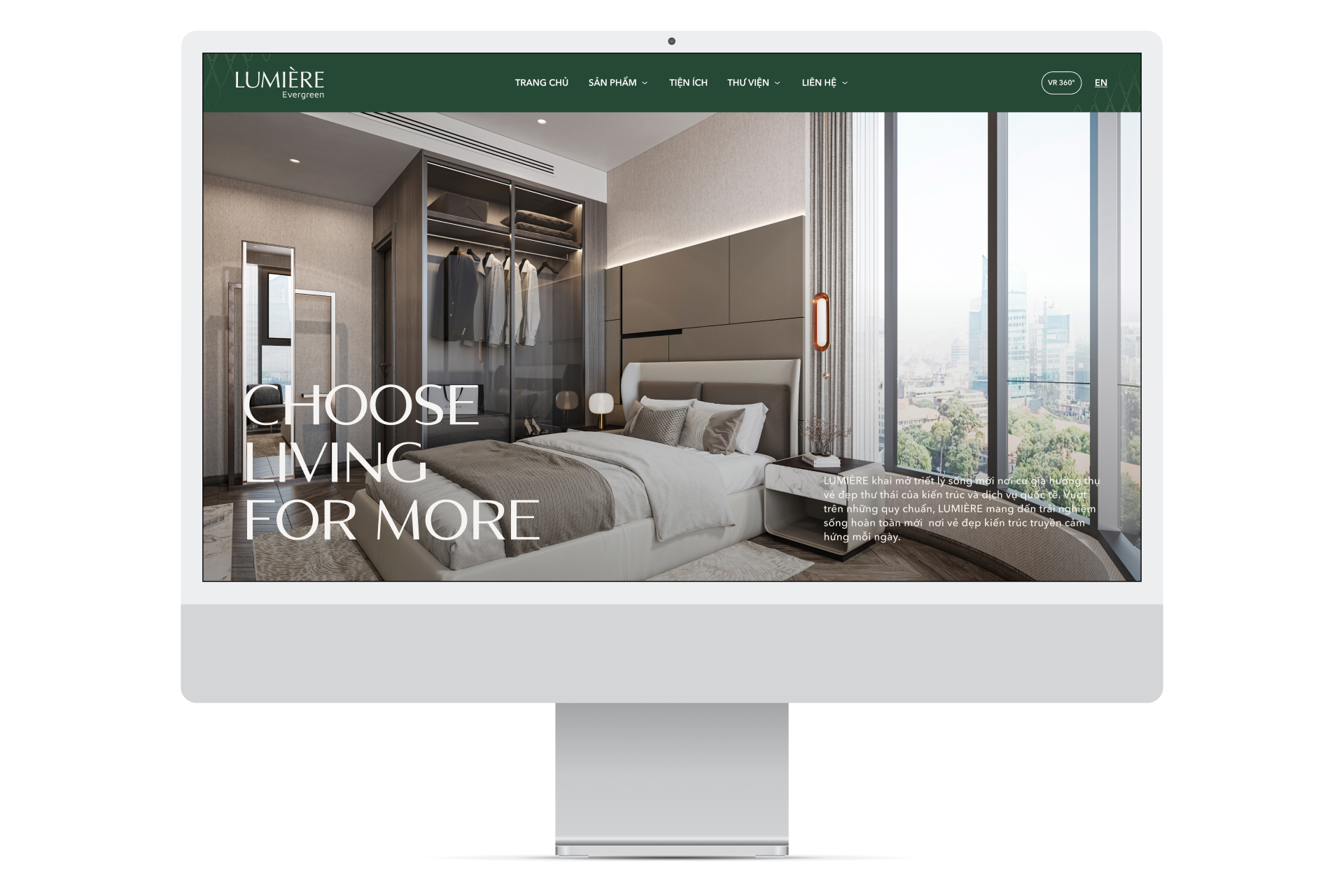
WEBSITE
The Only Three was commissioned to create both teasing microsites and websites in both desktop and mobile versions. For these The Only Three purposely chose a minimal but expressive layout, following the brand’s specific palette, typeface and integration guideline. Photos were featured across all pages showcasing the finest landscaping, amenities and interior.