DESCRIPTION
HAUS, a newly established real estate project in Vietnam with a vision to establish an exceptional, one-of-a-kind home in the most sought-after locations across Vietnam. Poised to be a groundbreaking and innovative real estate project where residents can immerse themselves in a crafted habitat of pristine nature and inner comfort.
The mission of the project is to create a habitat of balance, privacy and utmost comfort, whilst catering to peaceful harmony and relaxation. A truly unique location with exceptional service and a place to call home, as well as a destination.
Scope of Work
Creative Concept
Brand Strategy
Naming
Tagline
Key Visual
INSPIRATION & CONCEPT
With the underlying concept of health and mindfulness infused together, The Only Three conceptualized HAUS to follow three distinctive personalities; genuine, approachable and extraordinary. With this, the agency also crafted three distinct brand values to act as an umbrella; timelessness, partnership, sustainability and emotional belonging.
Under these driven brand values, the very concept of HAUS thrives and comes to life. Under Timelessness, the brand narrative is always evolving and progressing whilst maintaining what is timeless to the story.
Under partnership, the focus is on leveraging our speciality with each partners’ strengths to deliver the highest standard of service to customers. Under sustainability, the very importance of wellness and nature comes into play, with environmental preservation at the core of the concept. With emotional belonging, we drive the sense of delivering value to one another within the community we wish to foster and build.
Inspired by all that nature has to offer, together with heightened refinement and a focus on both physical & mental wellbeing, the very concept of HAUS is driven by the luxuries we can find within ourselves and what’s surrounding us, underlined by preservation and world-class service.
BRANDING
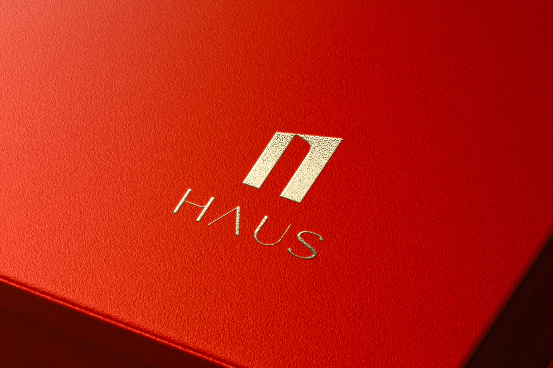
For this project, The Only Three was responsible for the holistic communication and branding strategy, from designing the logo, font as well as establishing the color palettes to reflect HAUS’s position and philosophy.
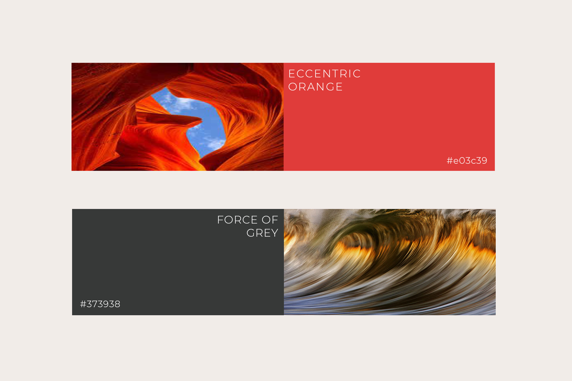
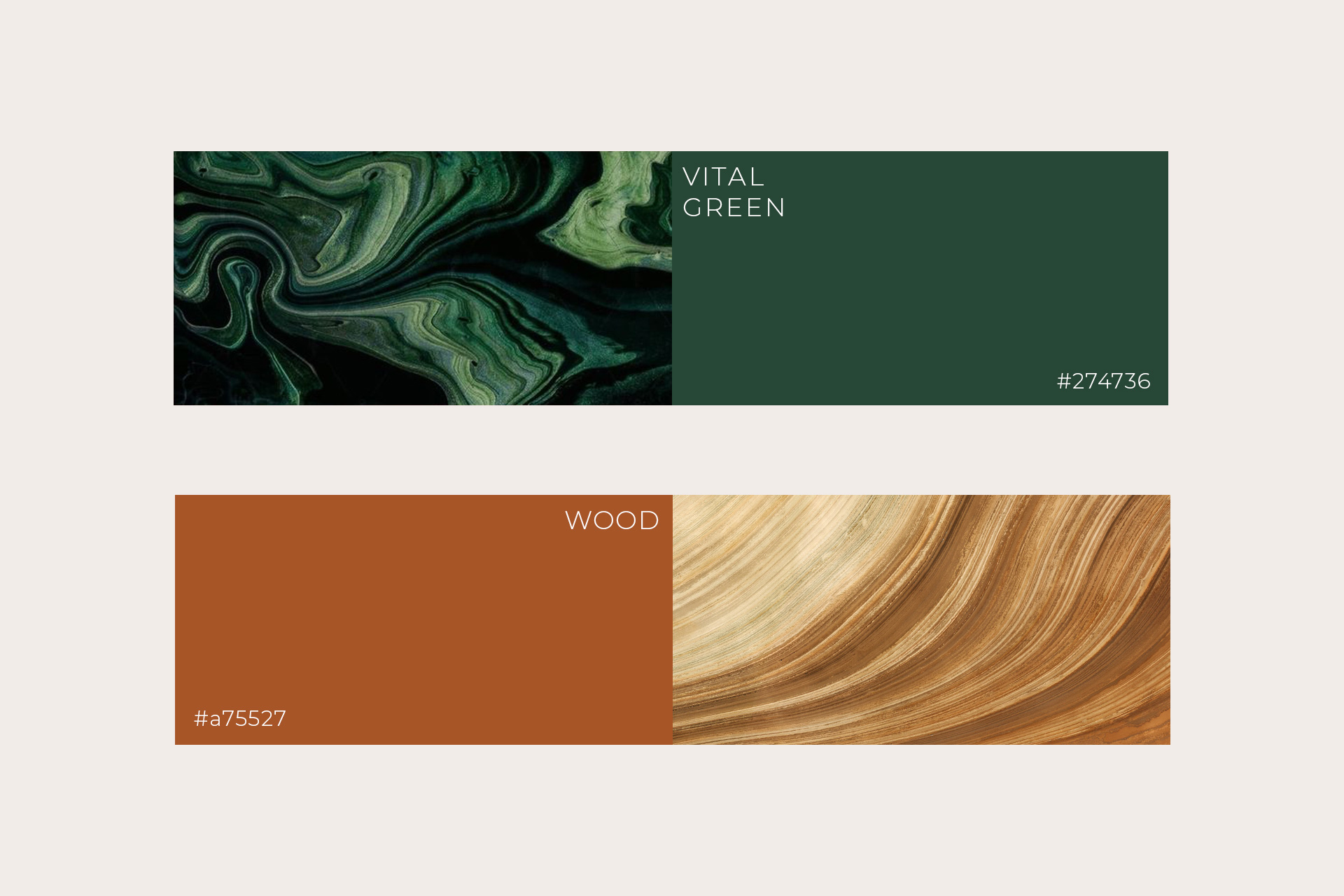
The very identity of the brand rests on wellness, sustainability and luxury. Therefore, the font and color is established, timeless and understated. In choosing the brand colors, we devised primary colors to reflect the brand story; eccentric orange and force of grey, whilst establishing vital green, vivid turquoise and wood as strong secondary colors. Each color reflects key elements of the HAUS story, inspired by jolts of energy (eccentric orange) to stylish sophistication (force of grey) and refreshingly light (vivid turquoise).
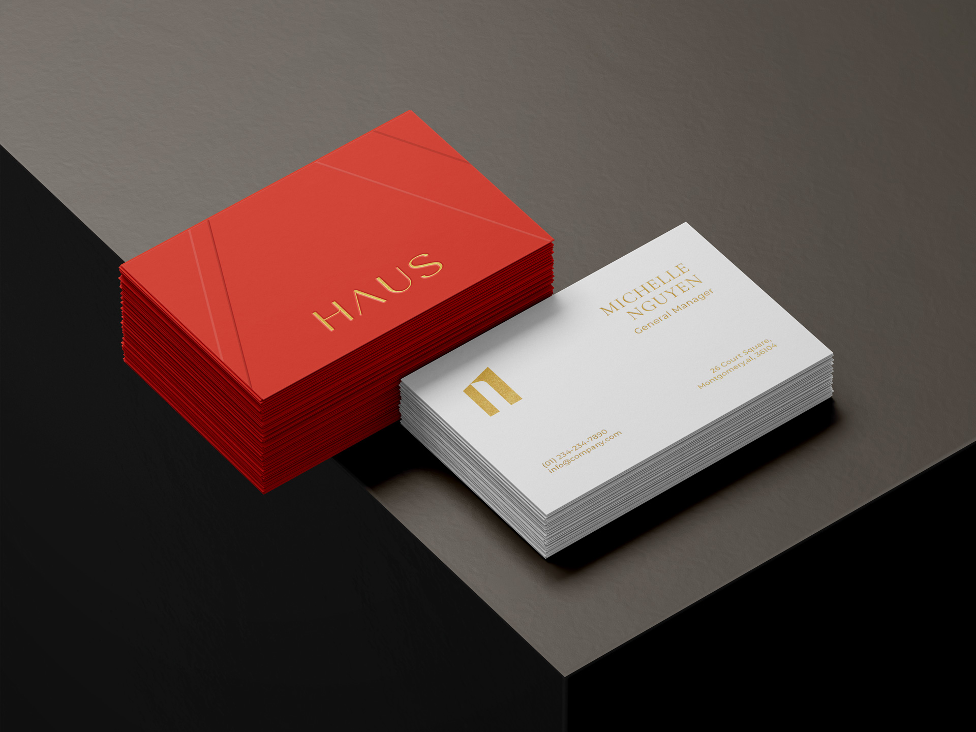
We established key primary colors and their pantone/CMYK palettes for designers to be able to design with consistency. Beyond this, we also devised a clear color usage guide to establish color usage ratio across all key communication materials.
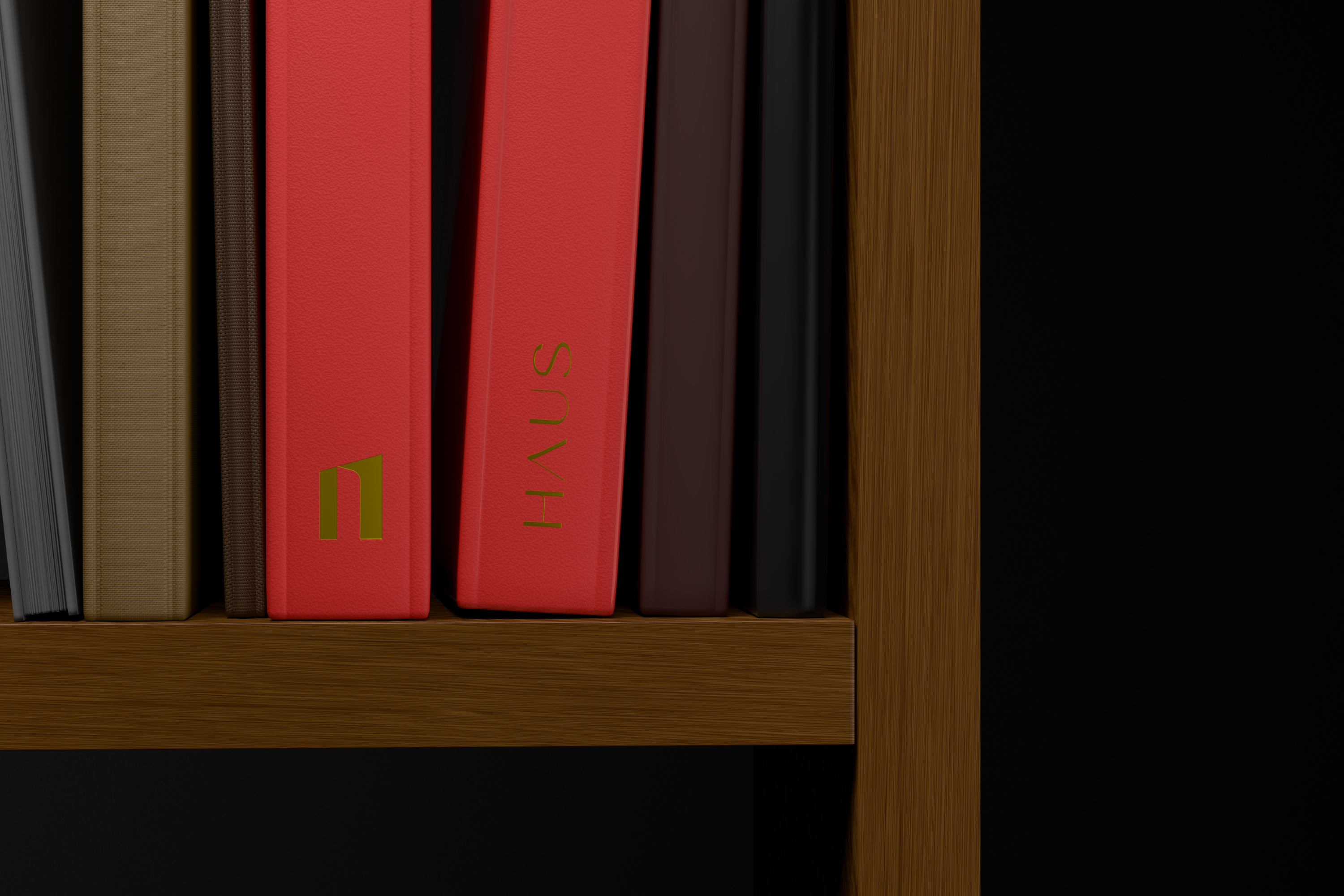
We also established key primary font sets, highlighting the importance of rightfully using the correct balance and typography for each material issued.
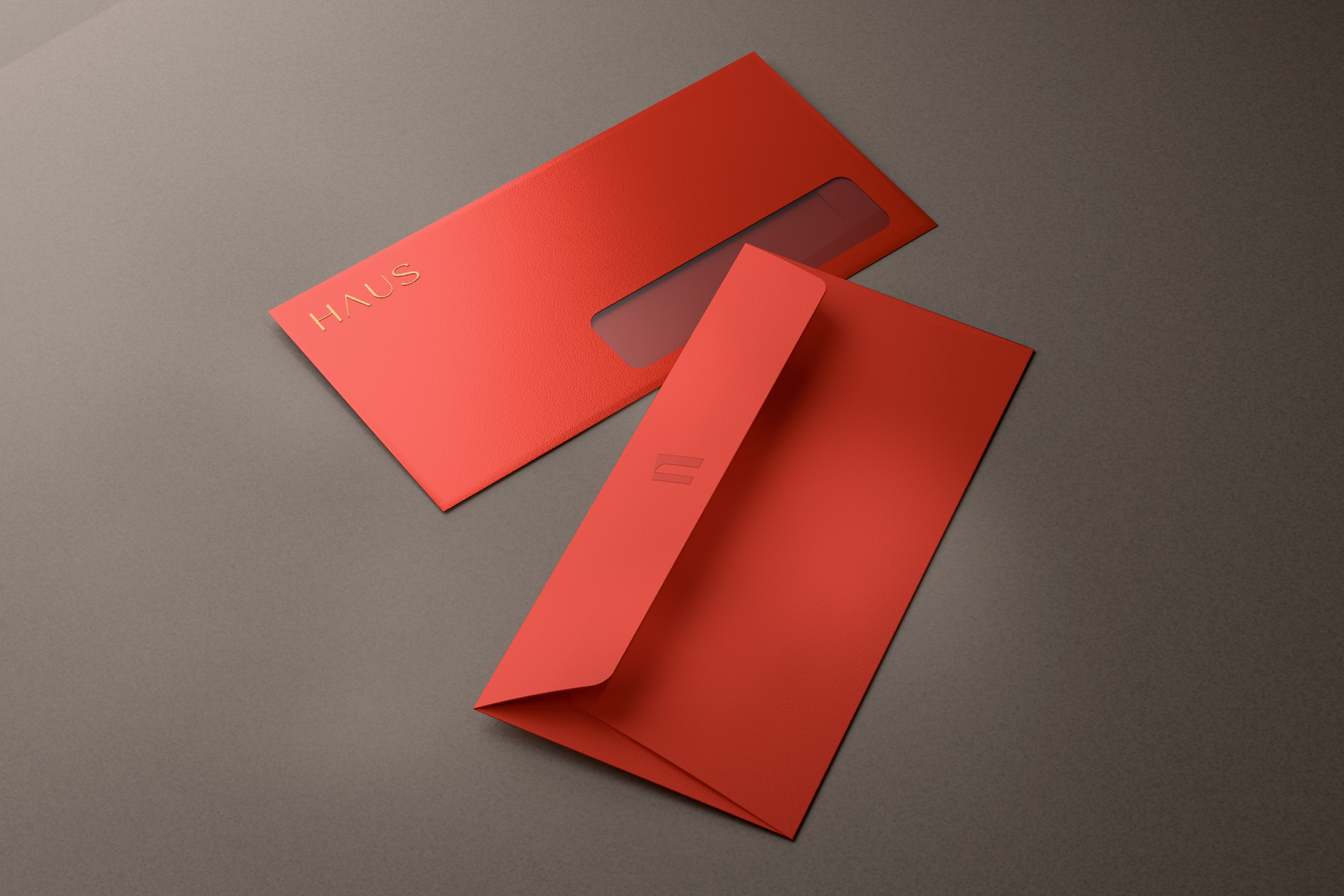
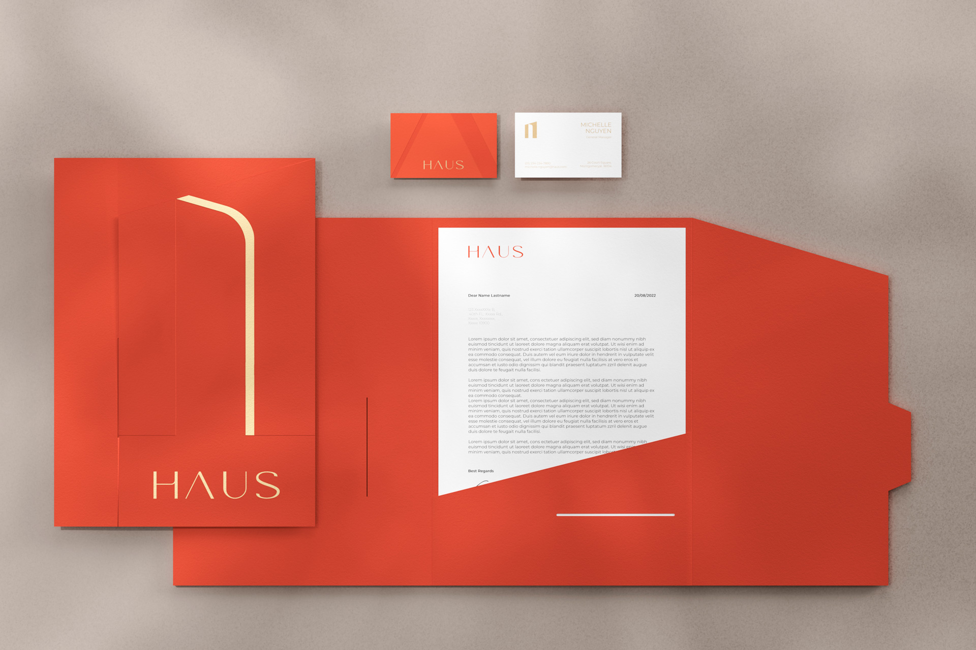
Beyond this, we also devised key graphic usage for branding purposes. This refers to establishing HAUS’s logo as the key design element in order for it to stand out from competitors. The logo’s existing design can be used to create frames, and the curve of it can be used as a guideline to crop images for further design purposes.
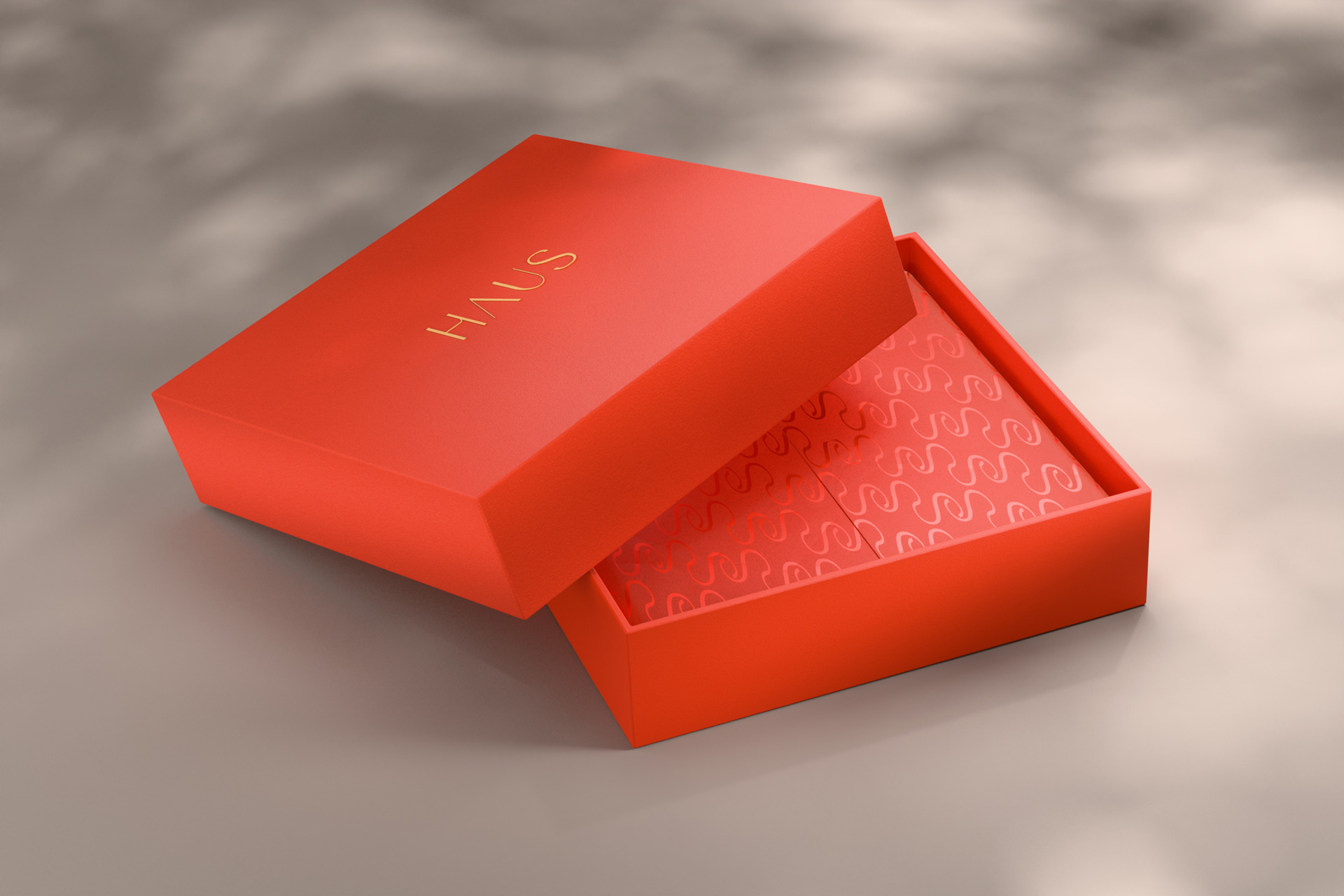
HAUS’s logo can also be used to create patterns that create the meaning behind each letter within HAUS.
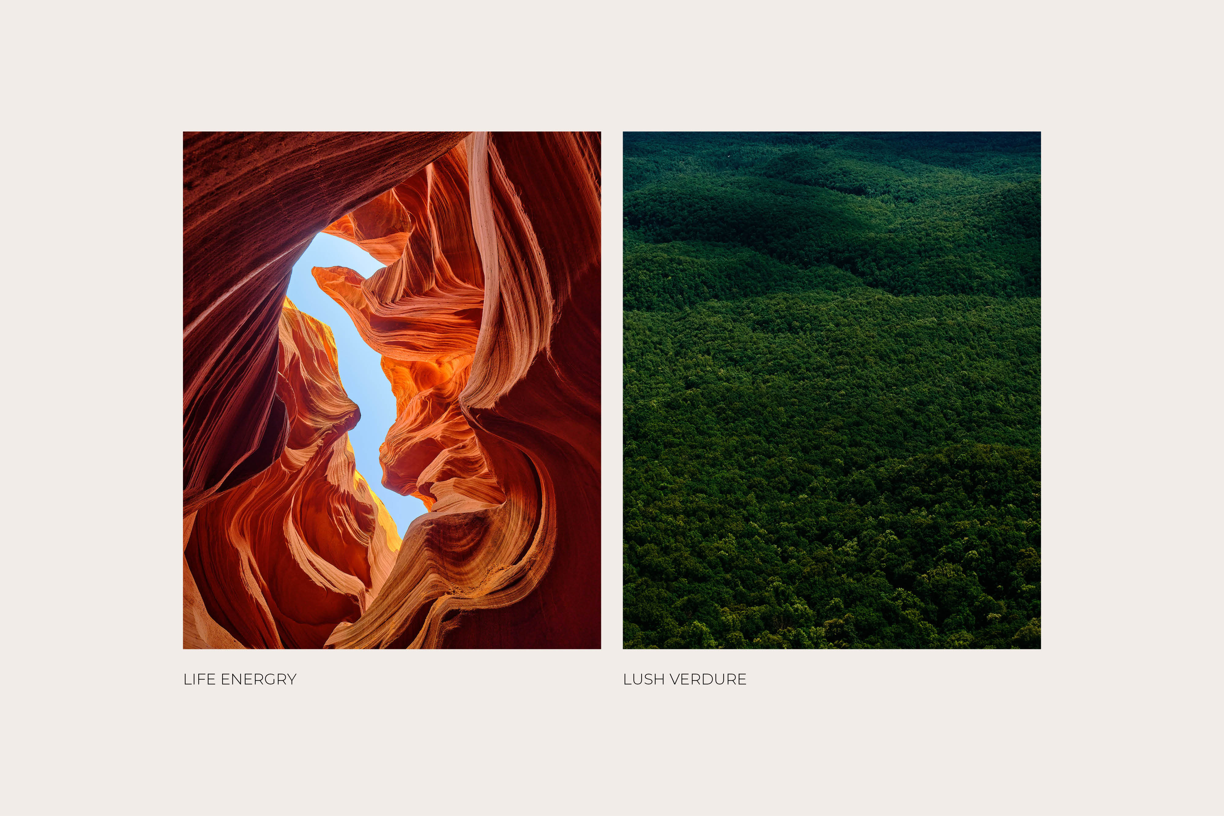
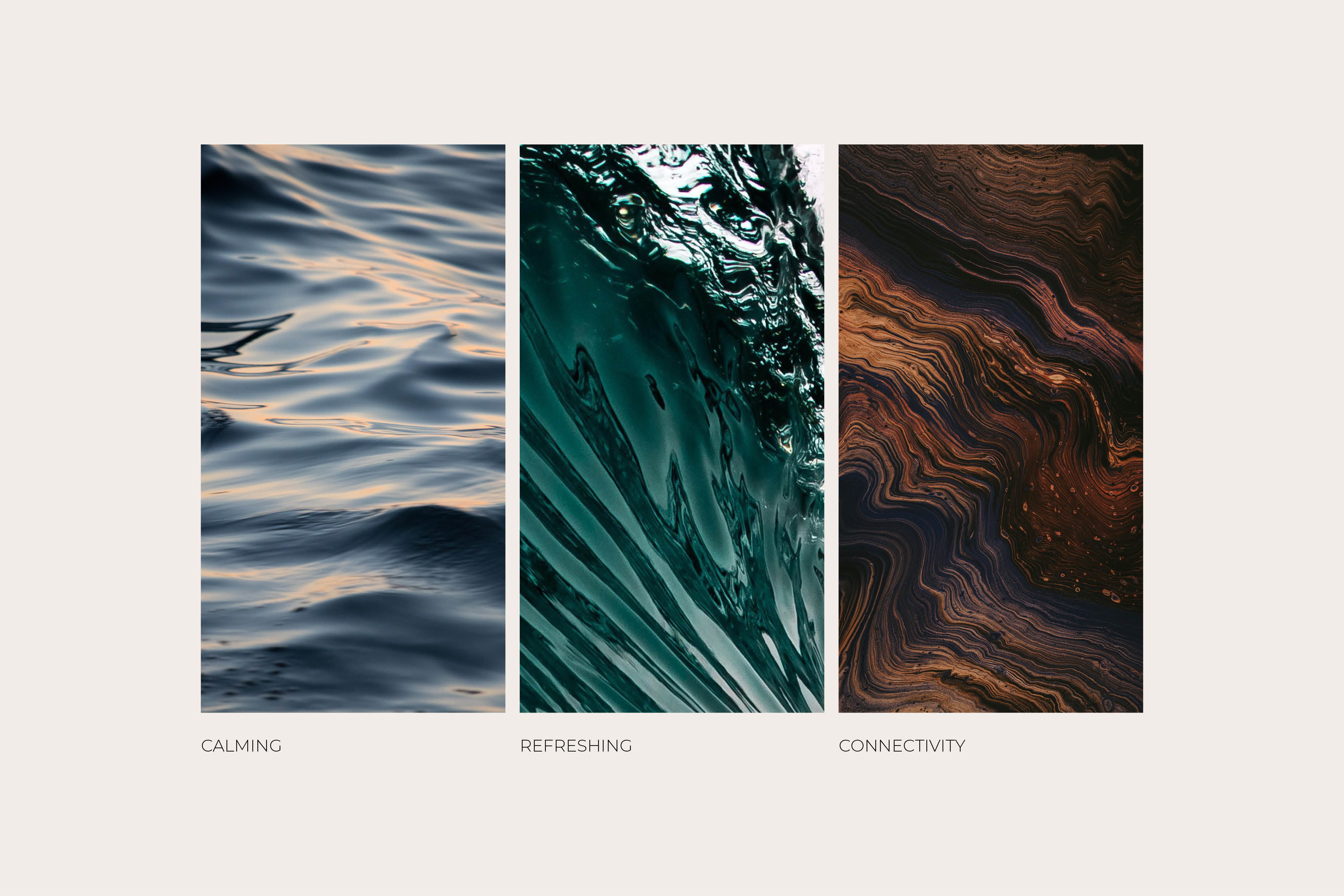
Beyond typography and graphics, we also designed a guideline to brand photography, from designing a mood&tone element of dynamic angles, serenity and subtle color tones, to evoking feelings of dynamism with camera angles in photoshoots.


APPLICATIONS
Under our communications strategy, we also designed applications such as envelopes, letterheads and products for HAUS. From crafting the color and design of letterheads for papers to outlining the leaflet to ensure consistent communication and branding, we are able to bring HAUS to life.
The guidelines for printed materials also focus on telling a unique story, only applicable to the HAUS brand. We focus on the big details and zone in on subtlety, such as giveaways which can include locally sourced ingredients, to the differing textures of the brand book and colors for letter materials, as well as clearly establish color guidelines for any products related to the project.