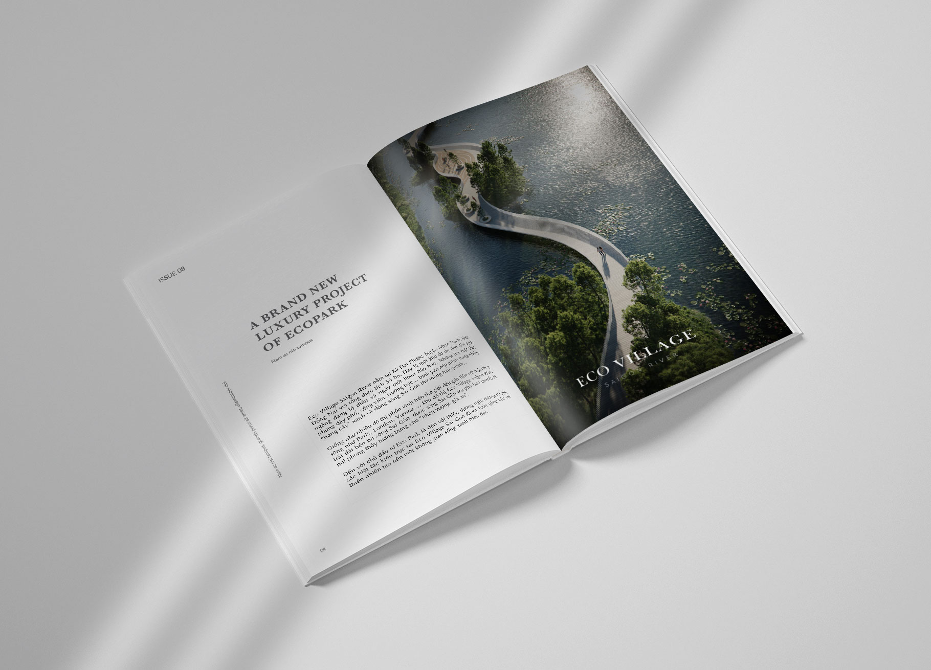
SAIGON RIVER
DESCRIPTION
Situated by the peaceful yet dynamic Saigon river, Ecovillage Saigon River is Vietnam’s first and the world’s sixth Blue Zone.This newest residential project from Ecopark– the visionary Vietnamese eco-urban developer–caters to the well-being and rejuvenation of its residents and visitors, with the aim to introduce a longer and more fulfilled lifespan of higher standard to the region. To best convey Ecovillage Saigon River’s spirit and ambition, The Only Three has developed this special Blue Zone’s branding and key visuals.
Scope of Work
Creative Concept
Brand Identity
Key Visual
INSPIRATION & CONCEPT
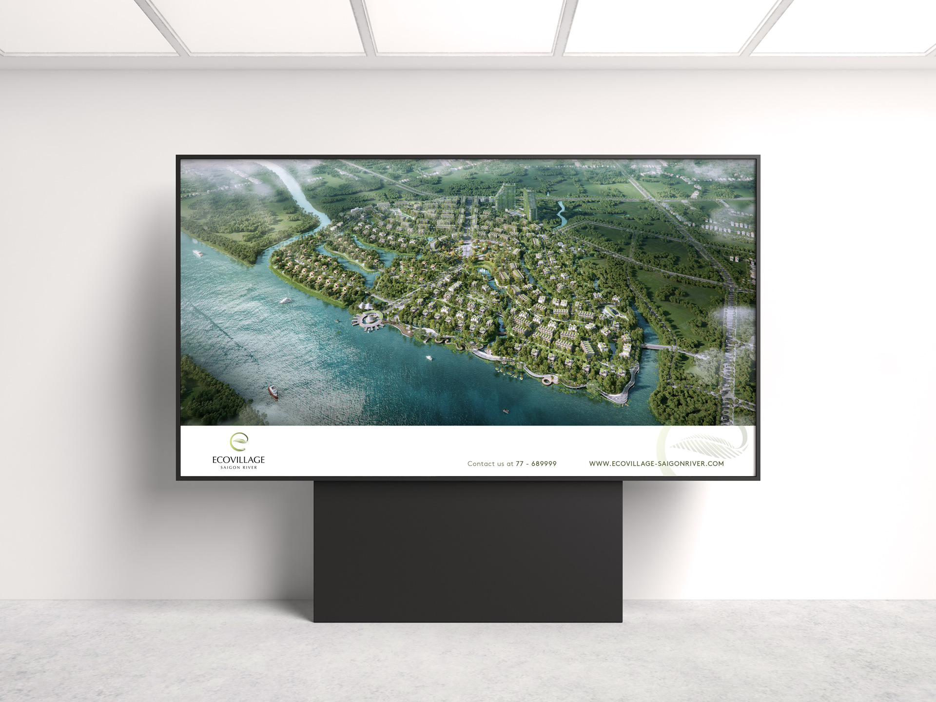
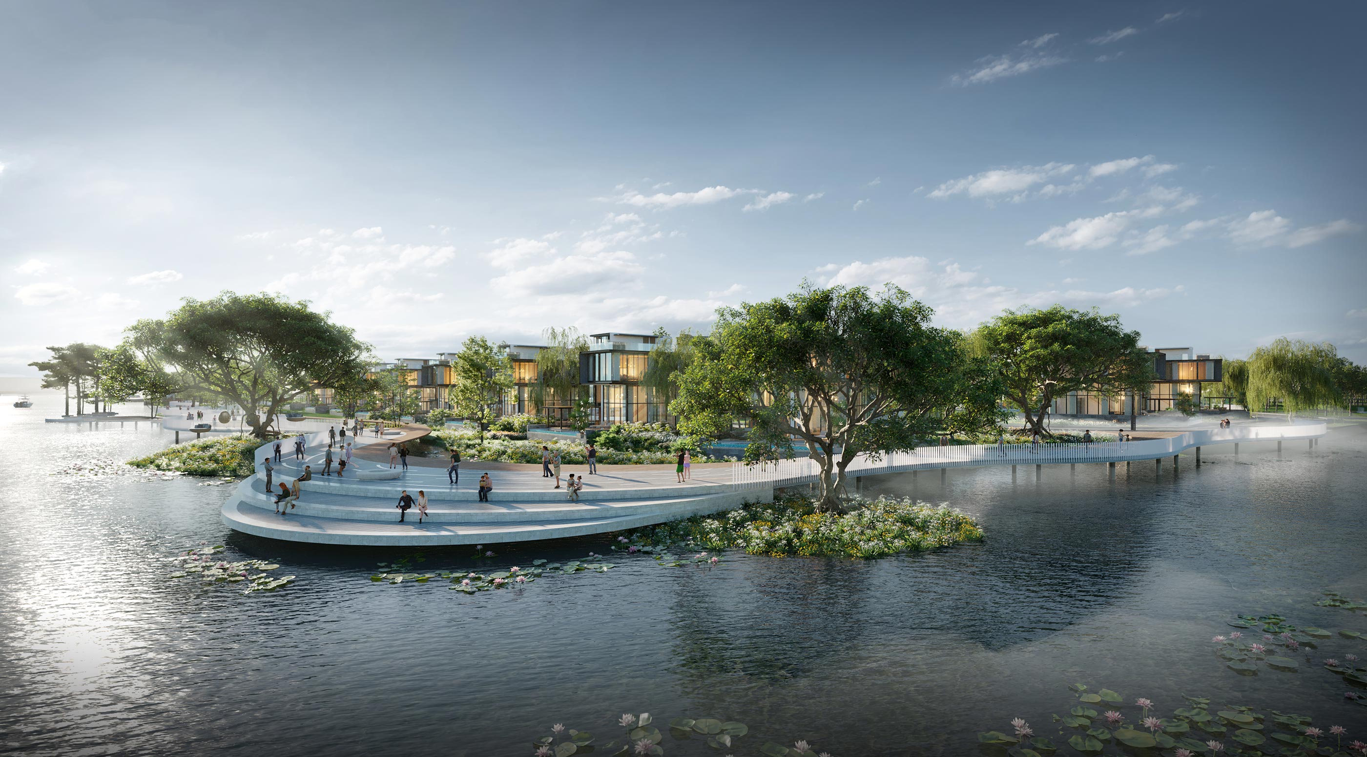
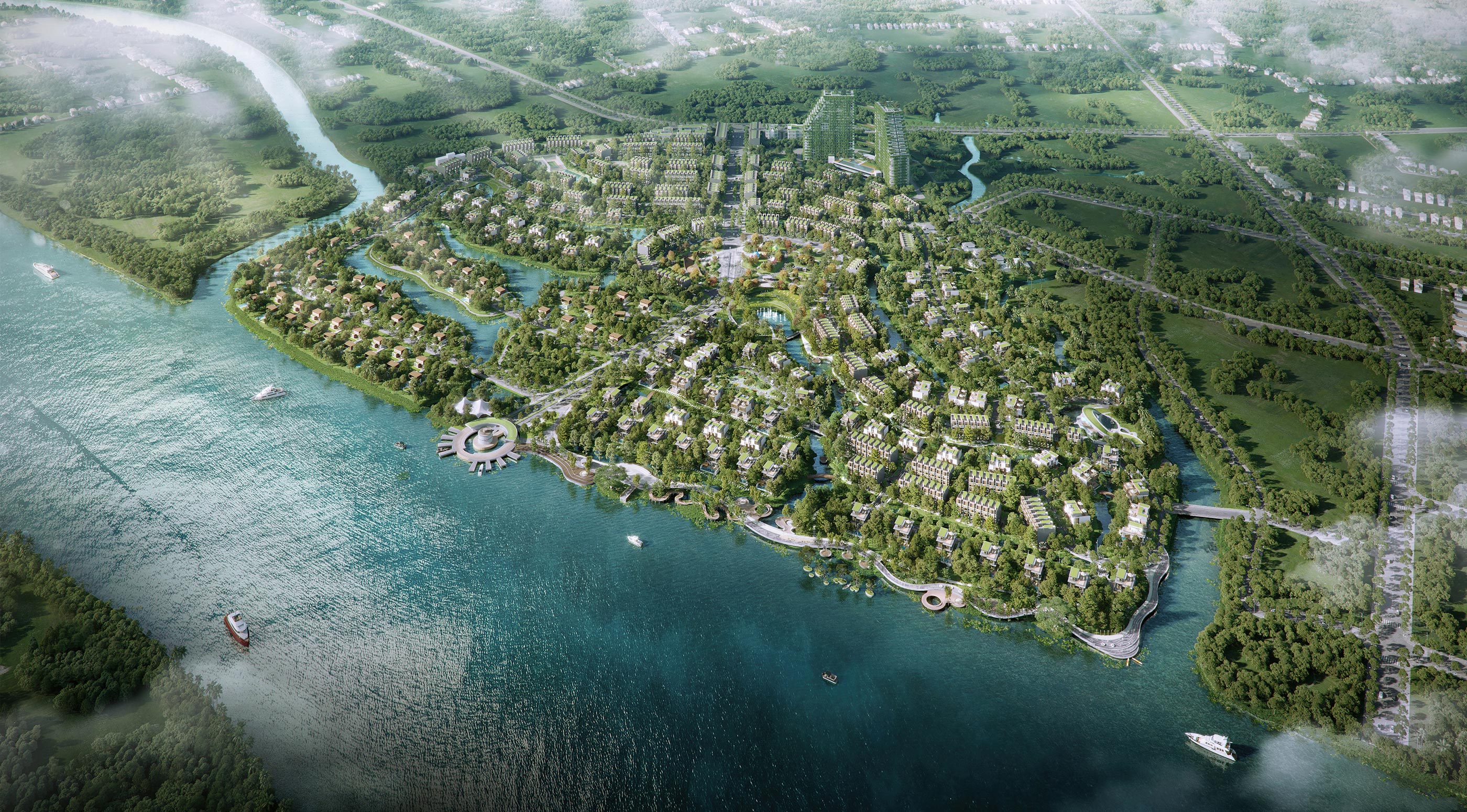
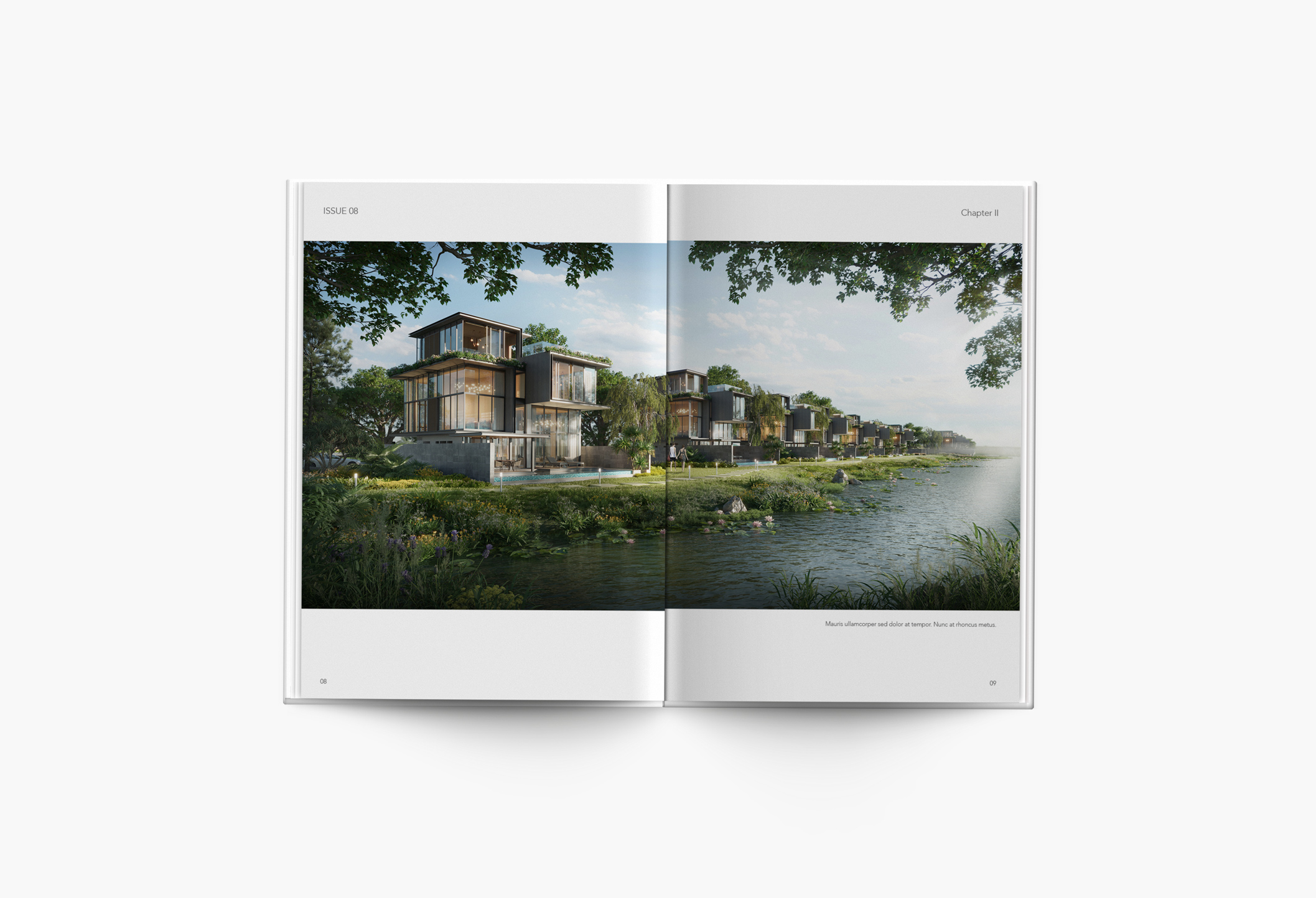
Saigon river, with its natural landscape and historically, culturally rich community, is the undisputed core element of Ecovillage Saigon River. Covering 32 hectares of water and 4 hectares of parkland, this project promises to reserve 30% of its total area for greenery. Inspired by the river’s presence and Ecovillage Saigon River’s ecological approach, The Only Three decided to take nature, greenery and urban green space as the main concept for this project’s branding.


BRANDING
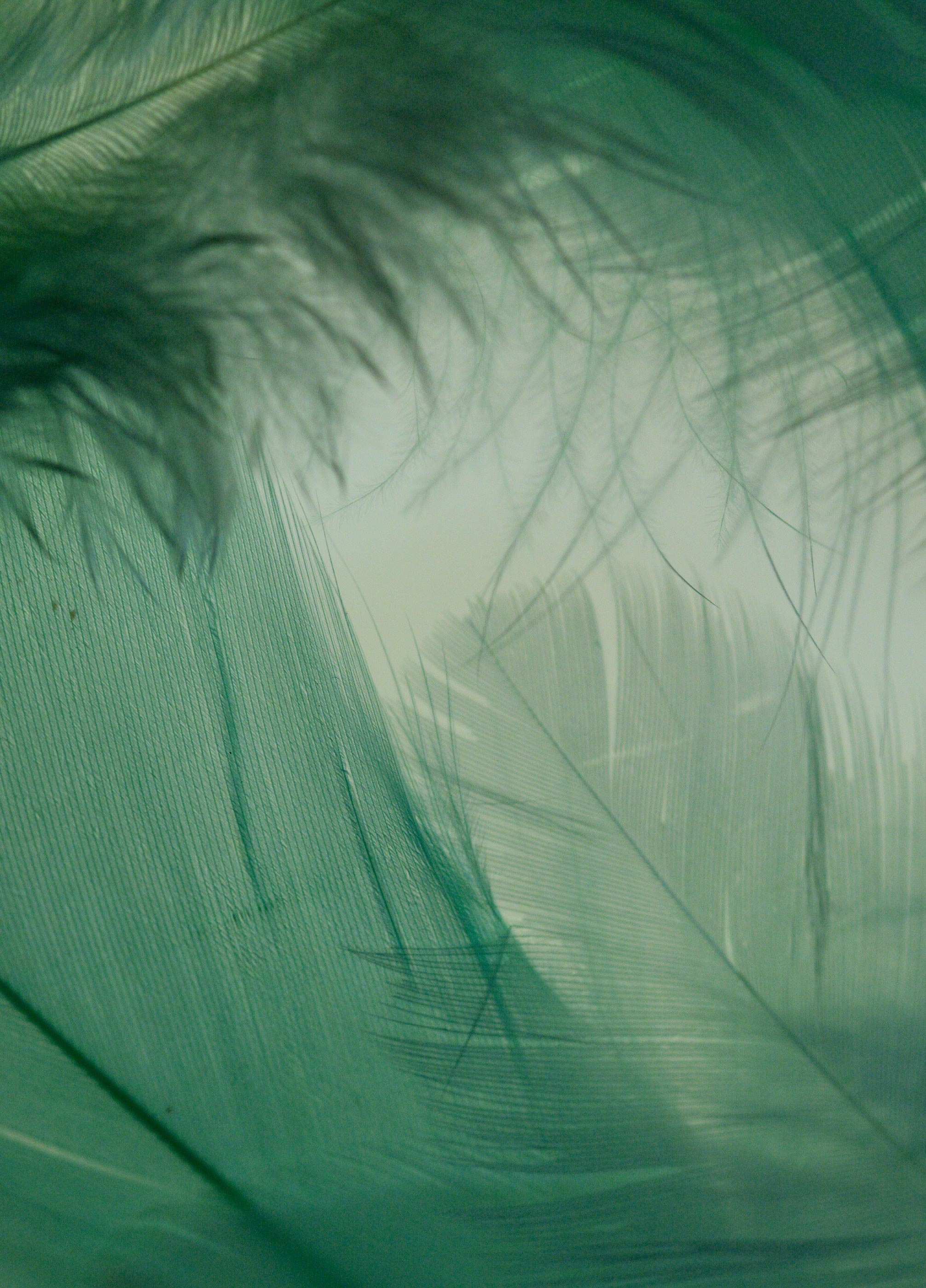
After a careful research of the Saigon River as well as Ecopark’s brand image, The Only Three was able to conceive an outstanding logo that best represents Ecovillage Saigon River. The logo takes the form of the letter “e” standing for Ecopark, at the same time bearing the shape of the mangrove palm’s leaf–a native plant familiar to the river’s landscape. This meticulous design harmoniously combines the developer’s identity and a symbol of the local ecosystem.
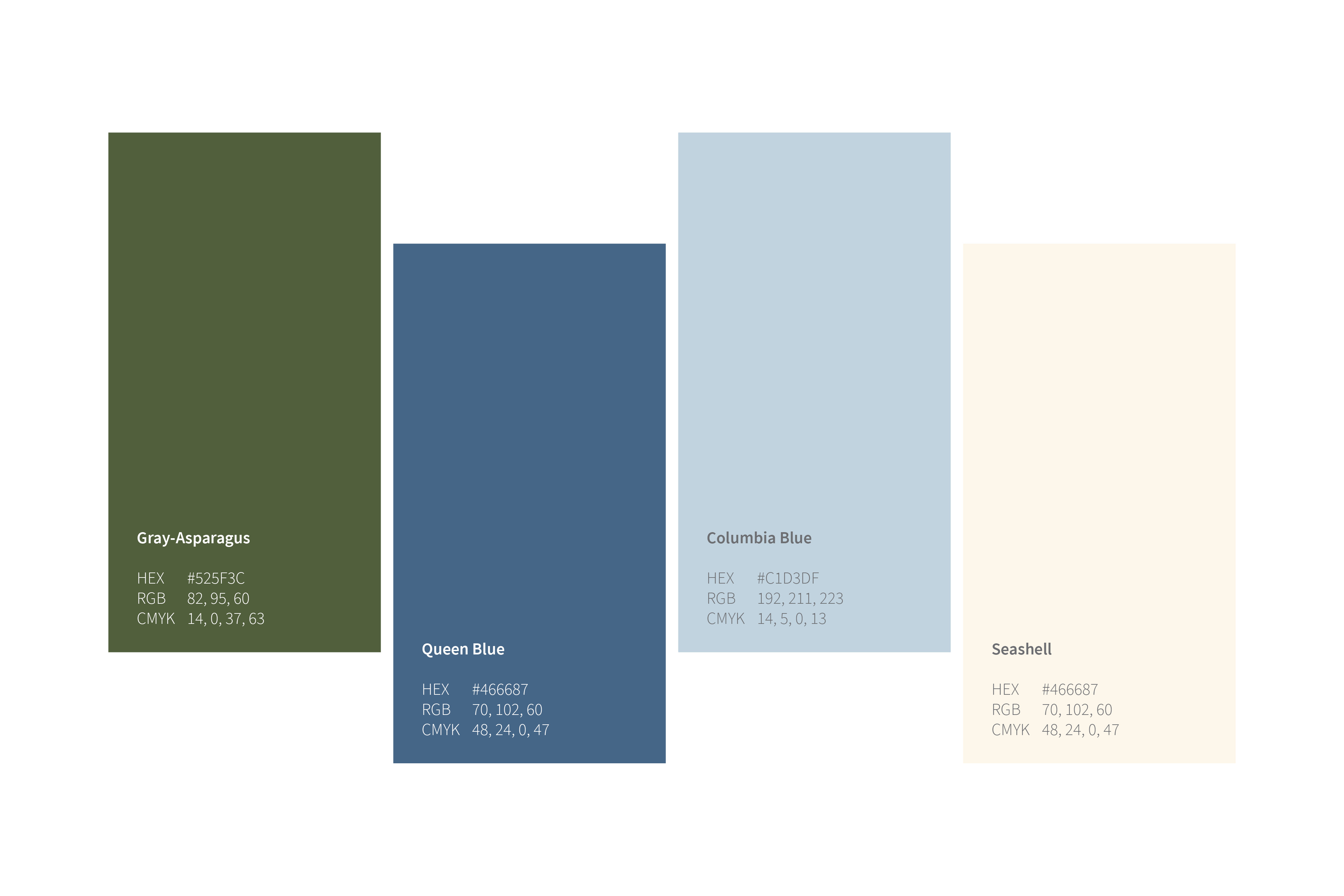
To further express the project’s concept and inspiration, The Only Three has chosen a colour palette consisting of four natural tones. The logo is rendered in green which calls to mind the greenery along the river’s bank. Two different blue tones act as the palette’s core to bring forth the image of Saigon river’s peaceful flow. The final touch is an ivory shade that reflects the sparkle of sunshine on water, adding warmth and balance to the palette.
APPLICATIONS
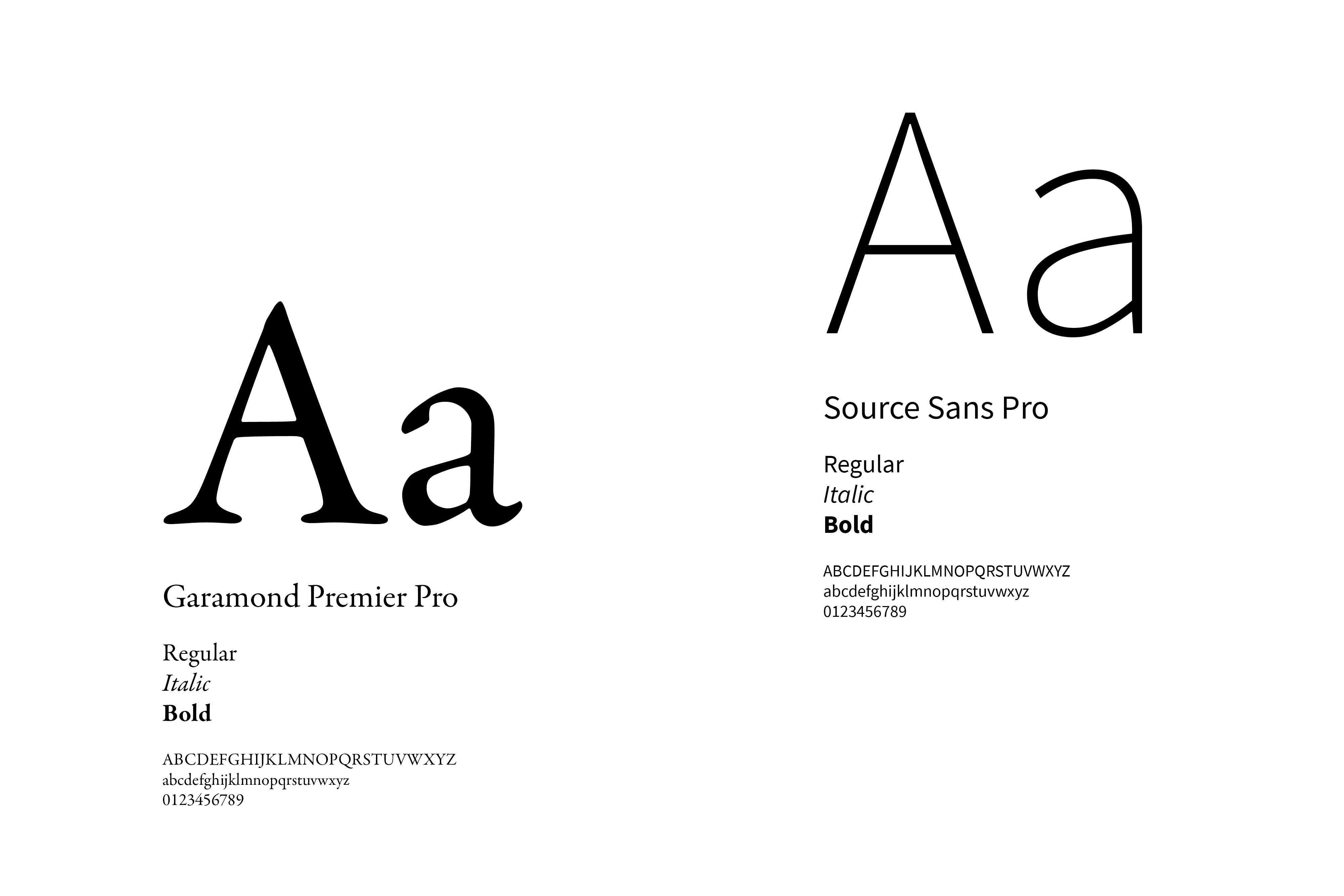
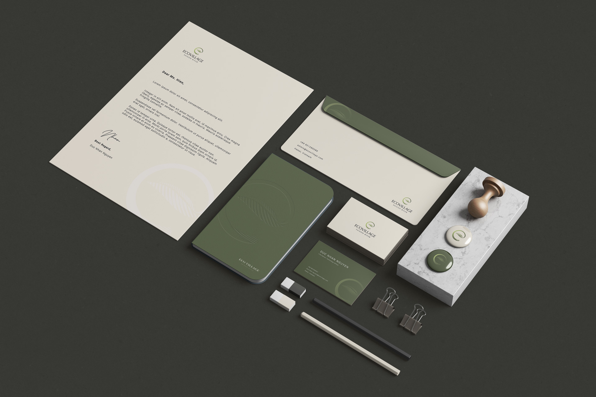
Beside the branding, The Only Three is also in charge of Ecovillage Saigon River’s brochure and stationary design. For this part, our studio has carefully chosen the materials to convey the project’s ecological yet prestigious spirit. The brochure features the project’s best visuals, following a coherent layout guidelines and respecting the brand’s chosen typeface. All stationery products are designed in ivory and green–two colours picked out from the project’s palette–to further enhance its sustainable and regional image.
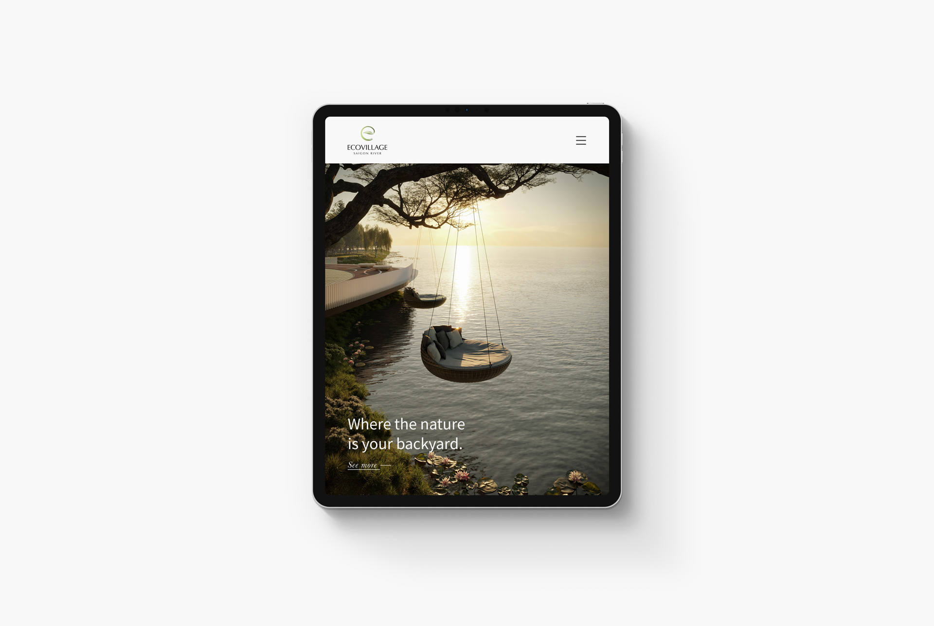
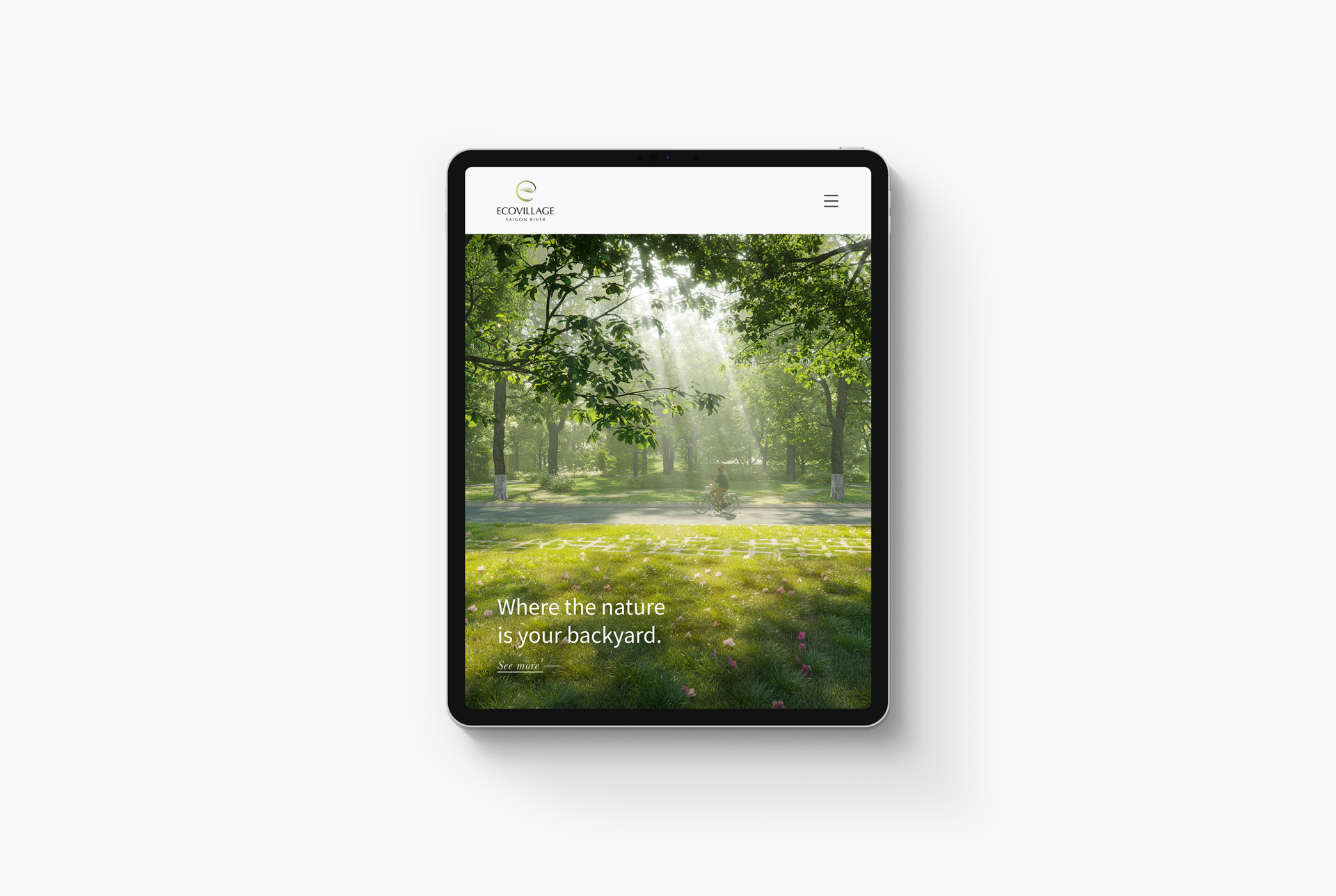
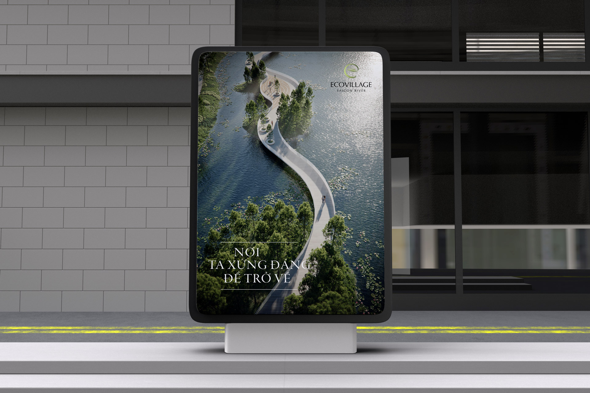
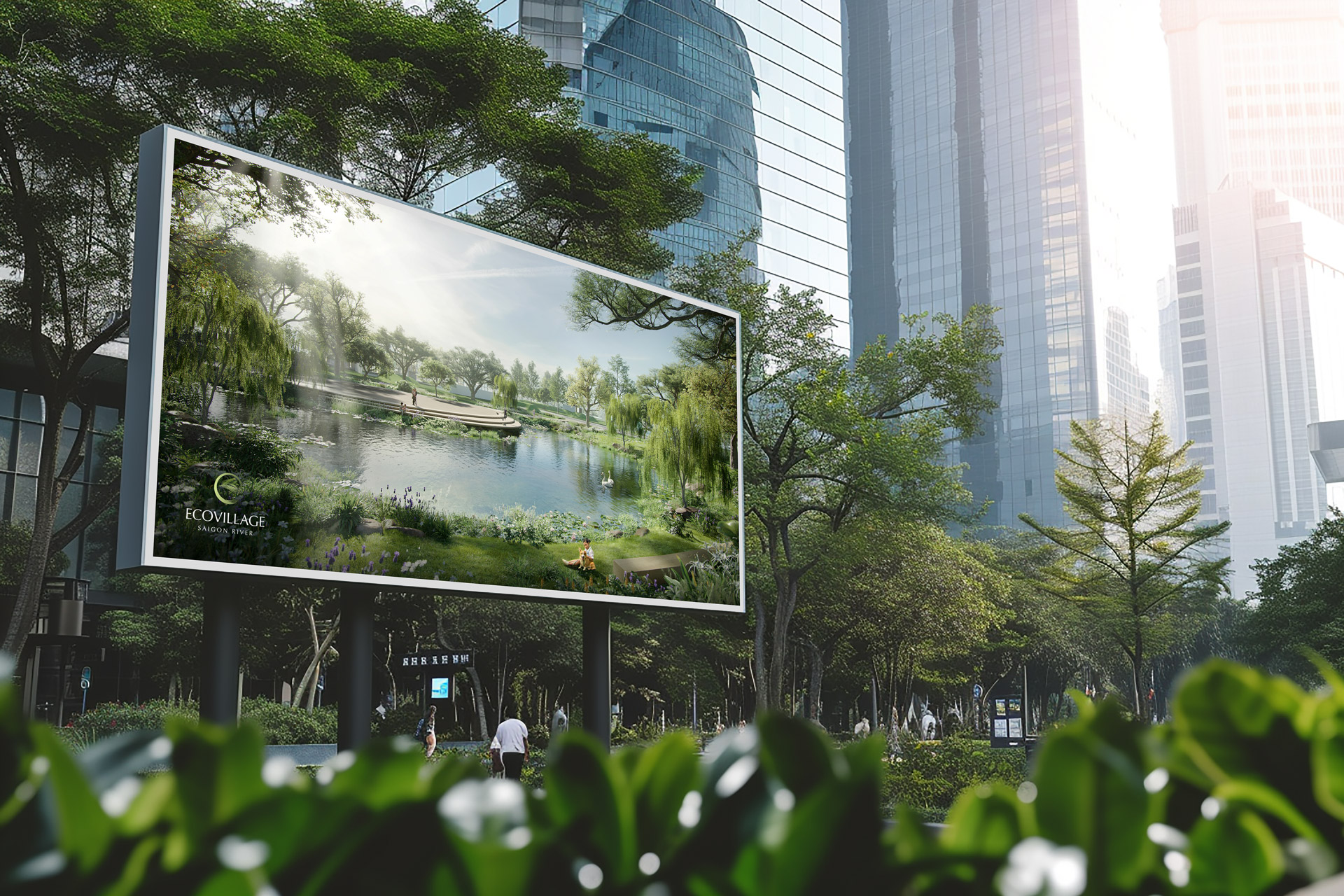
COMMUNICATION
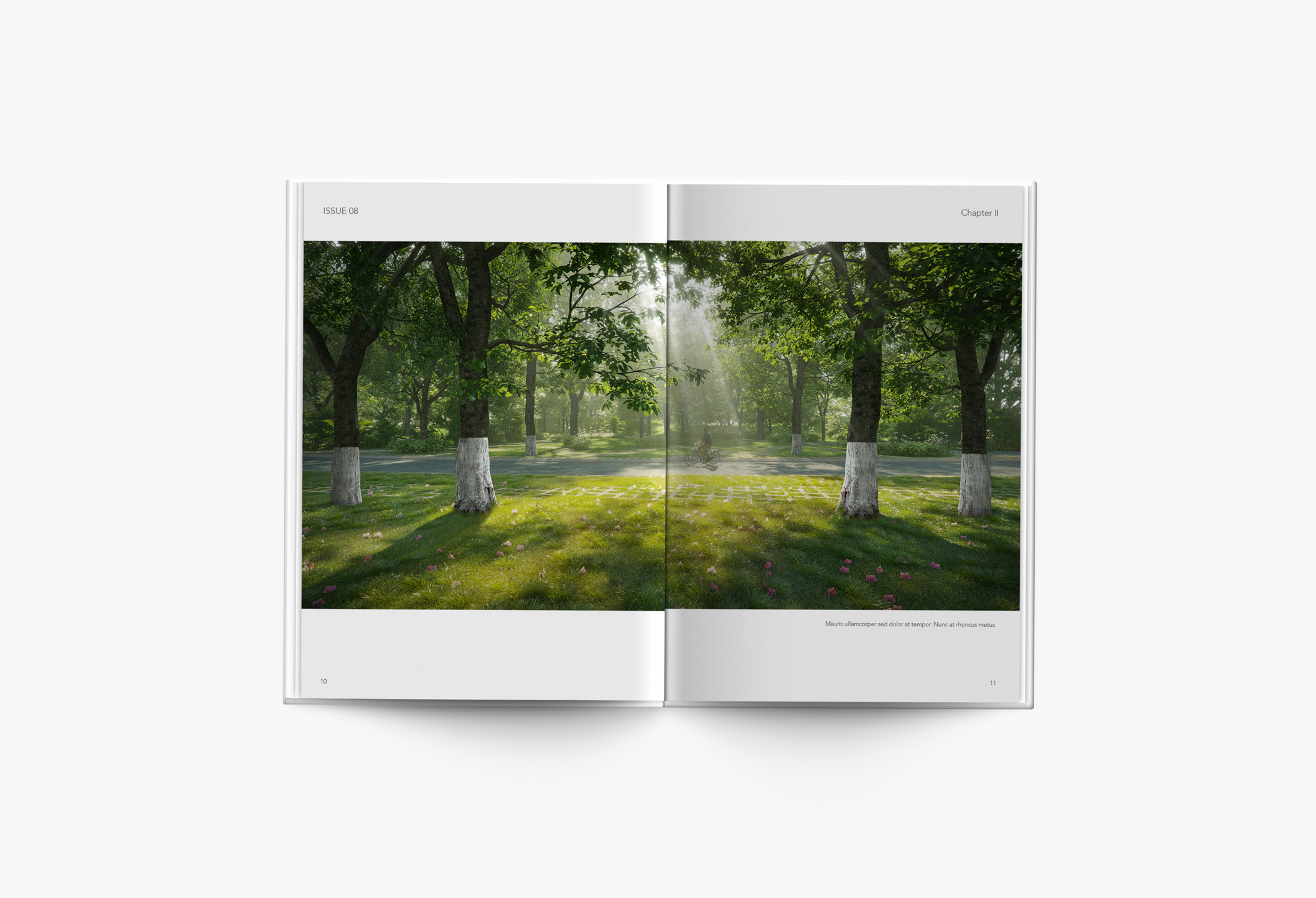
To make itself known to the public, Ecovillage Saigon River has established an advertisement campaign titled “The place we deserve to return to”. The Only Three also takes care of this campaign’s key visuals. To emphasize the project’s focus on nature and wellbeing, our studio has chosen the images that best showcase Ecovillage Saigon River’s beautiful natural landscape and abundant green space in relaxing moments, with the presence of community in various bonding activities.
The result is an impressive introduction of the green therapy to achieve the balance between the mind-the body-the spirit that Ecovillage Saigon River offers its residents and visitors, on various platforms including billboards and websites.