DESCRIPTION
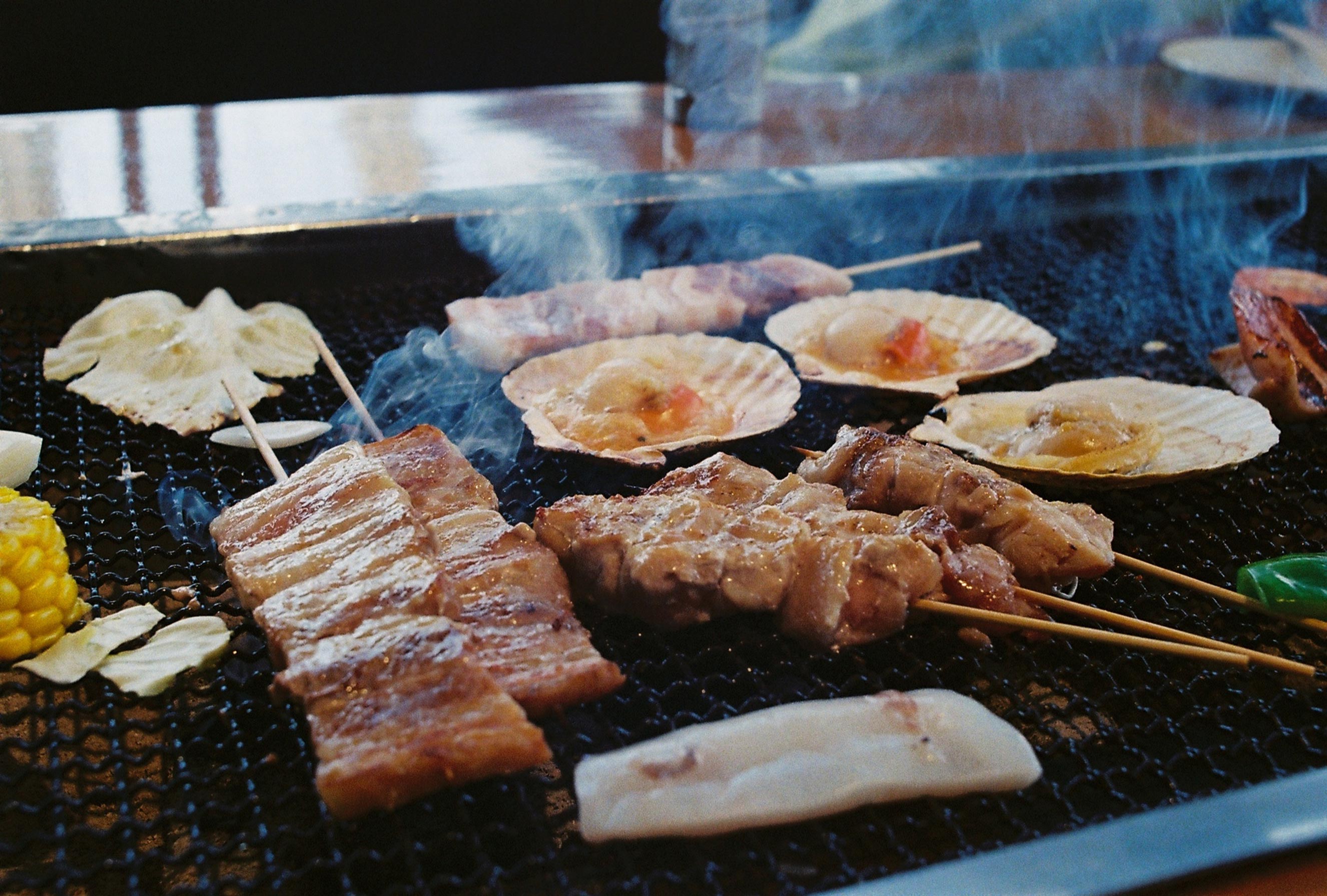
Calling The Costa Home – a beautiful residential tower overlooking the sparkling sea of Nha Trang Bay, Costa Robata is a contemporary Japanese restaurant with culinary highlights such as Robatayaki old style barbecue. This is also a short for “Robata” – an old-style Japanese charcoal barbecue that dates back centuries ago. The restaurant also offers other culinary highlights such as tempura, sushi, sashimi and yakitori.
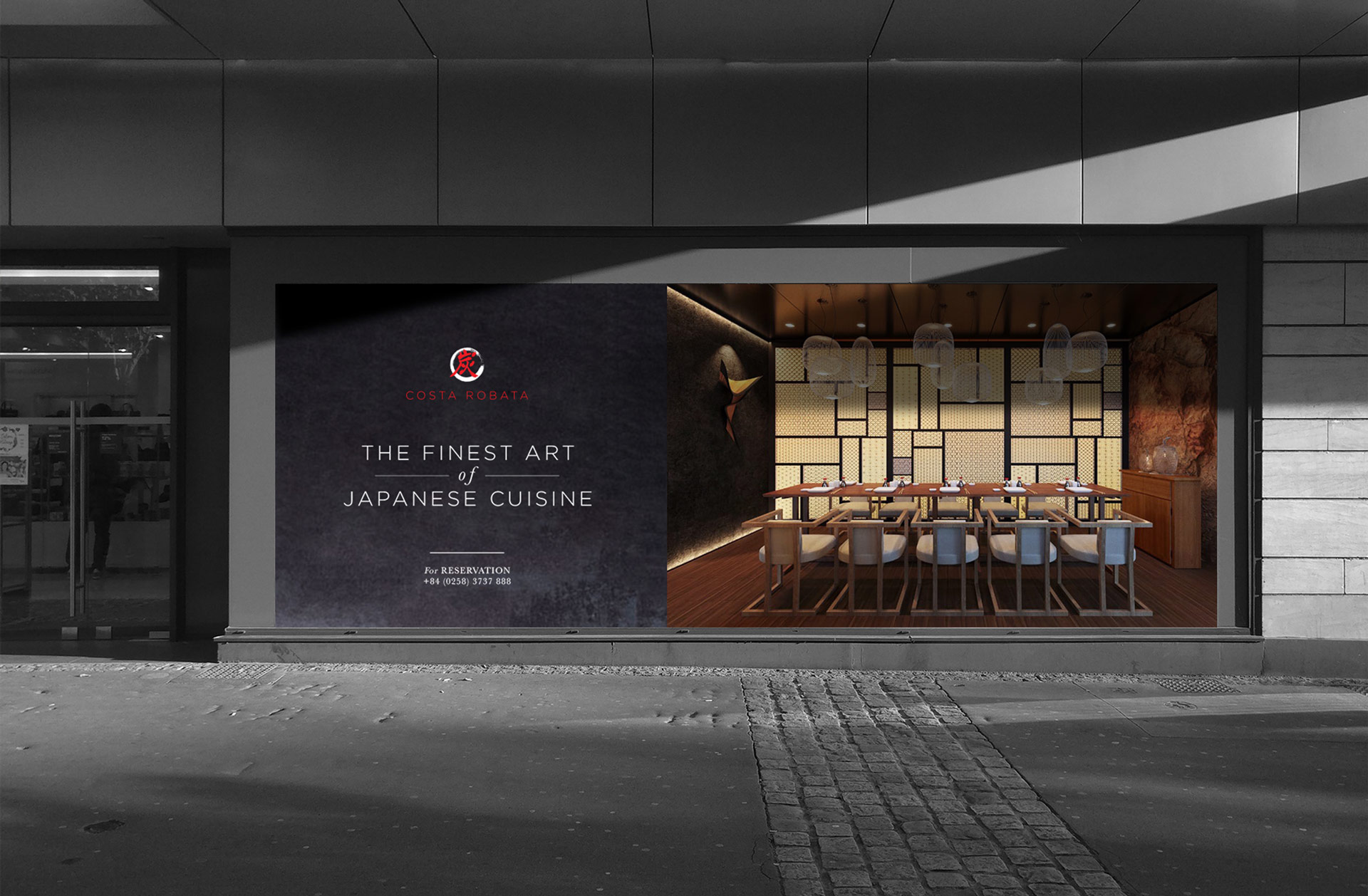
Pioneering bringing not only authentic culinary but a traditional yet creative culinary art of experience, Costa Robata offers a unique experience of Japanese cuisine. The interior is surrounded by a kitchen and sake bar, Costa Robata welcomes its customers with warm and elegant spaces, together with live music and open-kitchen performance by chefs at the heart of Nha Trang.
Scope of Work
Creative Concept
Brand Identity
Collateral Design
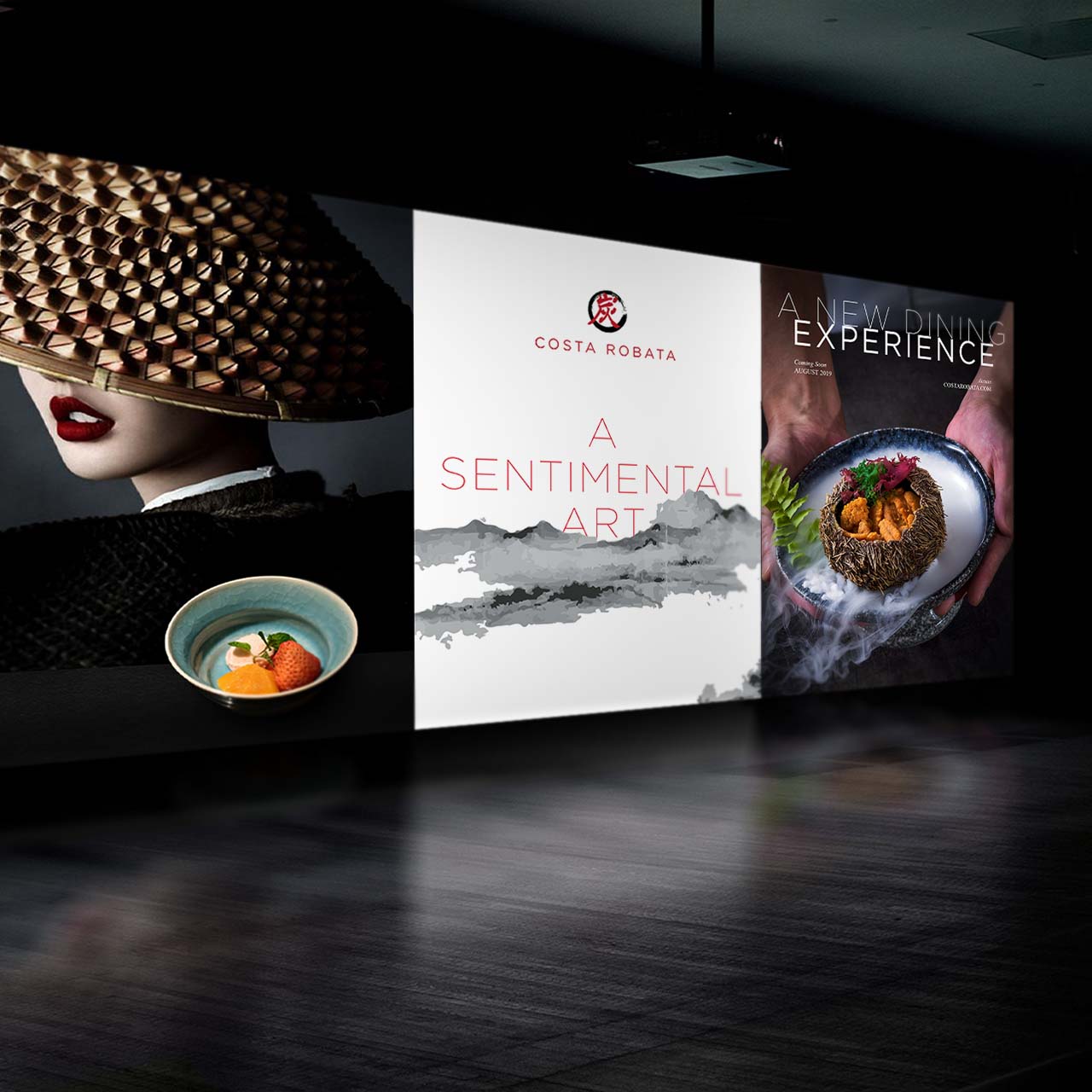
Key Visual
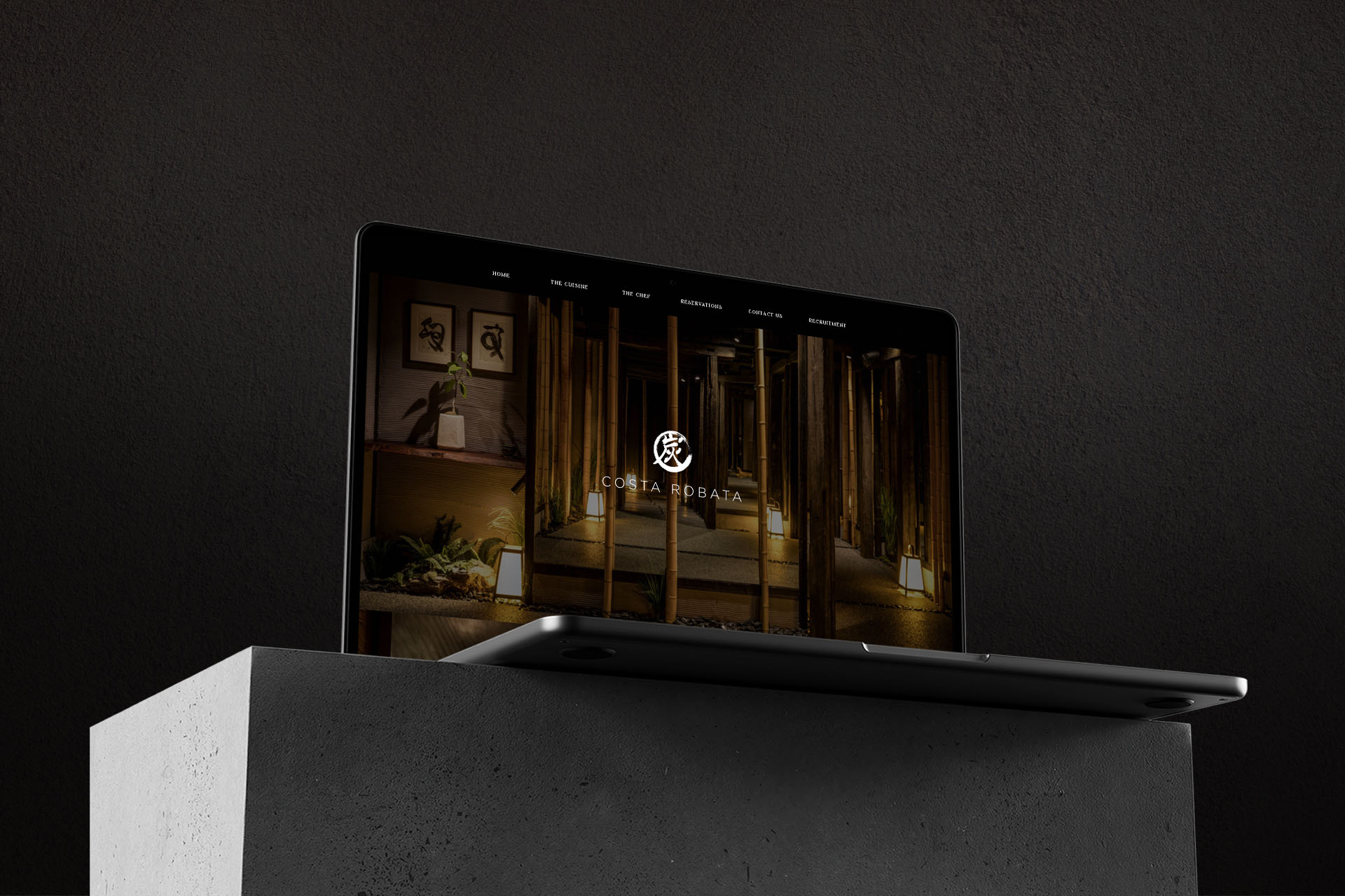
Website
INSPIRATION & CONCEPT
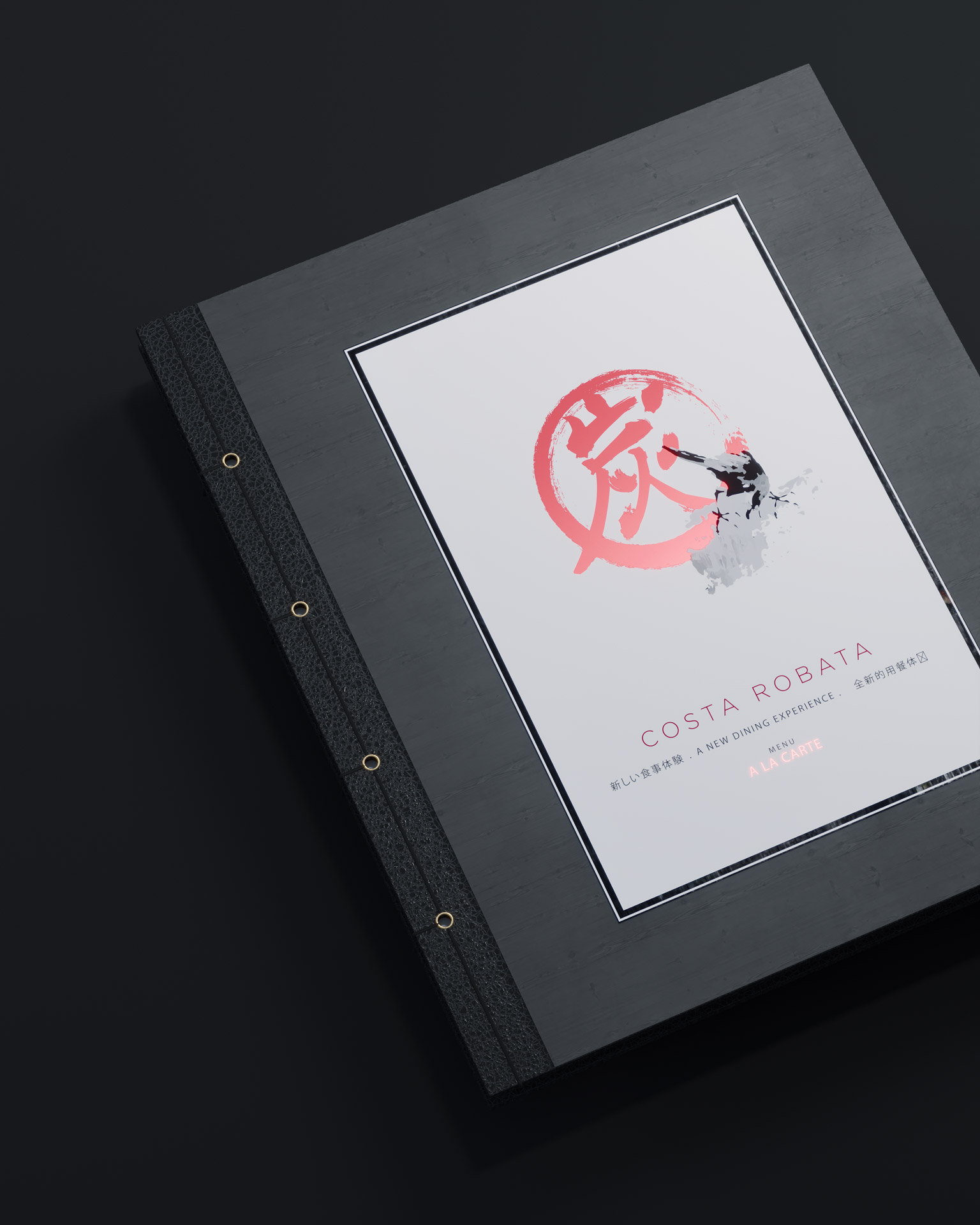
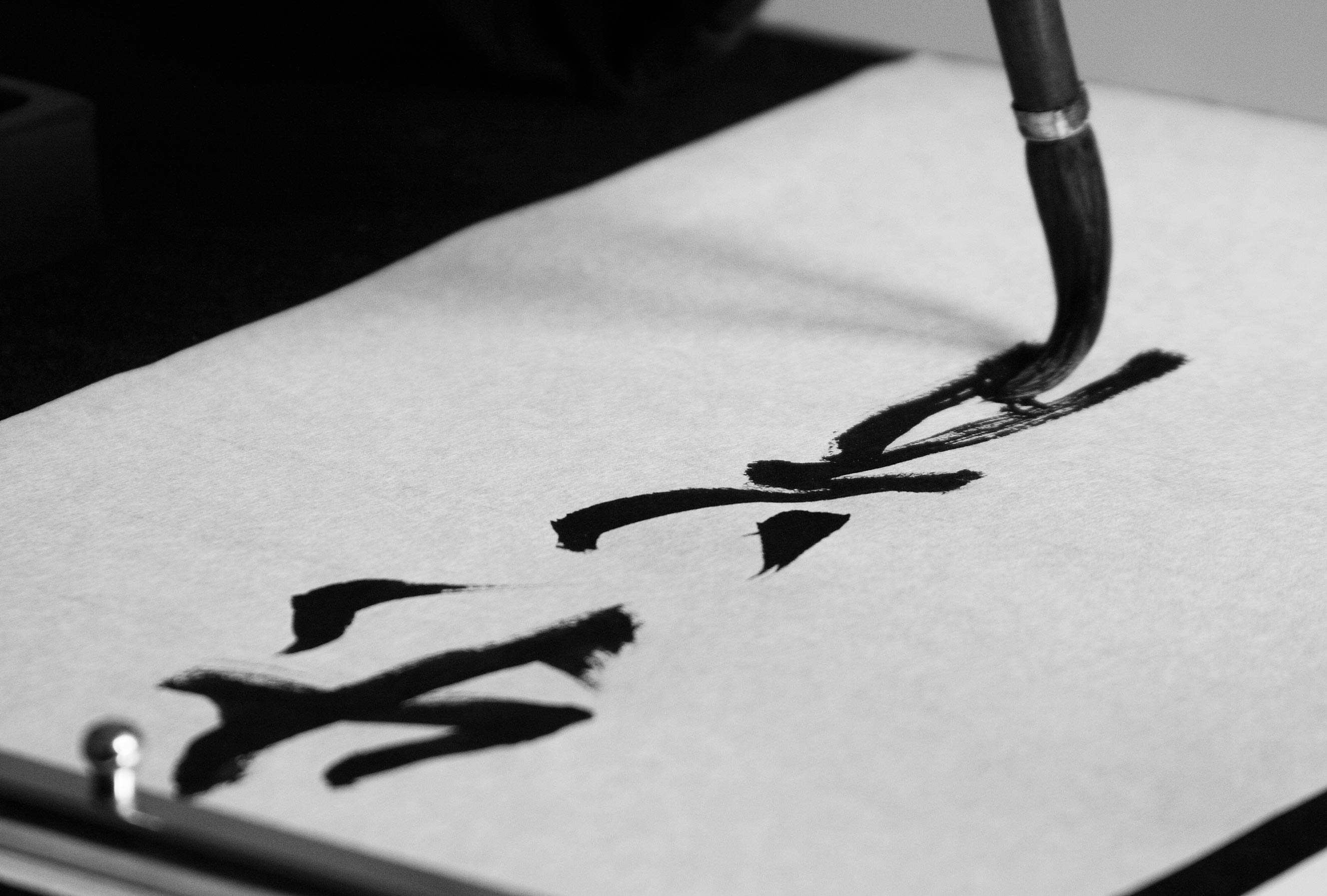
Our inspiration comes from the spirit of the restaurant – Robatayaki. “Charcoal” is a core element of the restaurant and an inspiration creating a traditional yet creative calligraphy of “炭” – the kanji for charcoal and also a combination of two different words “fire” “火” and “ash” “灰”.
Mindful of this beautiful, profound notion of kanjis, The Only Three has gained another precious inspiration: the unity and circle of creation between fire and ash. With charcoal as a point of connection, seeing that this circle of creation is a “ring” that encompasses Robatayaki and the art of cuisine in general.

BRANDING
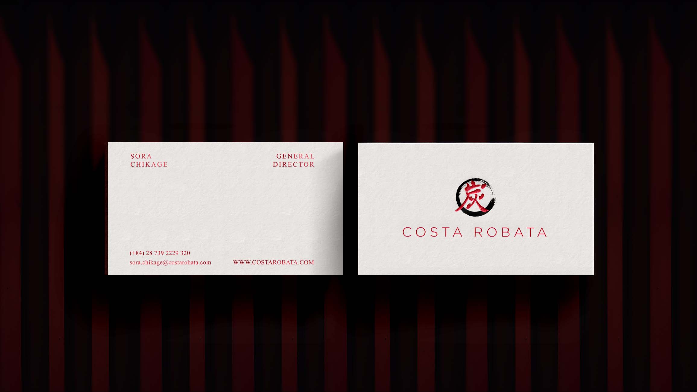
LOGO
Drawing inspiration from the Japanese culinary highlights – Robatayaki and the notion of kanjis and creative calligraphy of “炭”, our creative process brought these two signature elements to life through the final logo design – a brush stroke circling outside the center Kanji.
COLOR PALETTE
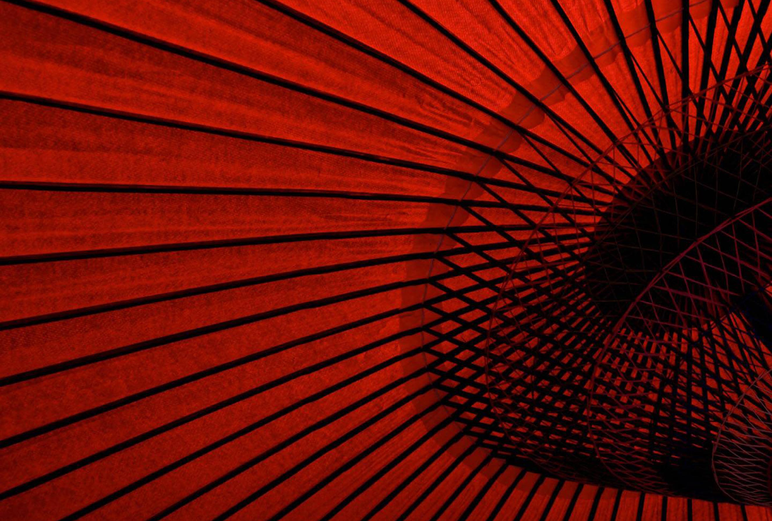
The color palette exudes a sense of timeless luxury but also its mysterious, calm and quiet vibe – a crucial part of the restaurant’s signature. The color white is added to pair with the black for a crisp and elegant look. Inspired by the burning charcoal of Robatayaki and fire performance in the restaurant, a deep red was added representing fire and bringing warmth to balance out the palette.
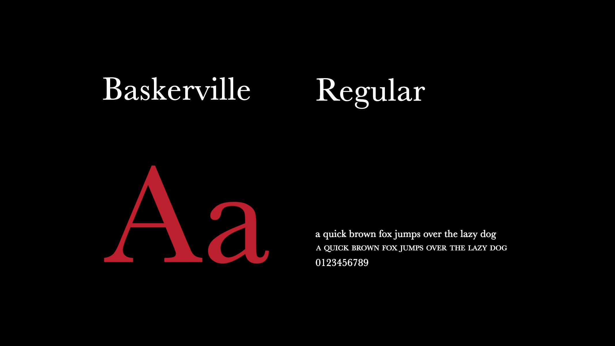
TYPEFACE
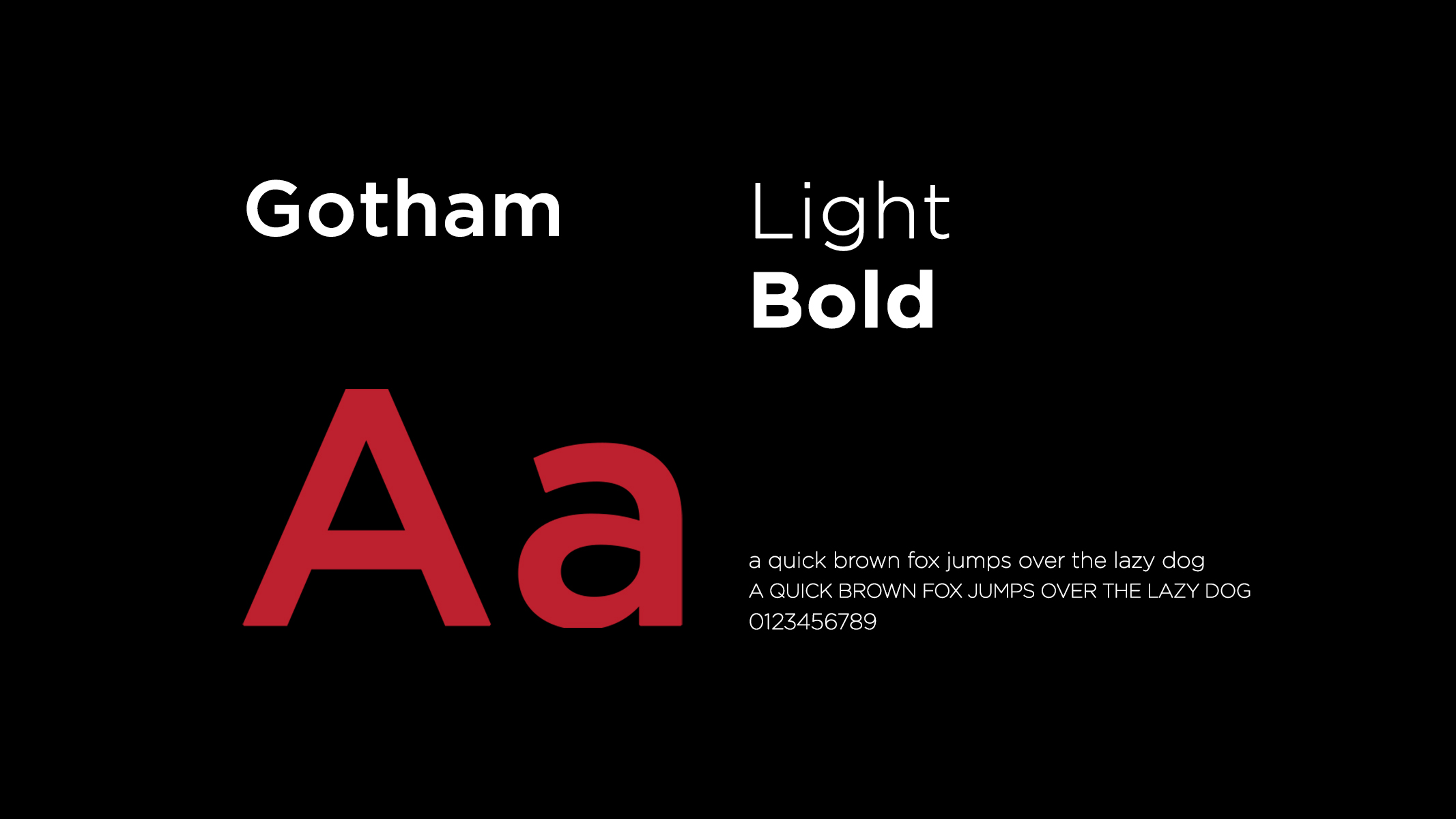
For typeface, Beau and Baskerville–two serif fonts were chosen bringing a sense of class and being formal. Creating a first impression that truly reflects its modernity and Japanese minimalist spirit, the collateral would need a more compact font. Gotham was chosen for the typewrite of their wordmark and headlines.

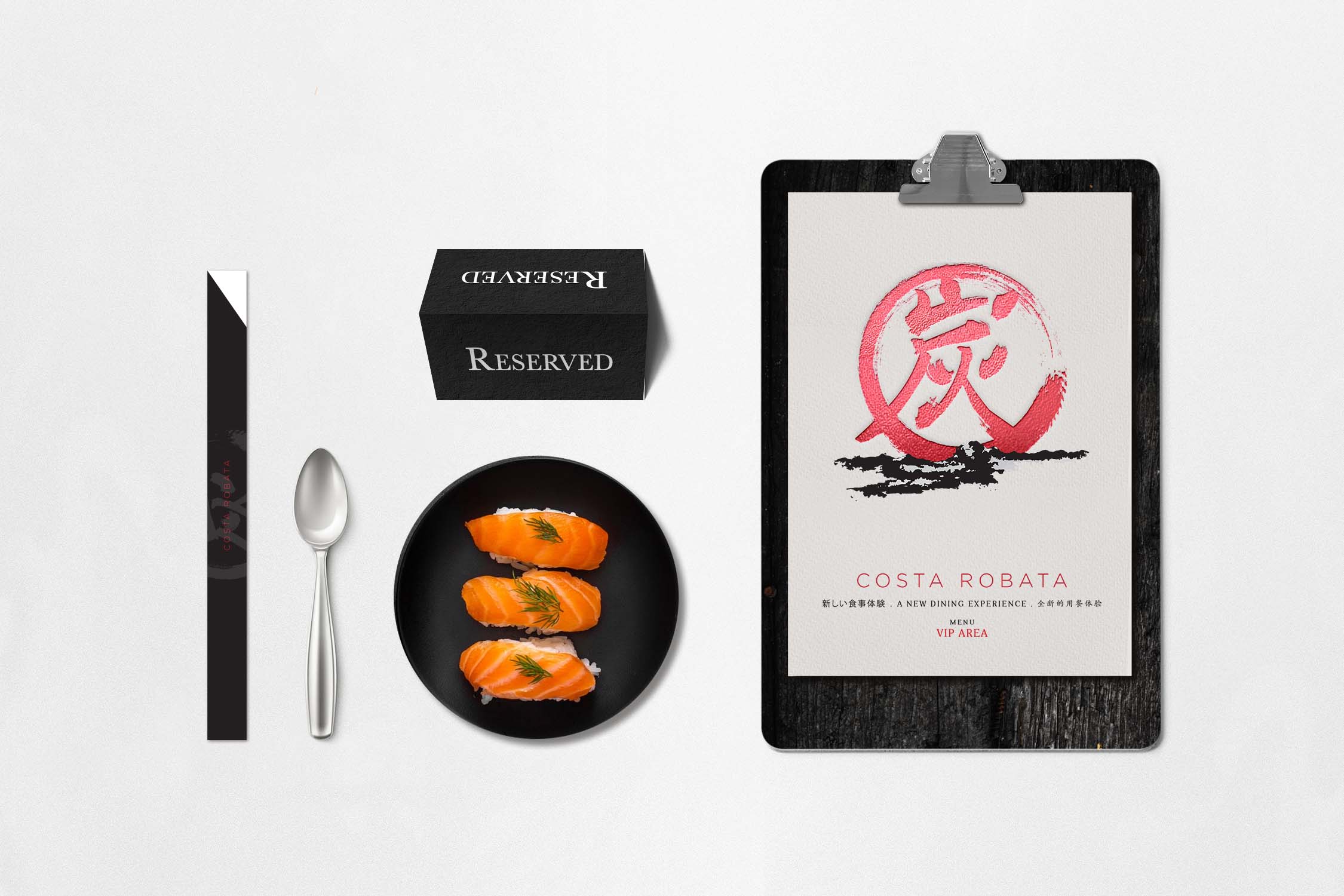
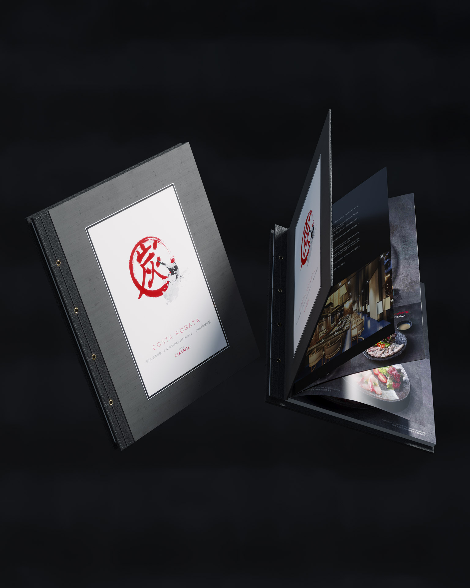
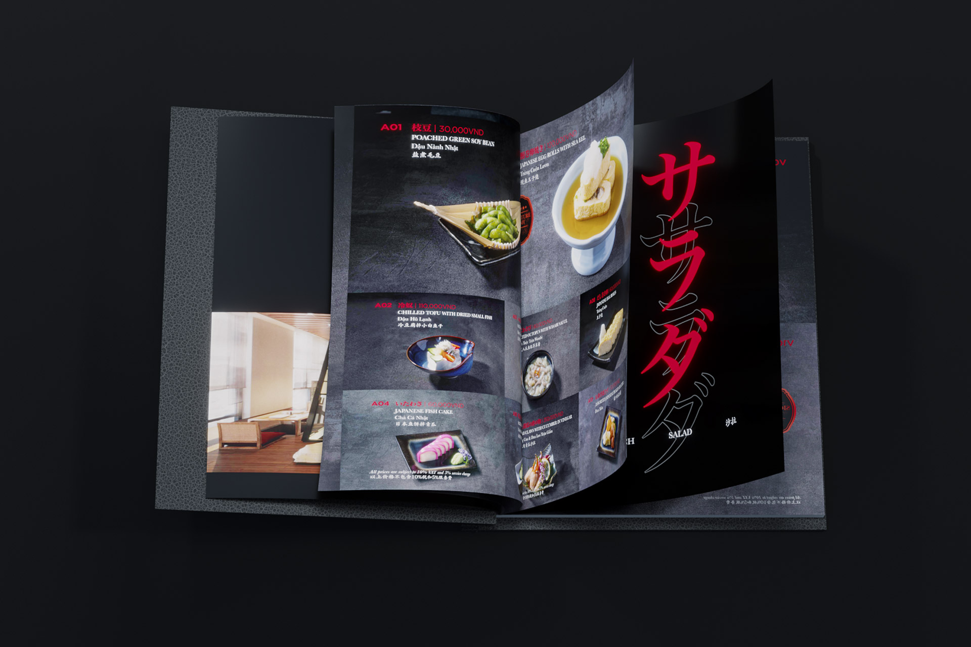
COLLATERALS