DESCRIPTION
Located within The Global City, a world-class urban complex created by Foster+Partners architecture firm to the west of Ho Chi Minh city, City Park is one of its global standard amenities, catering to the entertainment of all residents and visitors.
A visionary playground, this amusement park doesn’t only provide games and sports but also food, culture and other entertainment programs, promising an immersive experience full of adventure and bonding between visitors of all ages. Its aim is to offer an exciting escape from daily life and satisfy the five senses in the most whimsical, delightful and innovative ways.
Scope of Work
Creative Concept
Brand Identity
Sales Leaflet
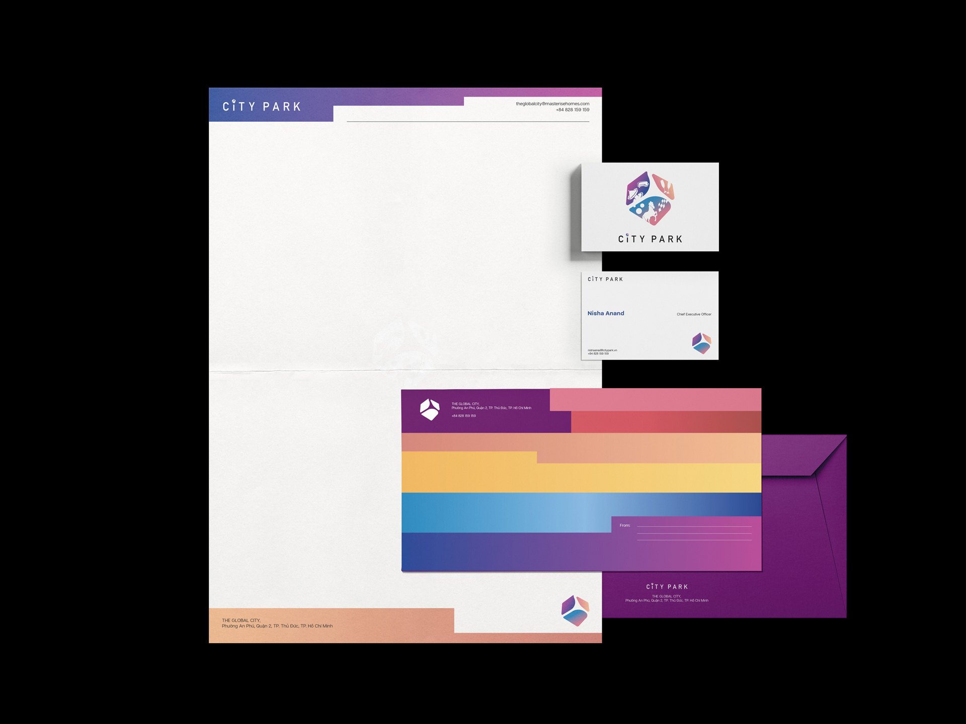
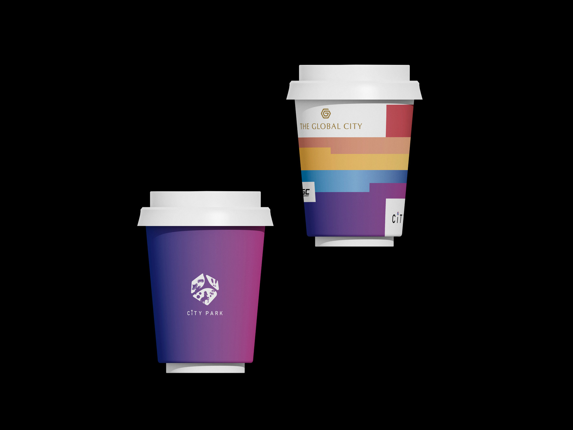
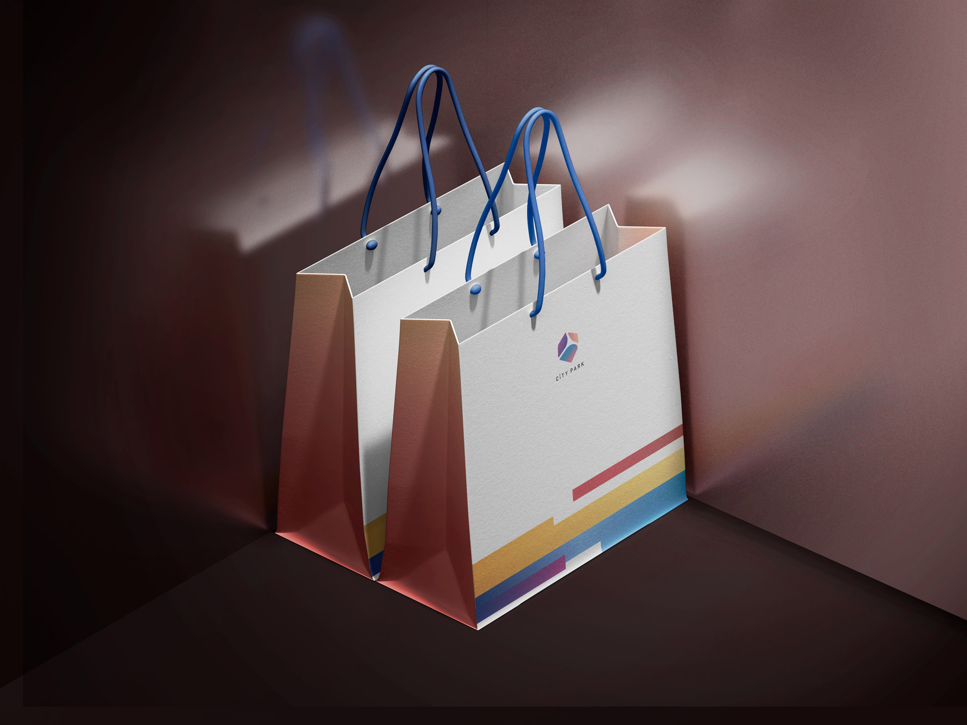
Collateral
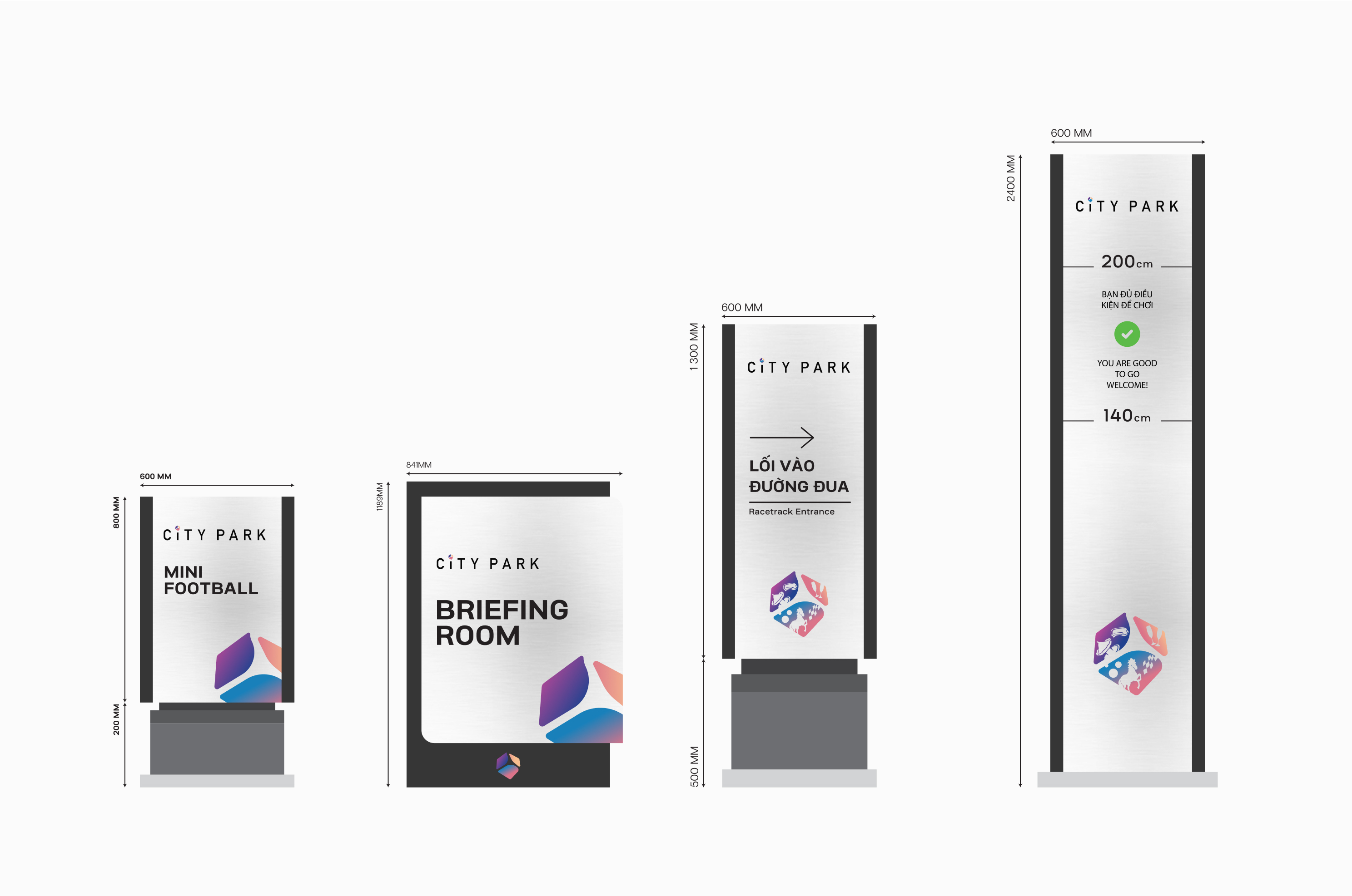
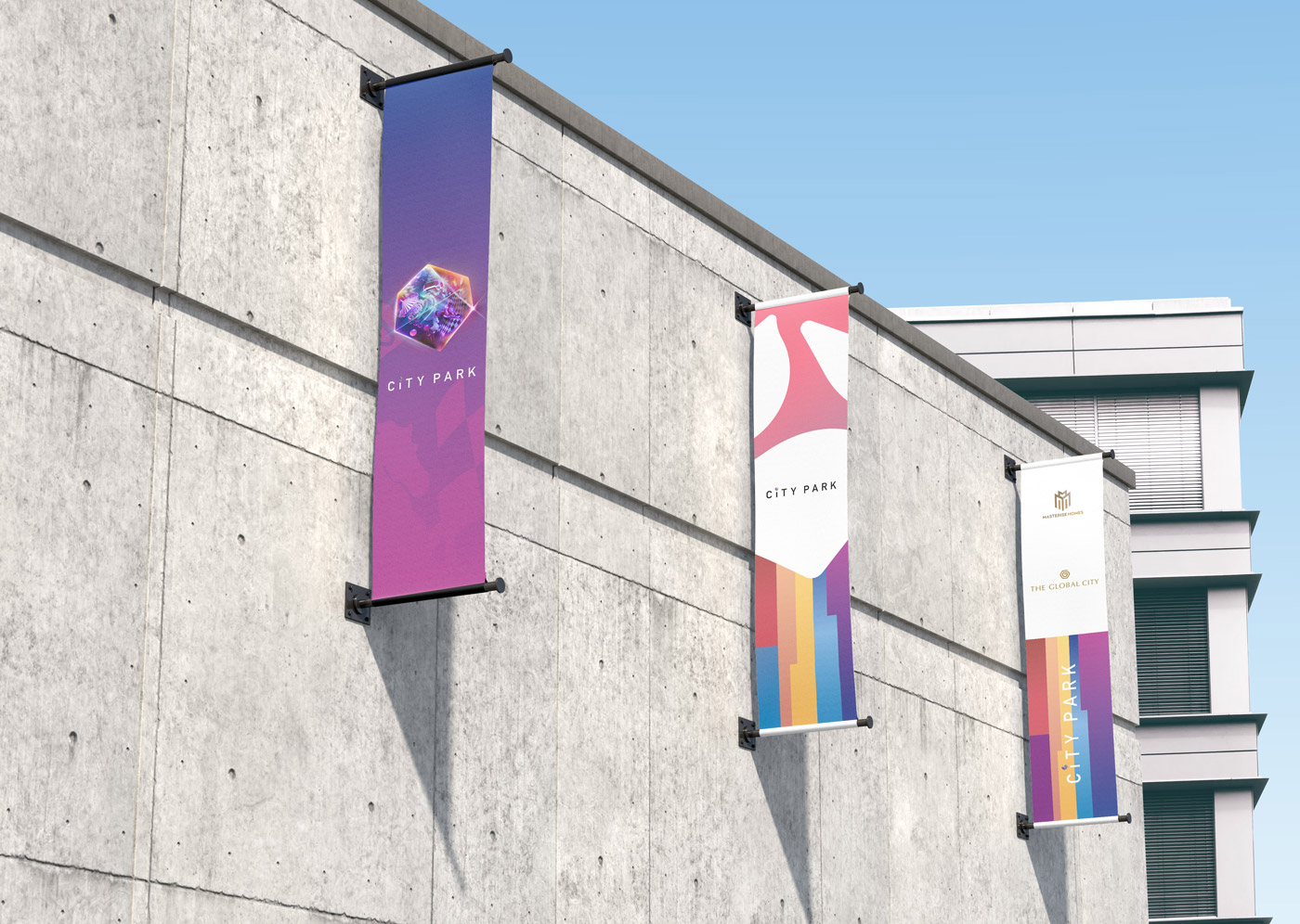
Signage
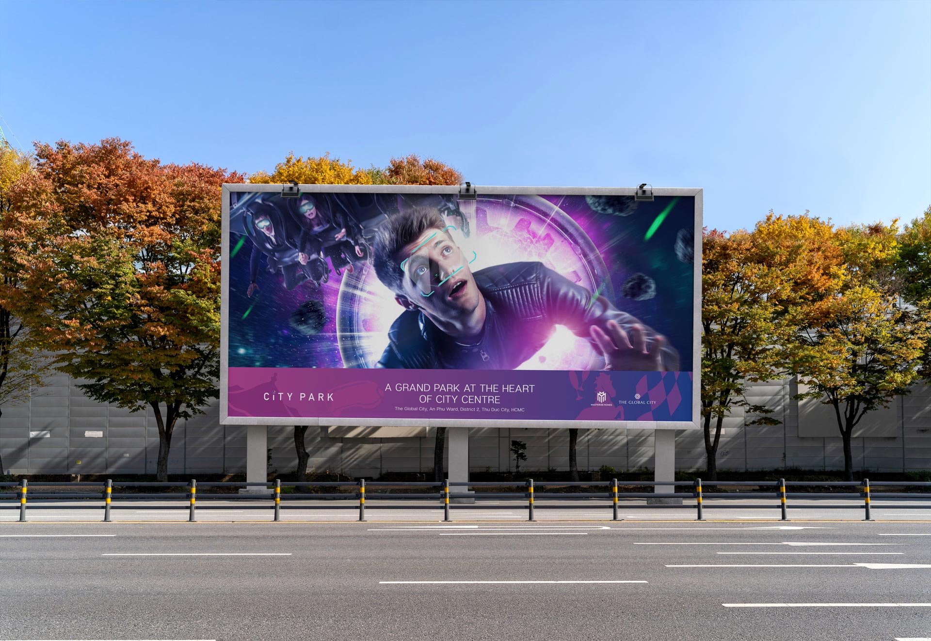
Key Visual
INSPIRATION & CONCEPT
Acknowledging City Park’s ambition, The Only Three introduced three archetypes for the brand: The Creator – The Jester – The Explorer. From these archetypes we developed the brand’s identity and marketing strategy following positive keywords such as community, happiness, variation and magic.
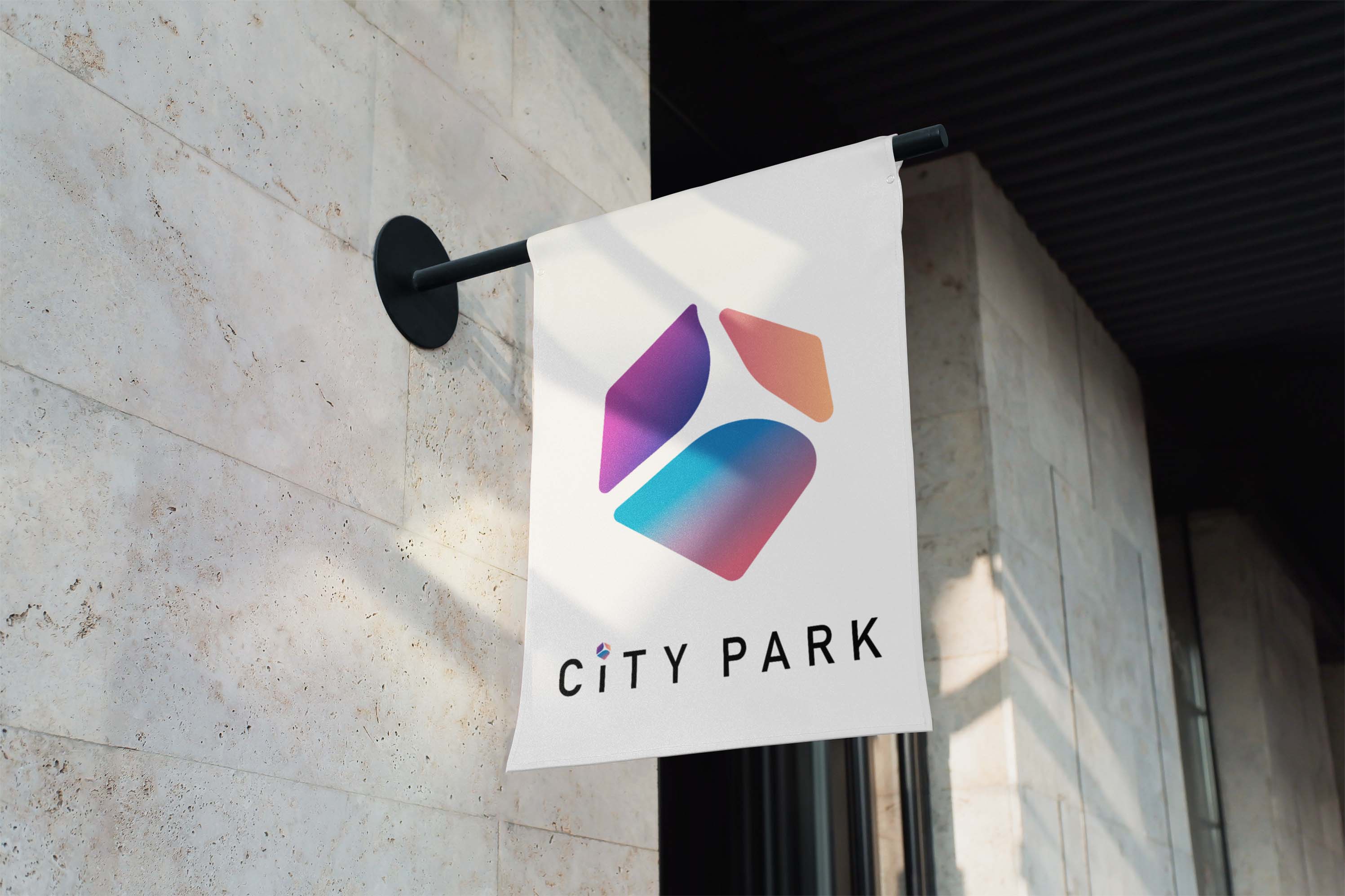
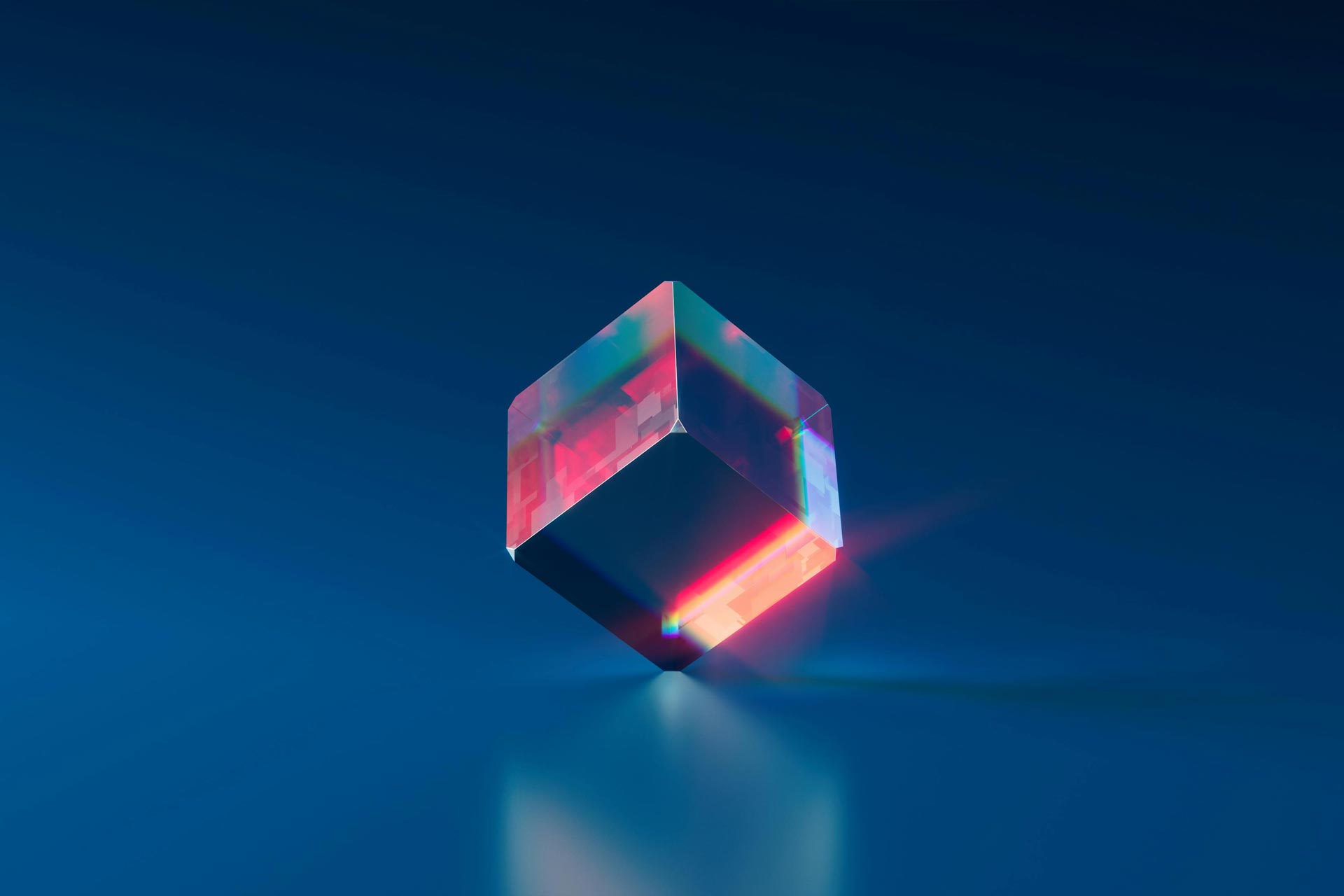
The Only Three’s brand concept and vision should reflect senses of futuristic, magical and complex look to represent the spirit of a pioneering amusement park created for people of all profiles. To achieve this effect, we’ve chosen the form of a multifaceted crystal cube for the graphic symbol. Three trapezoid facets are placed next to each other, symbolizing the connection between people of different backgrounds within the same community.

BRANDING
LOGO
The cube is illustrated in its rugged, primitive shape, conjuring a magical sense and people’s exploration spirit, as well as embodying various entertainment forms and programs available at the park. In the colored version, each facet is filled with a gradient of colors from the brand’s palette, further emphasizing visitors’ emotions and sensations which blur together upon exploring City Park.
The graphic symbol we’ve conceived will be attached on top of the letter “i” of the wordmark “City Park” – a clear and simplified typeface but yet complex and eye-catching graphic symbol pop up even more. The Only Three also developed the brand’s logo into an independent graphical logo with a smaller wordmark and the upscale, detailed illustration of the crystal cube, and another version with 3D flying objects to be used in marketing.
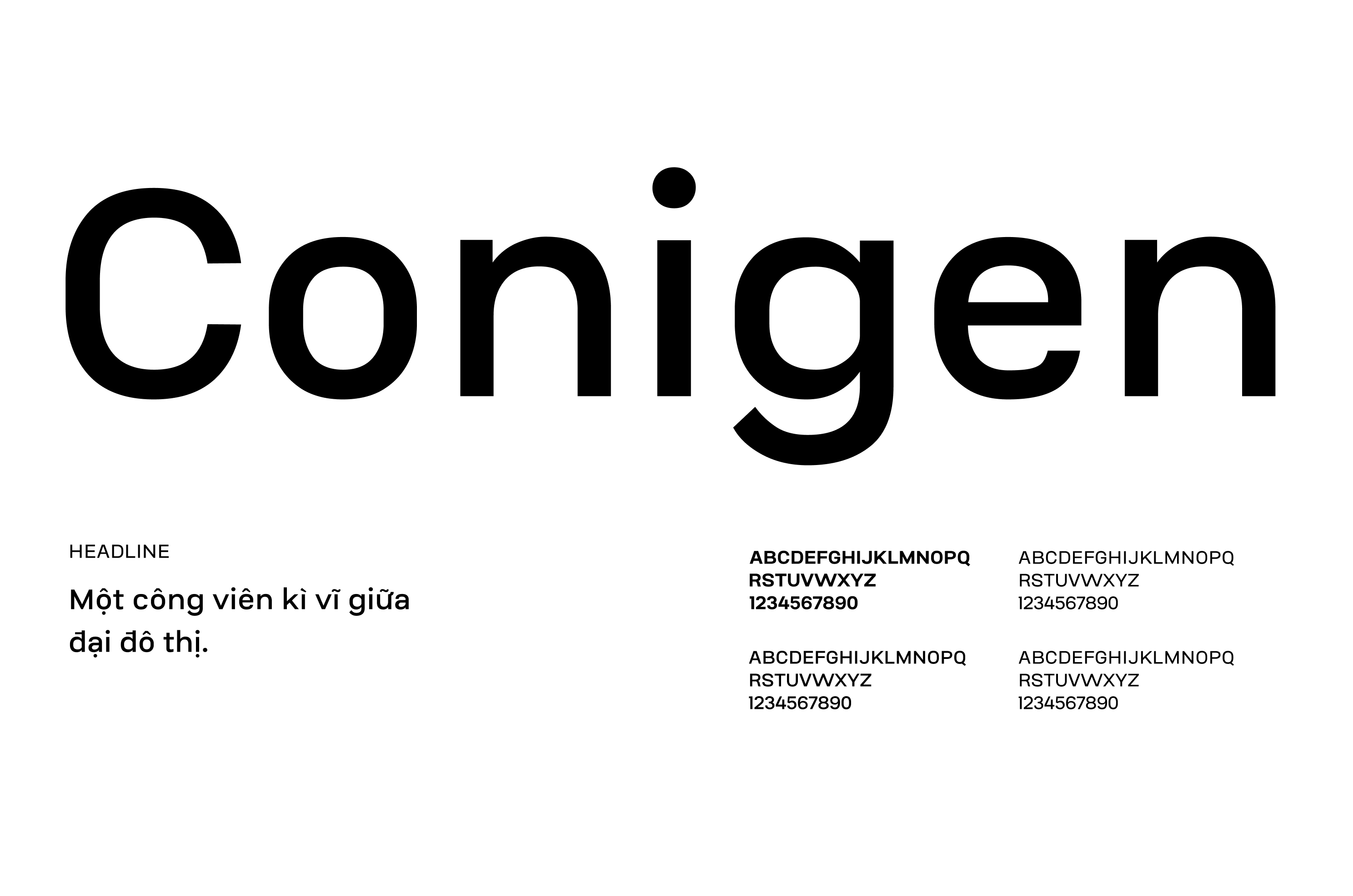
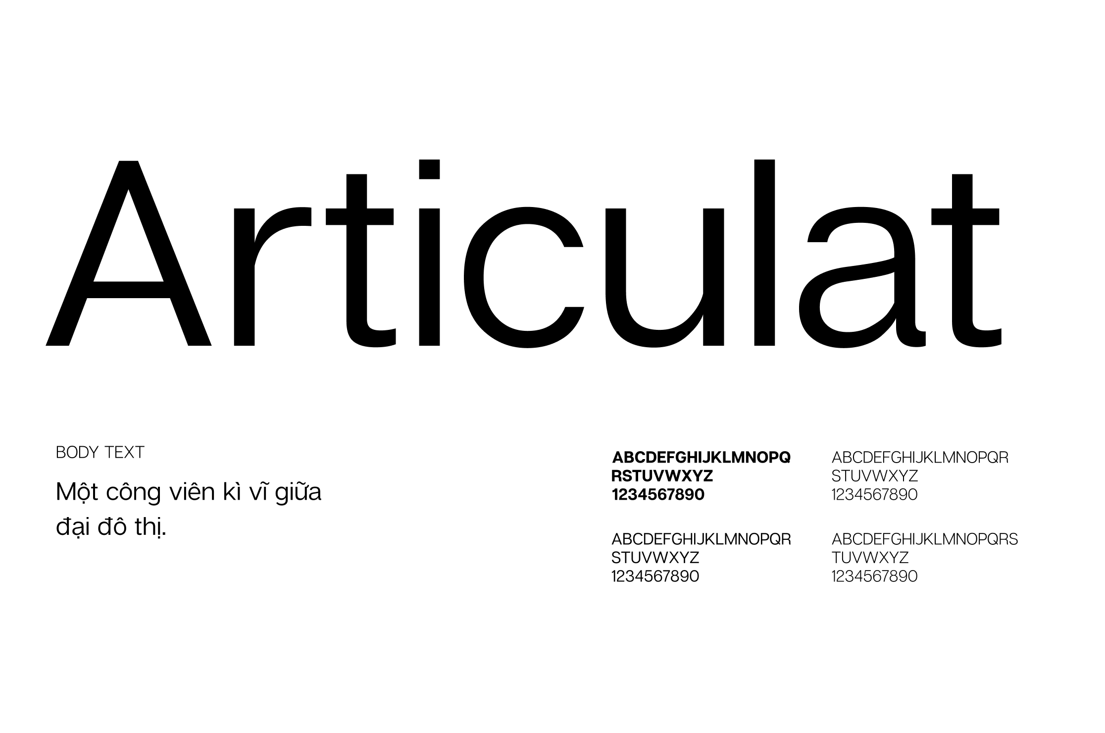
TYPEFACE
Choosing a fitting typeface to ensure clear communication and convey the brand’s spirit at the same time is an important mission. To carry out this mission The Only Three takes the futuristic and modern side of City Park as our direction.
Coming to Conigen, a font with an aerodynamic and technological feeling, for headers and sub-headers to leave a professional and innovative impression on the public. As for the content body, we selected Articulat because of its sharp yet delicate and casual design.
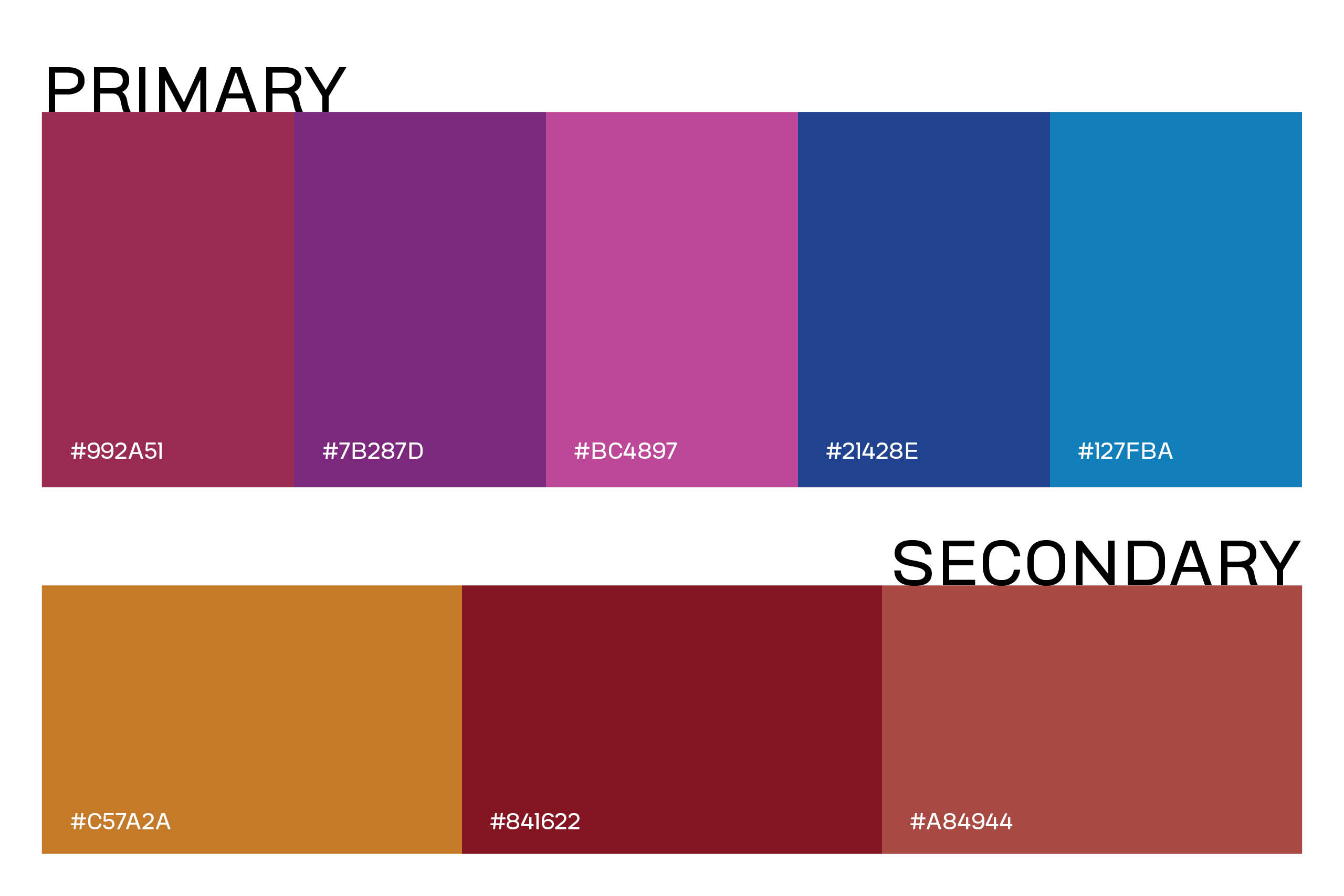
COLOR PALETTE
Inspired by the enchanting amusement park scenery, with structures reaching the blue sky above and colorful, futuristic neon lights by night, The Only Three has meticulously assembled the brand’s color palette to embody its spirit and ensure visual consistency across various contents.
The dominant hues in this palette are sky blue, wine red and purplish-pink typical of amusement parks in twilight hours, evoking magical, joyful, exciting and adventurous feelings. The secondary tones are warm yellow and tones of red, calling to mind the image of merry-go-rounds and circus tents and adding needed warmth to the palette.
COMMUNICATION
A unique striped pattern inspired by the colorful reflections of the multifaceted cube symbol was created. The stripes come in diverse geometric shapes, in solid or gradients of colors taken from the brand’s palette, and are carefully arranged following color combination rules to assure a vibrant but pleasing appearance.
The Only Three is also commissioned to produce City Park’s signage, banners, posters and collateral. For these materials the brand’s symbols are employed in many versions, scale and layout, along with strong, bold and minimal typeface. The photos on these key visuals are also mindfully selected according to our team’s direction to best convey the brand’s spirit.